portfolio
Every virtual space I've created (or at least, the ones worth noting). Download links have been provided where applicable.
-
Skin Deep
(id Tech 4, 2025) -
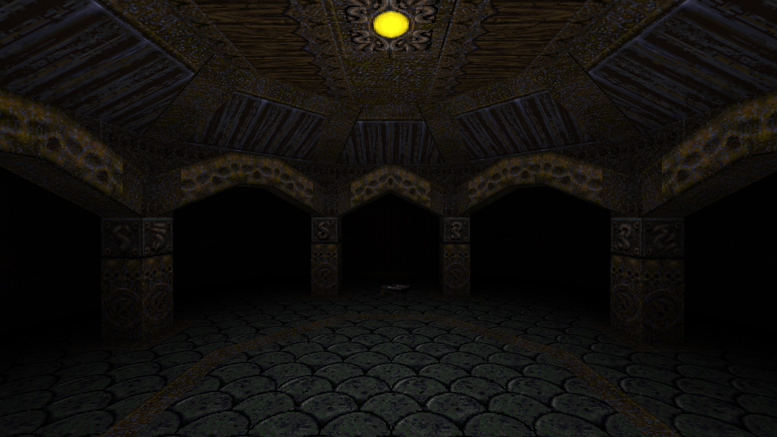
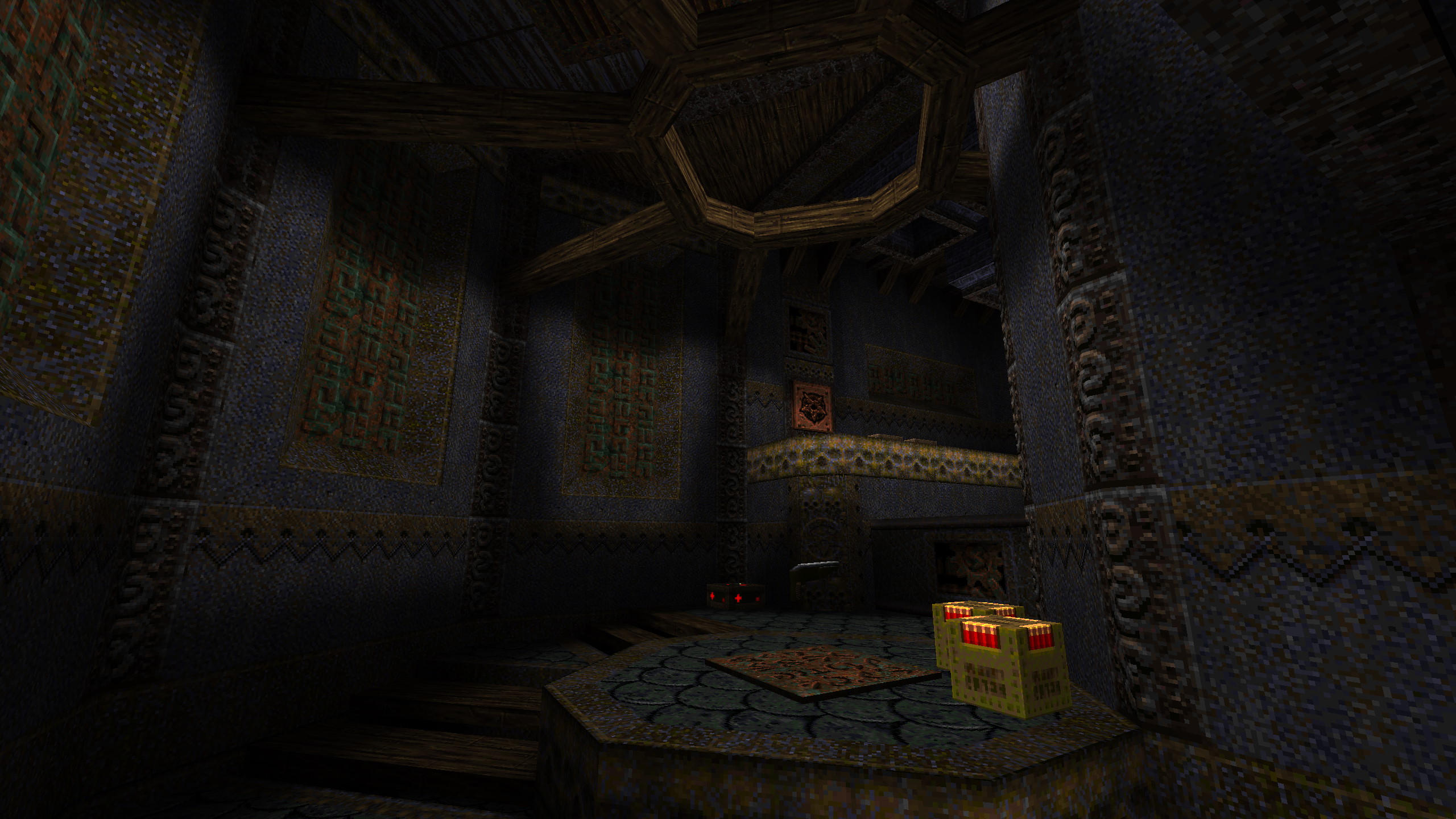
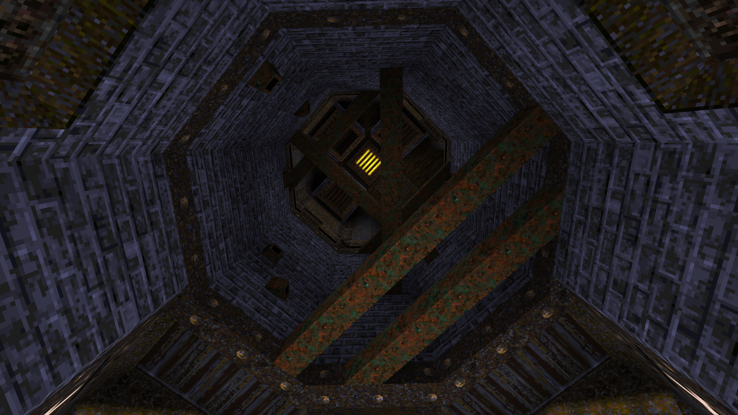
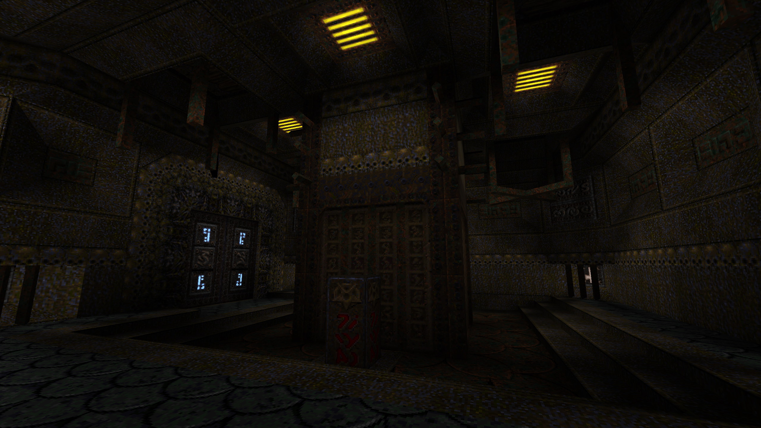
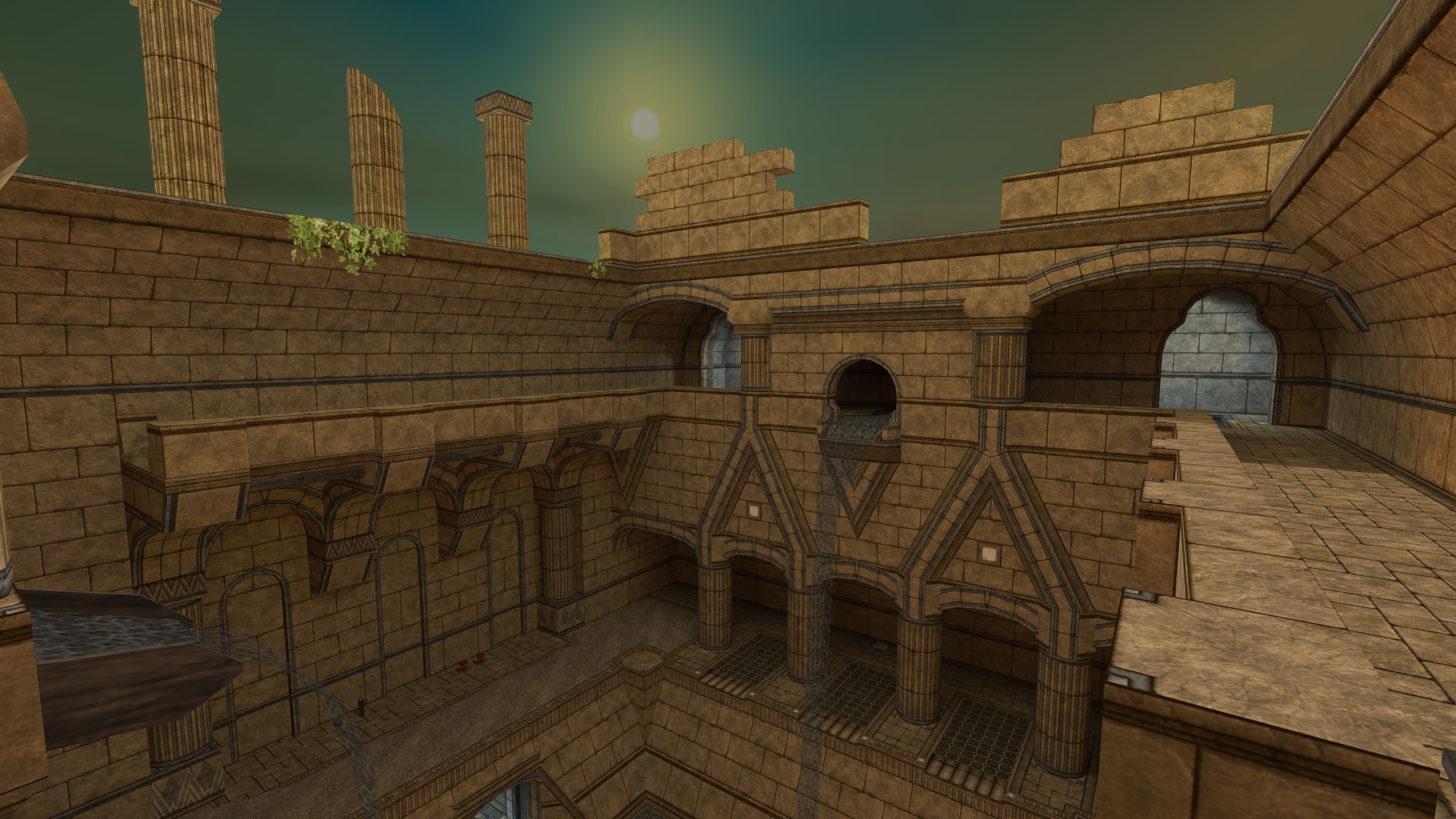
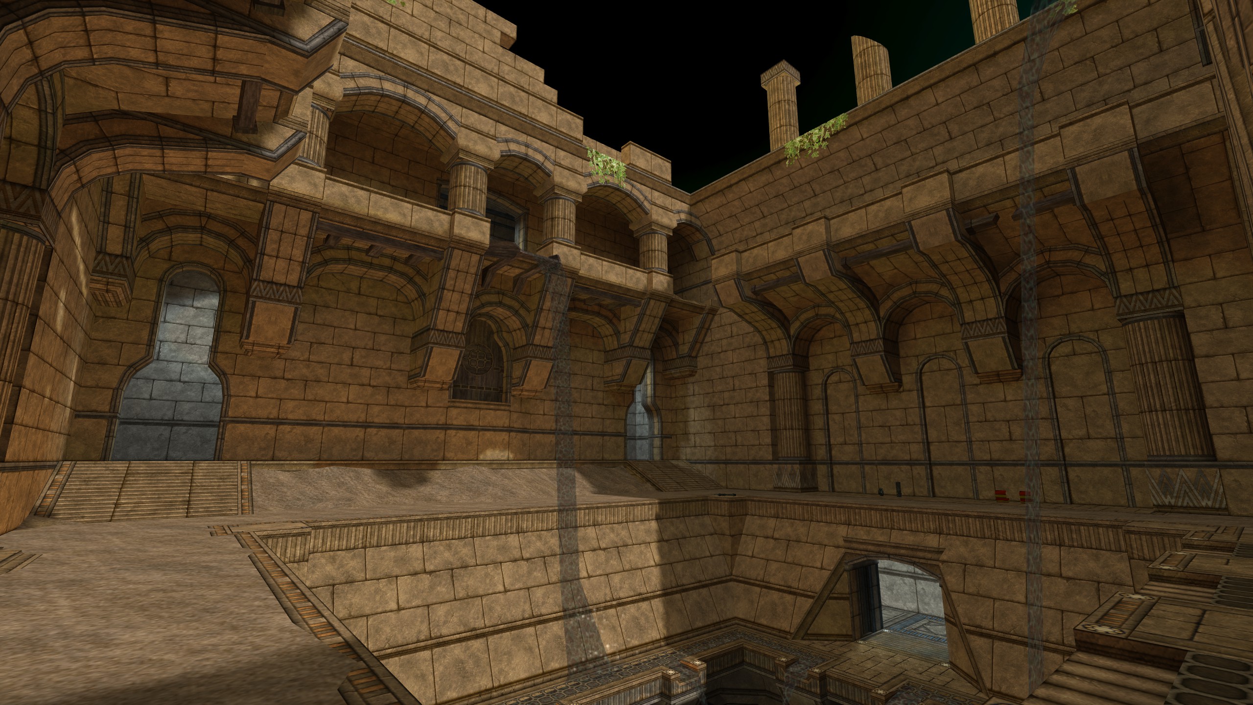
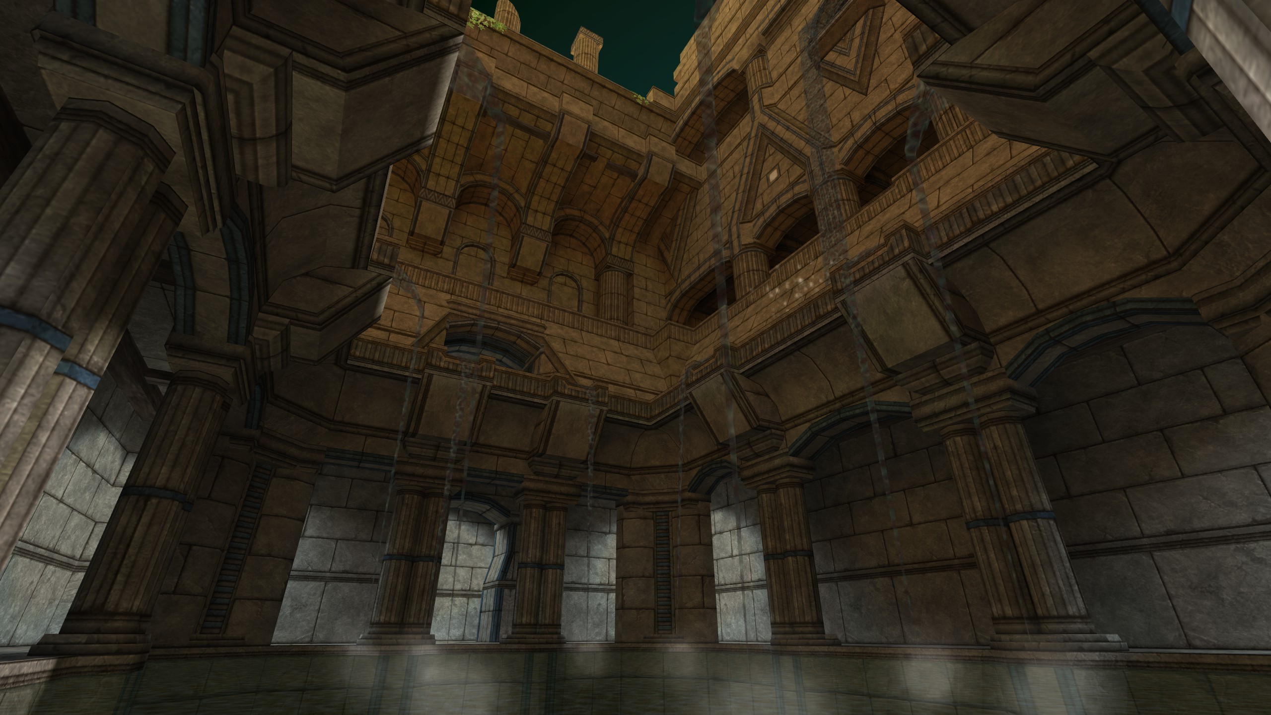
Only You Can Prevent Containment Breaches
(Quake (Copper mod), 2023) -
The Warmest Body In The Room
(Quake, 2022) -
Amid A Fresh Carcass
(Quake (Copper mod), 2022) -
Head Reattachment Trauma
(Quake, 2022) -
The Stars We Lost To Grief
(Quake, 2022) -
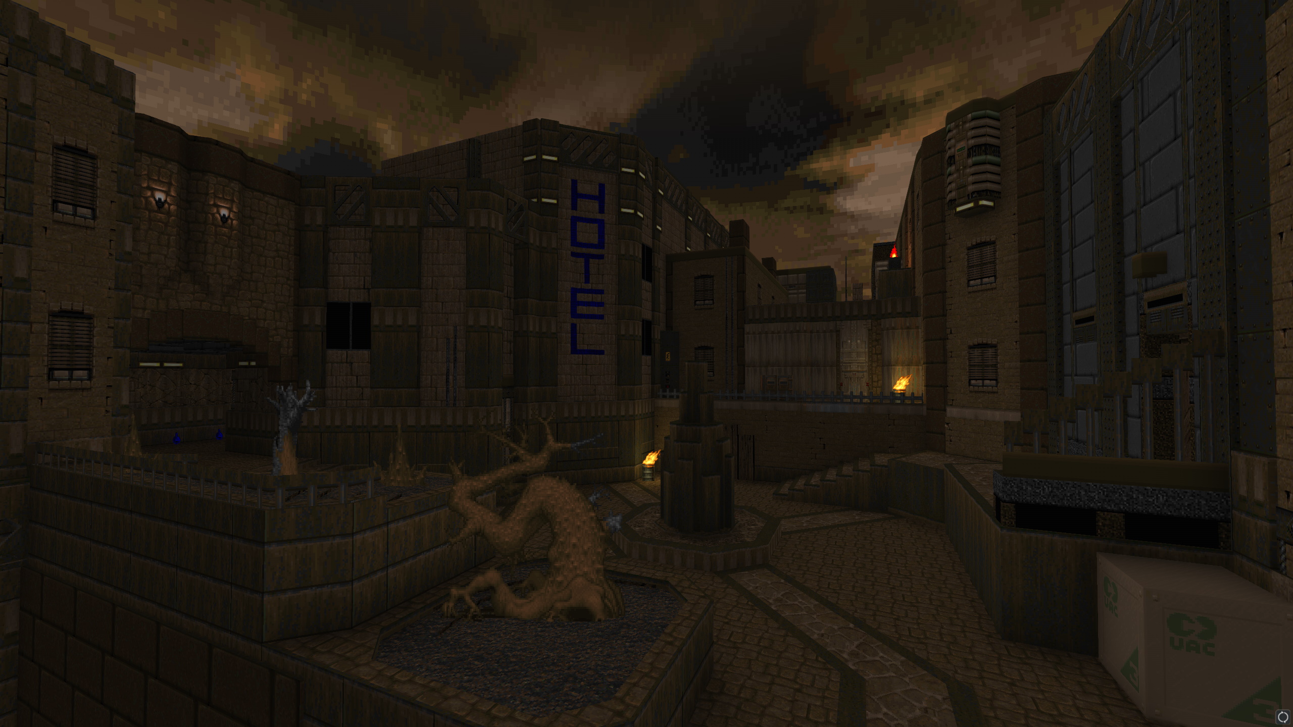
Don't Turn Your Back On The City
(Doom II (Boom-compatible), 2021) -
dm_perthowned
(GoldSrc, 2020) -
dm_lister
(GoldSrc, 2017) -
Skint
(Unreal Engine 4, 2017) -
de_nocredit
(Source, 2016) -
de_coredump
(Source, 2016)
-
 Go to previous slide
Go to next slide
Go to previous slide
Go to next slide
-
 Go to previous slide
Go to next slide
Go to previous slide
Go to next slide
-
 Go to previous slide
Go to next slide
Go to previous slide
Go to next slide
-
 Go to previous slide
Go to next slide
Go to previous slide
Go to next slide
-
 Go to previous slide
Go to next slide
Go to previous slide
Go to next slide
-
 Go to previous slide
Go to next slide
Go to previous slide
Go to next slide
-
 Go to previous slide
Go to next slide
Go to previous slide
Go to next slide
-
 Go to previous slide
Go to next slide
Go to previous slide
Go to next slide
-
 Go to previous slide
Go to next slide
Go to previous slide
Go to next slide
-
 Go to previous slide
Go to next slide
Go to previous slide
Go to next slide
-
 Go to previous slide
Go to next slide
Go to previous slide
Go to next slide
-
 Go to previous slide
Go to next slide
Go to previous slide
Go to next slide
-
 Go to previous slide
Go to next slide
Go to previous slide
Go to next slide
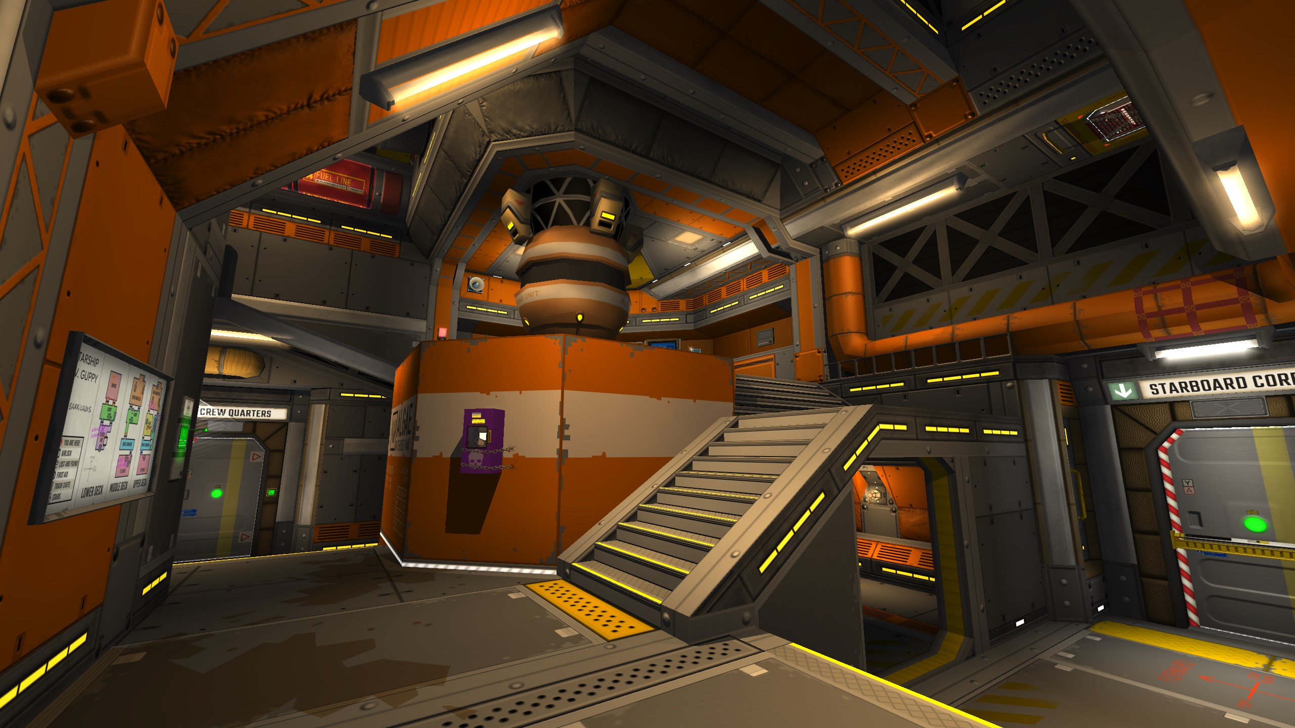
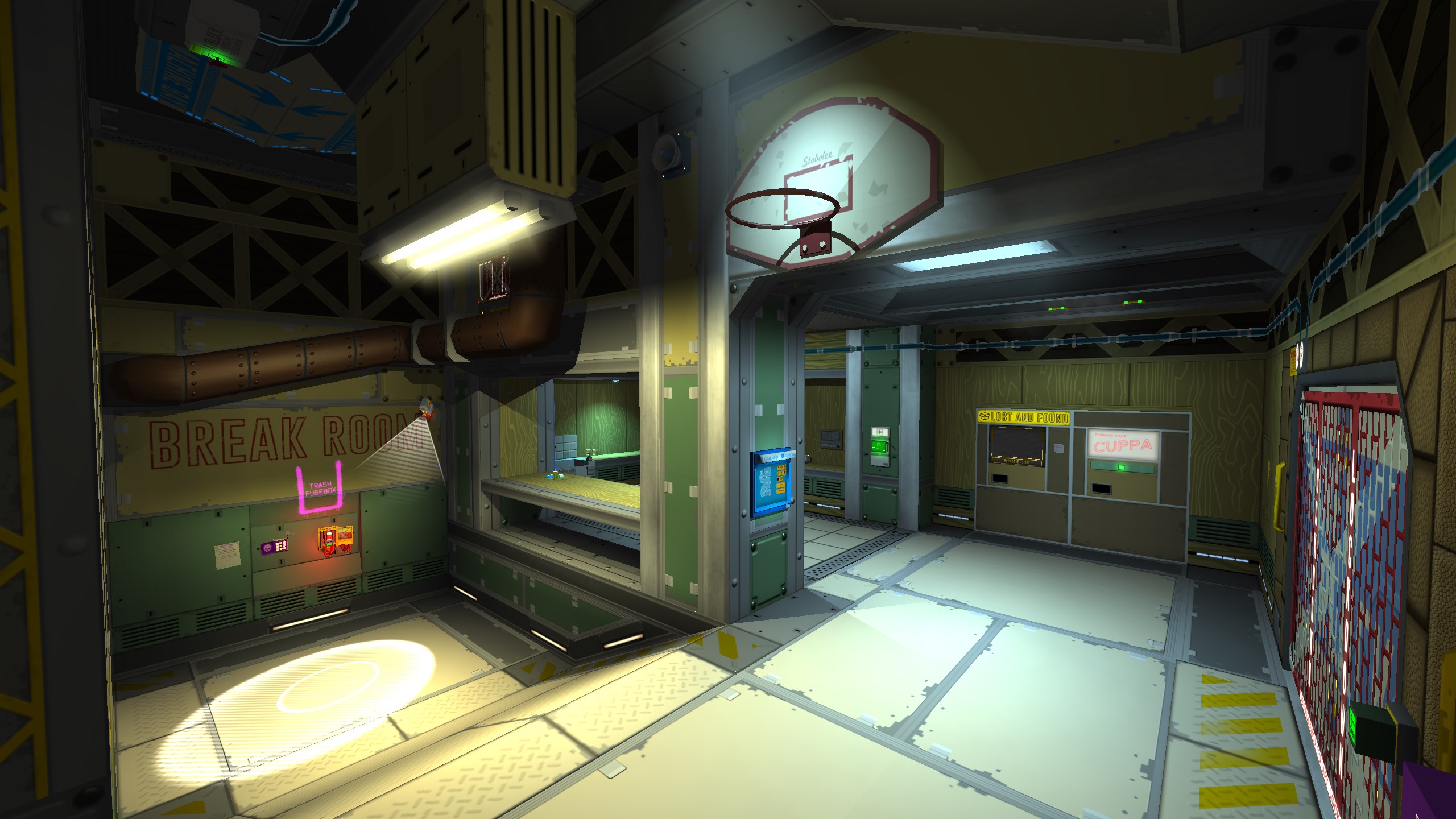
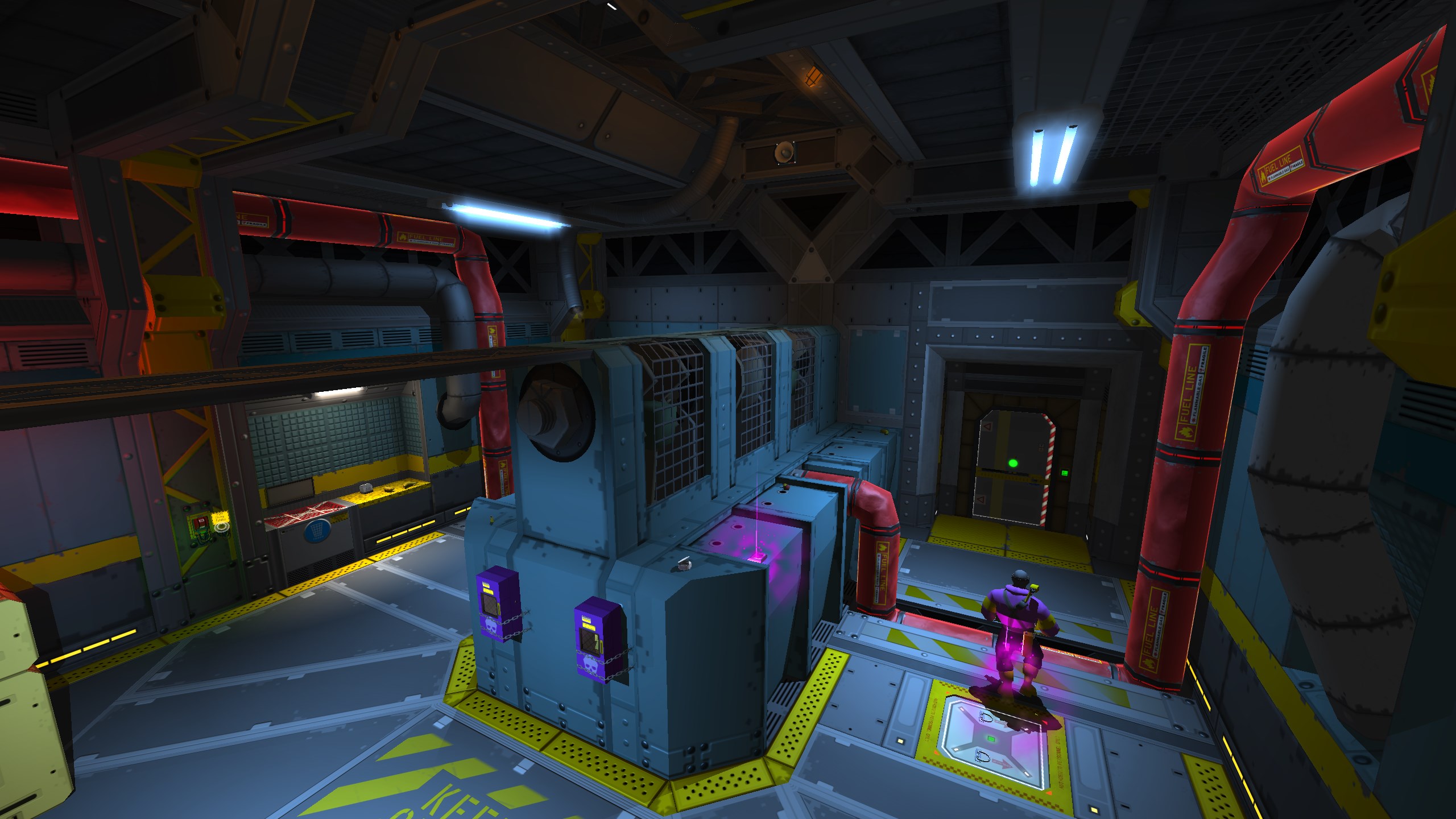
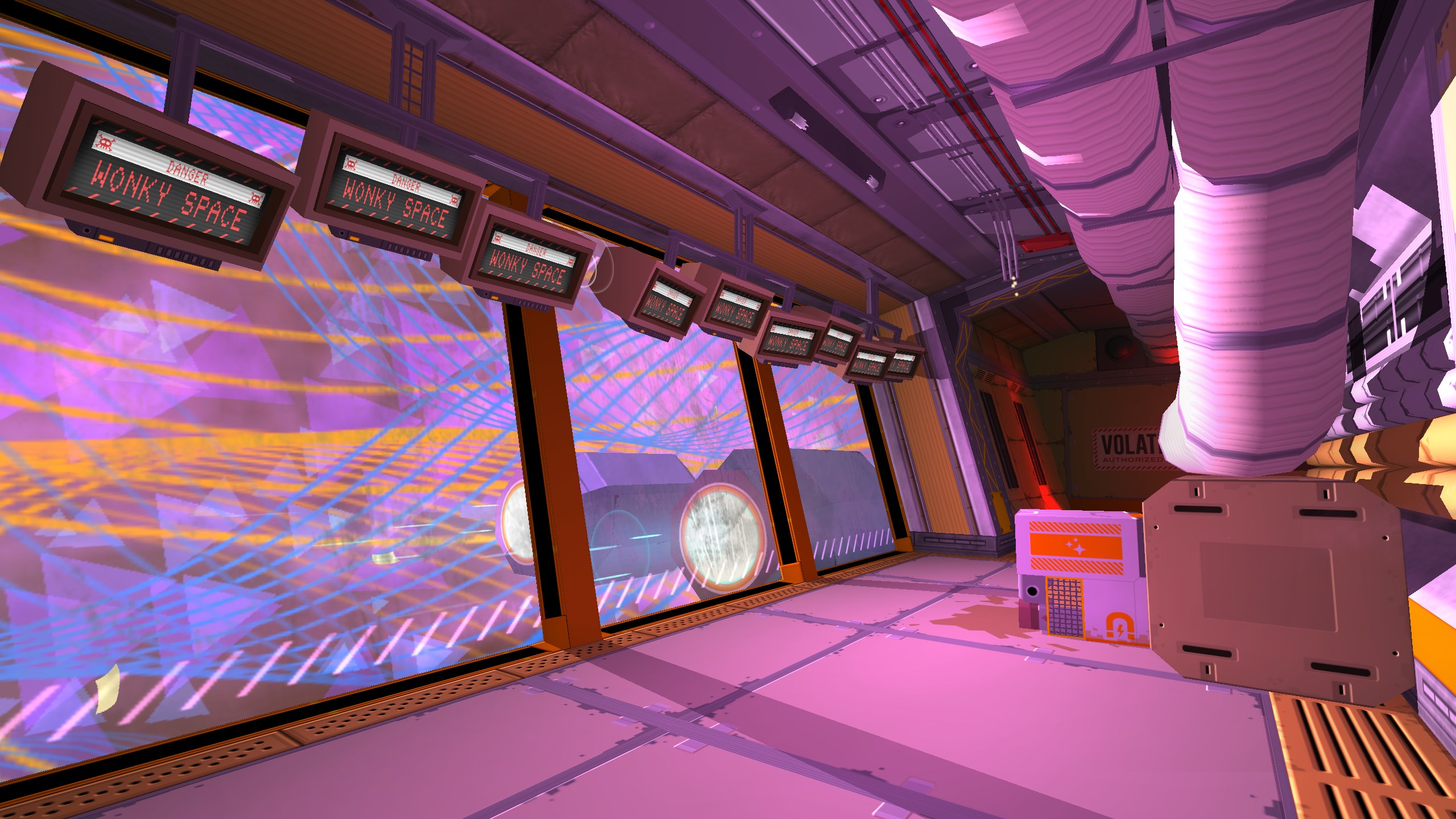
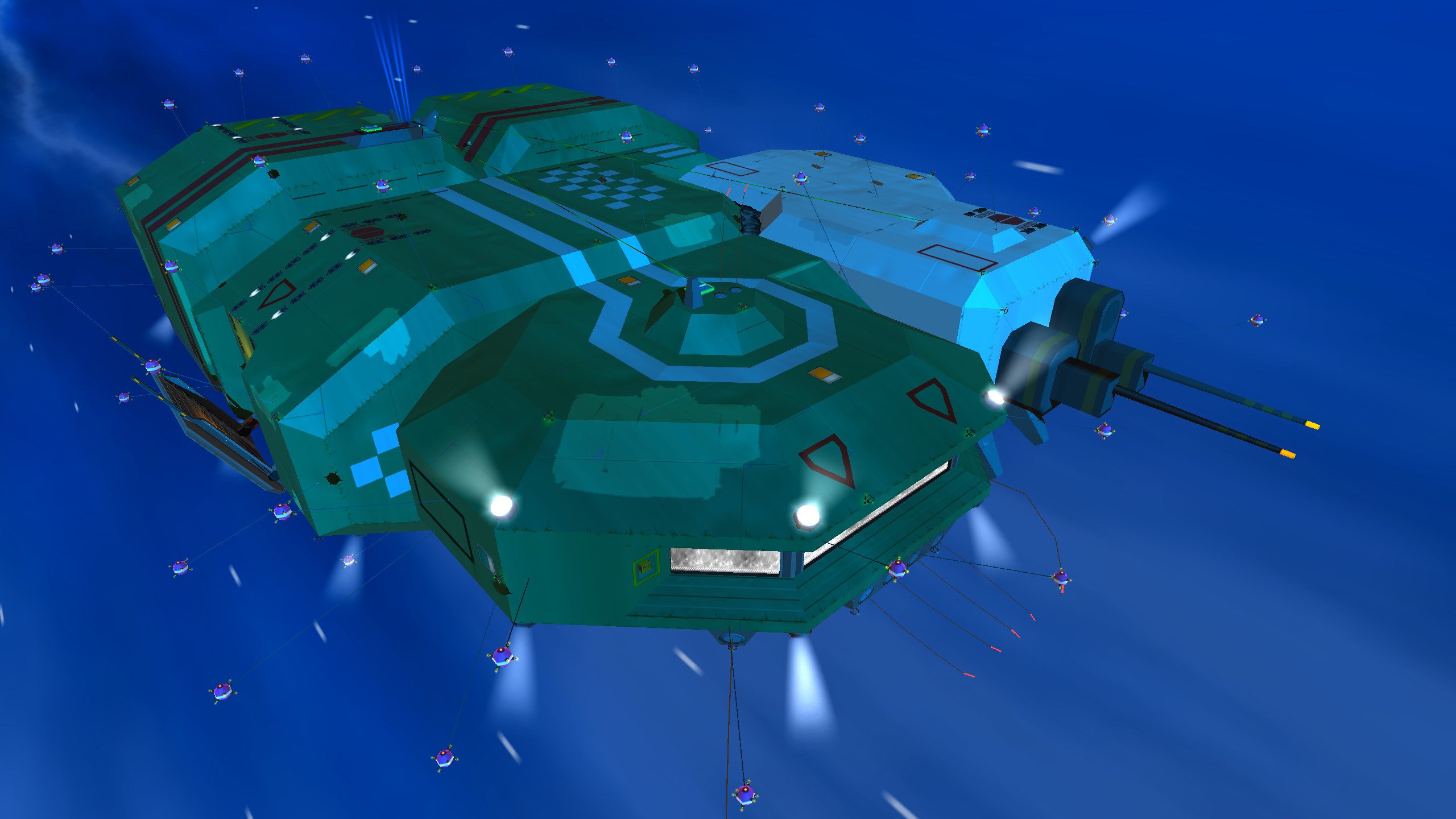
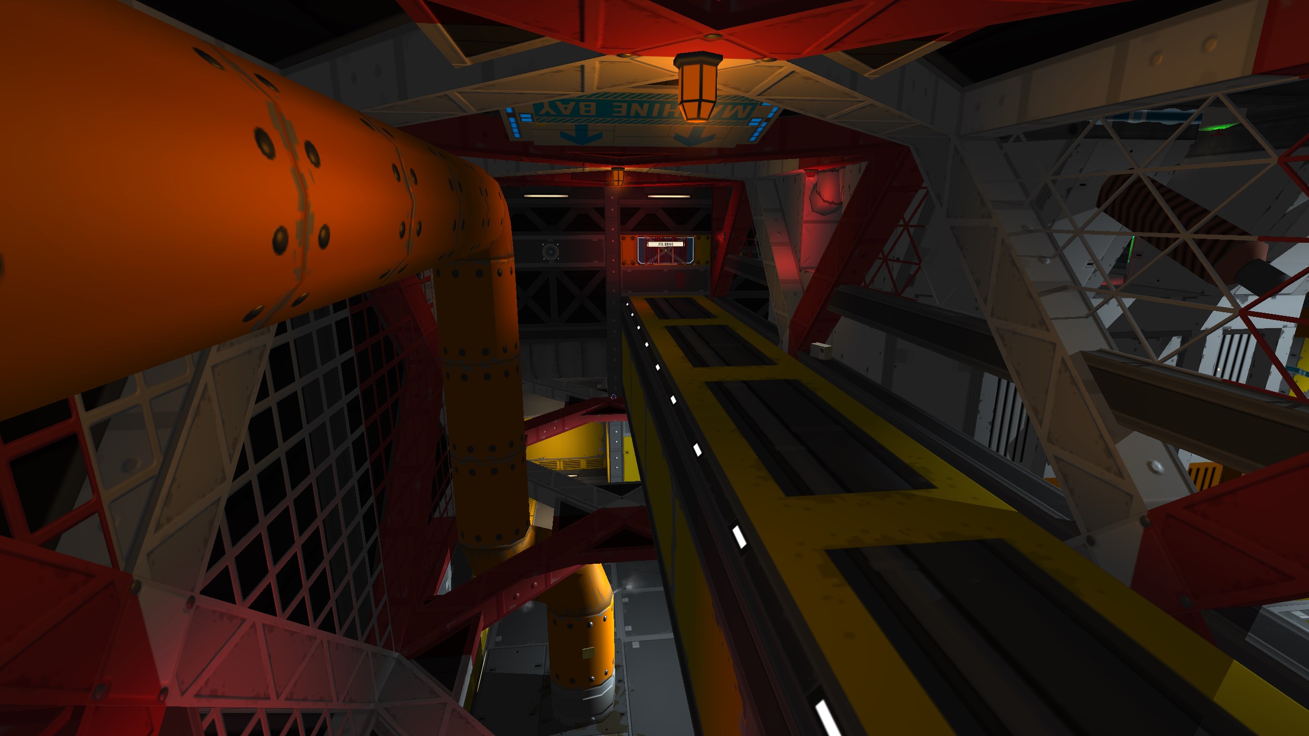
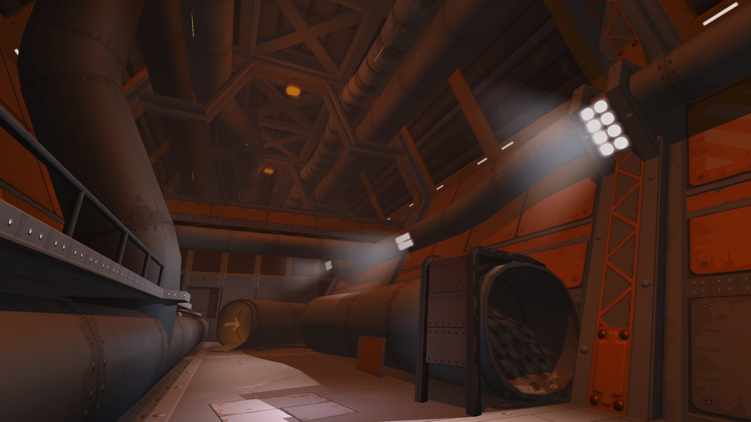
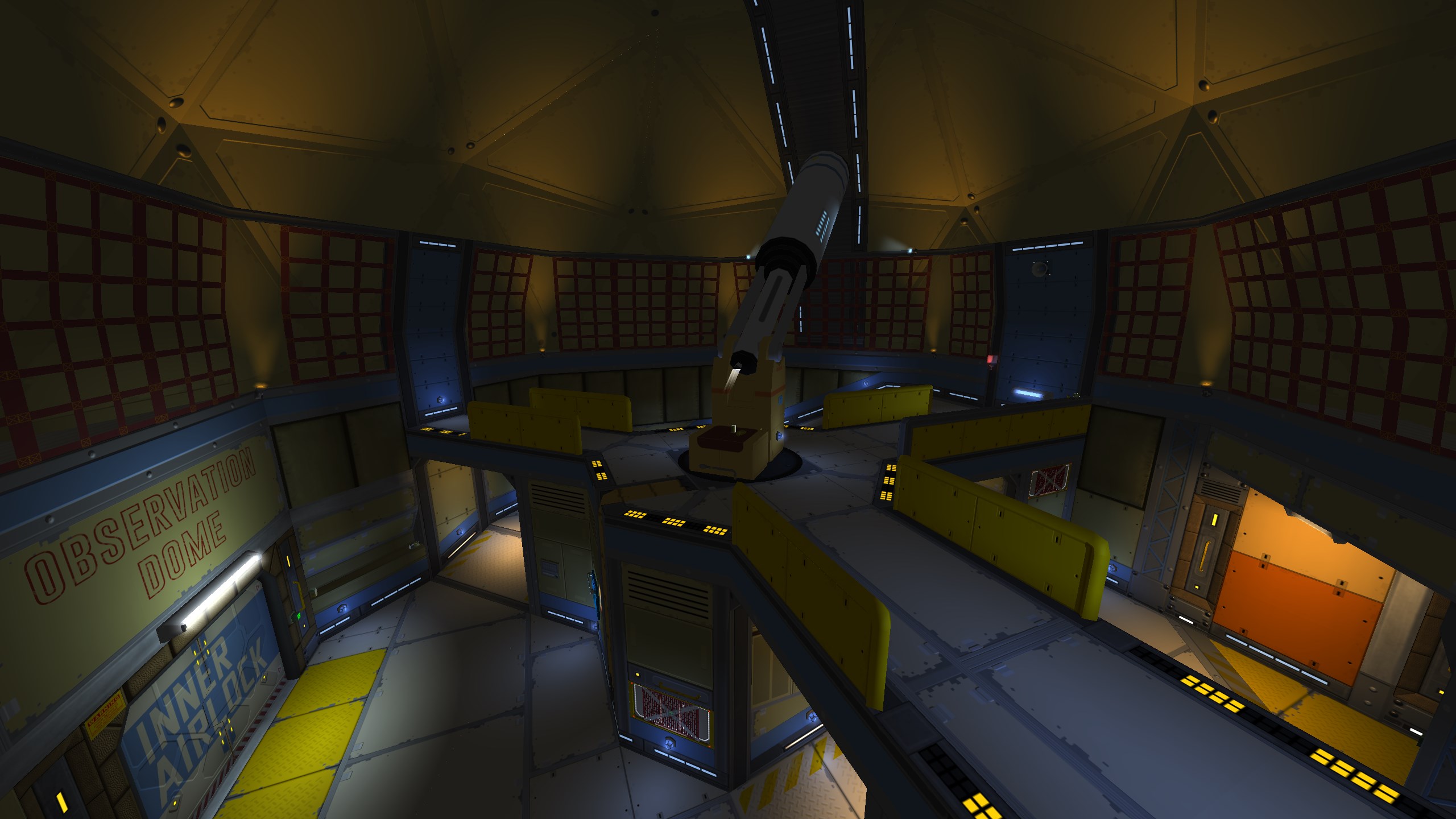
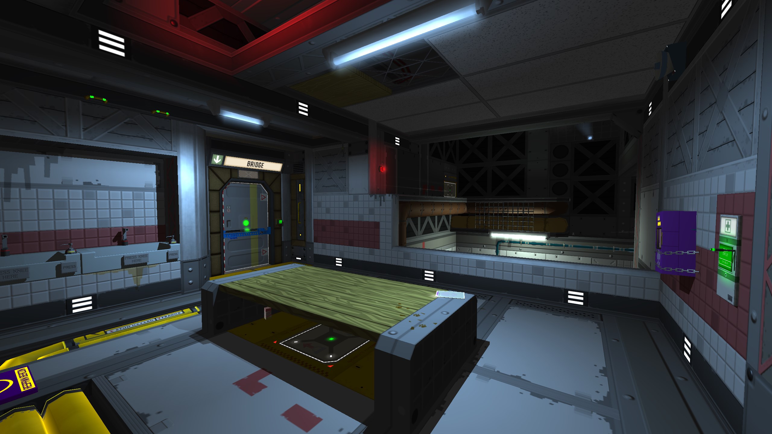
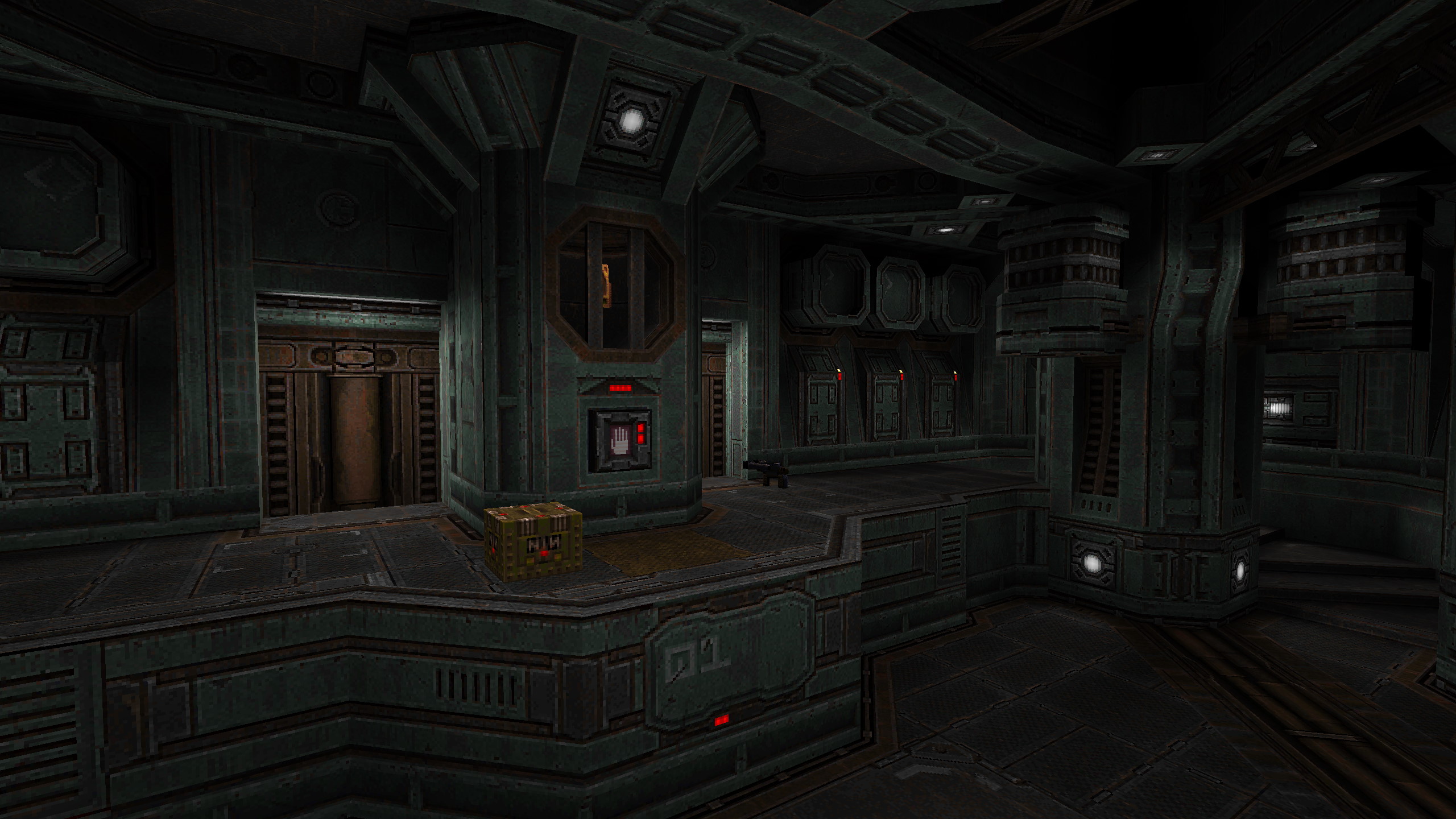
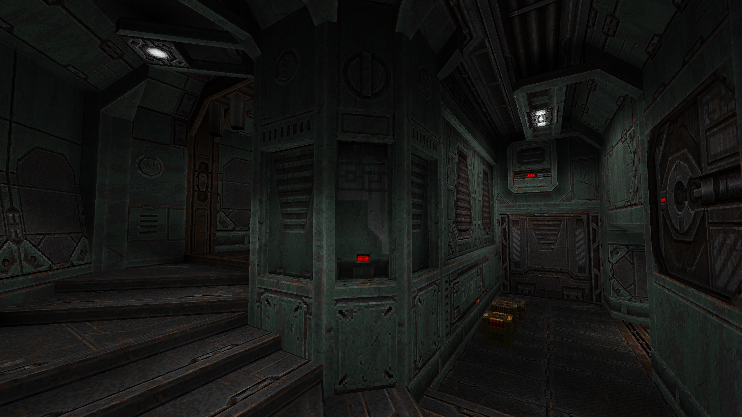
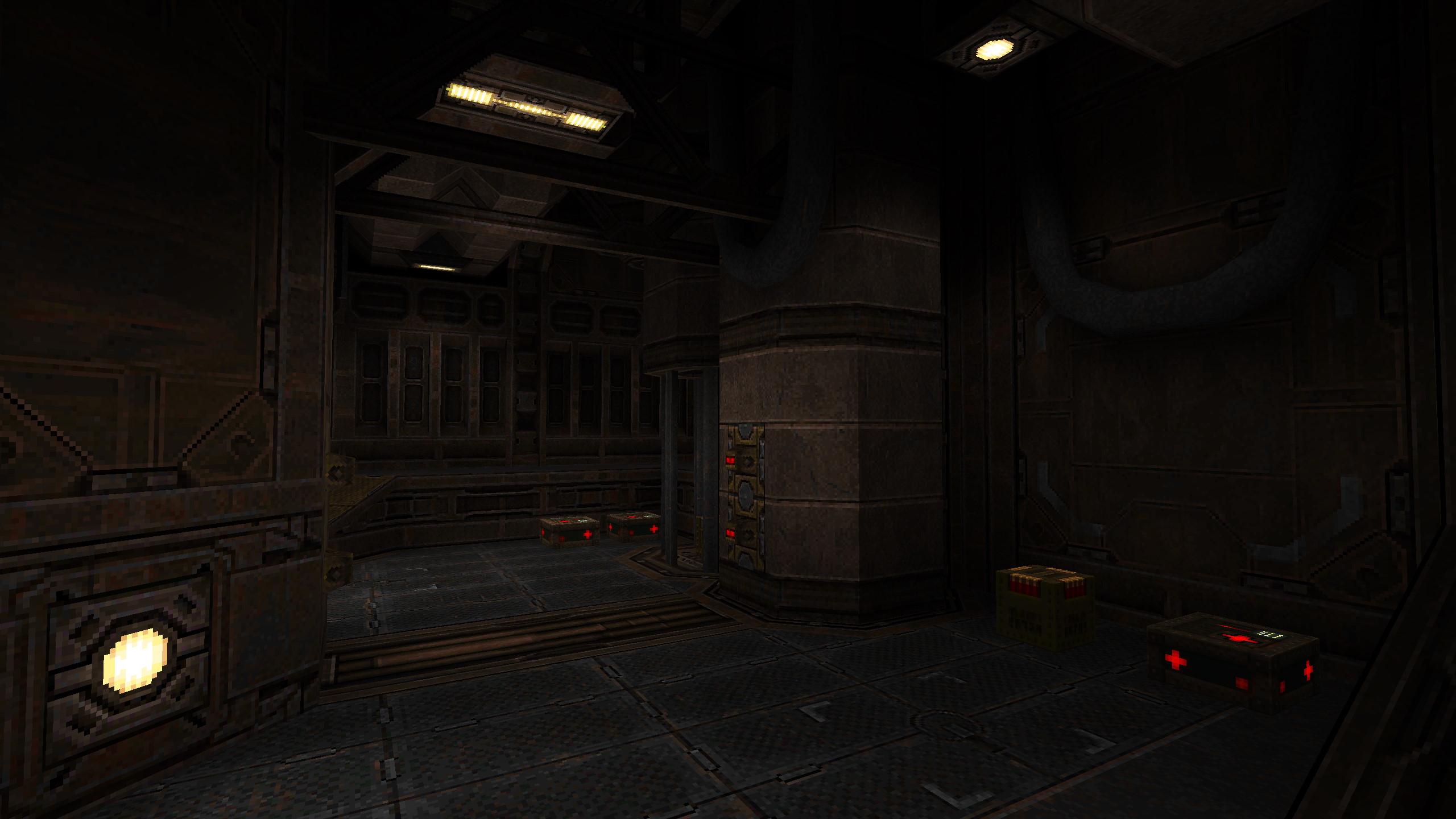
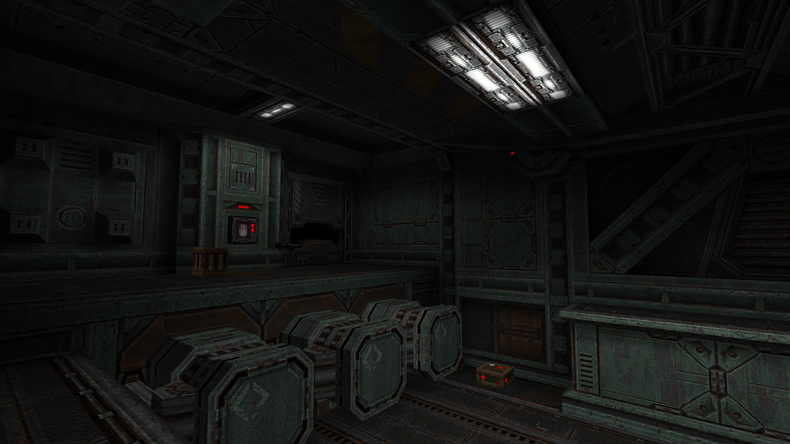
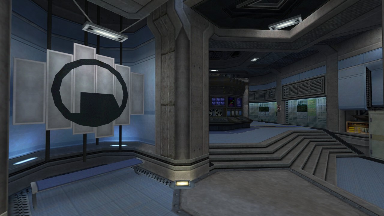
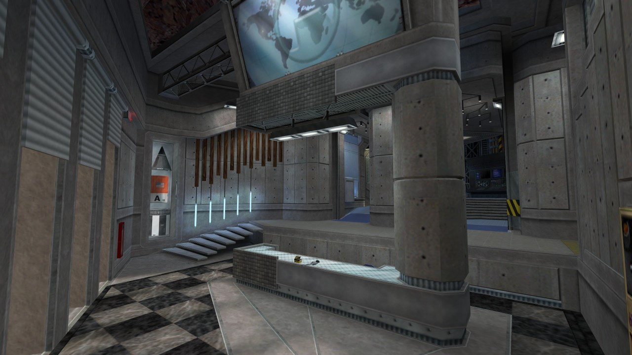
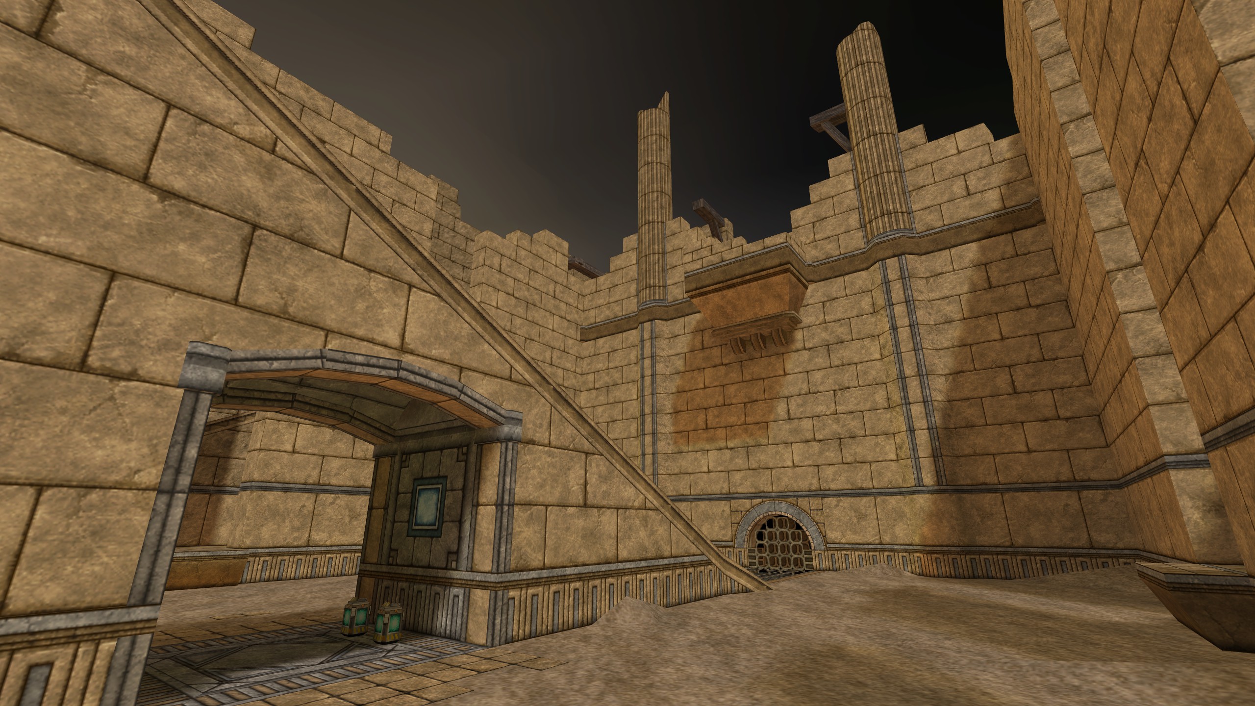
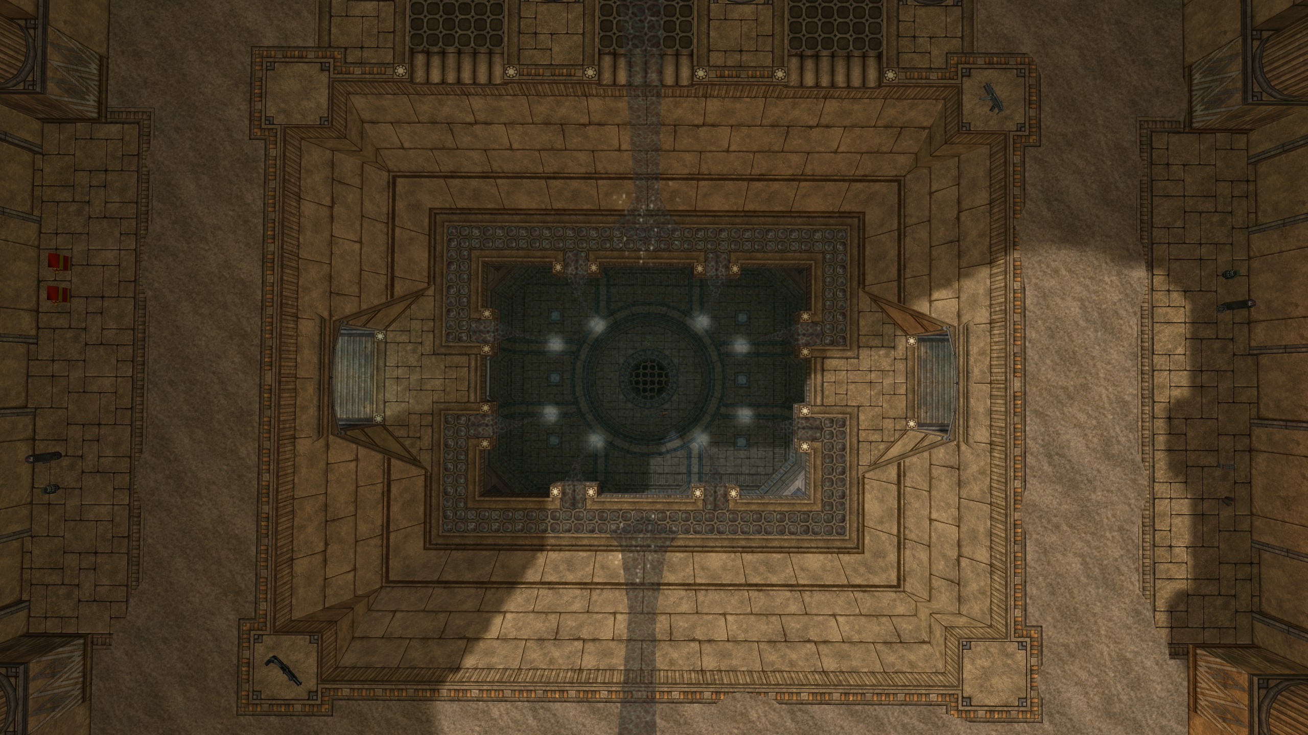
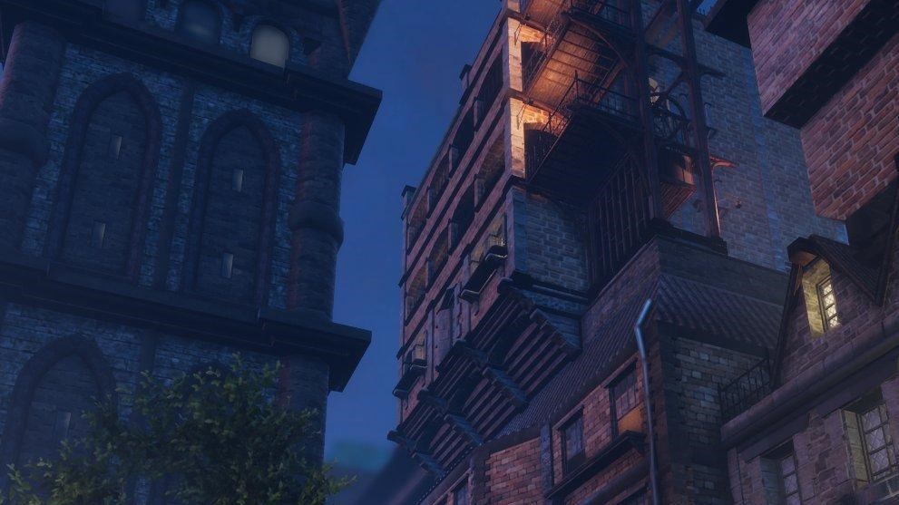
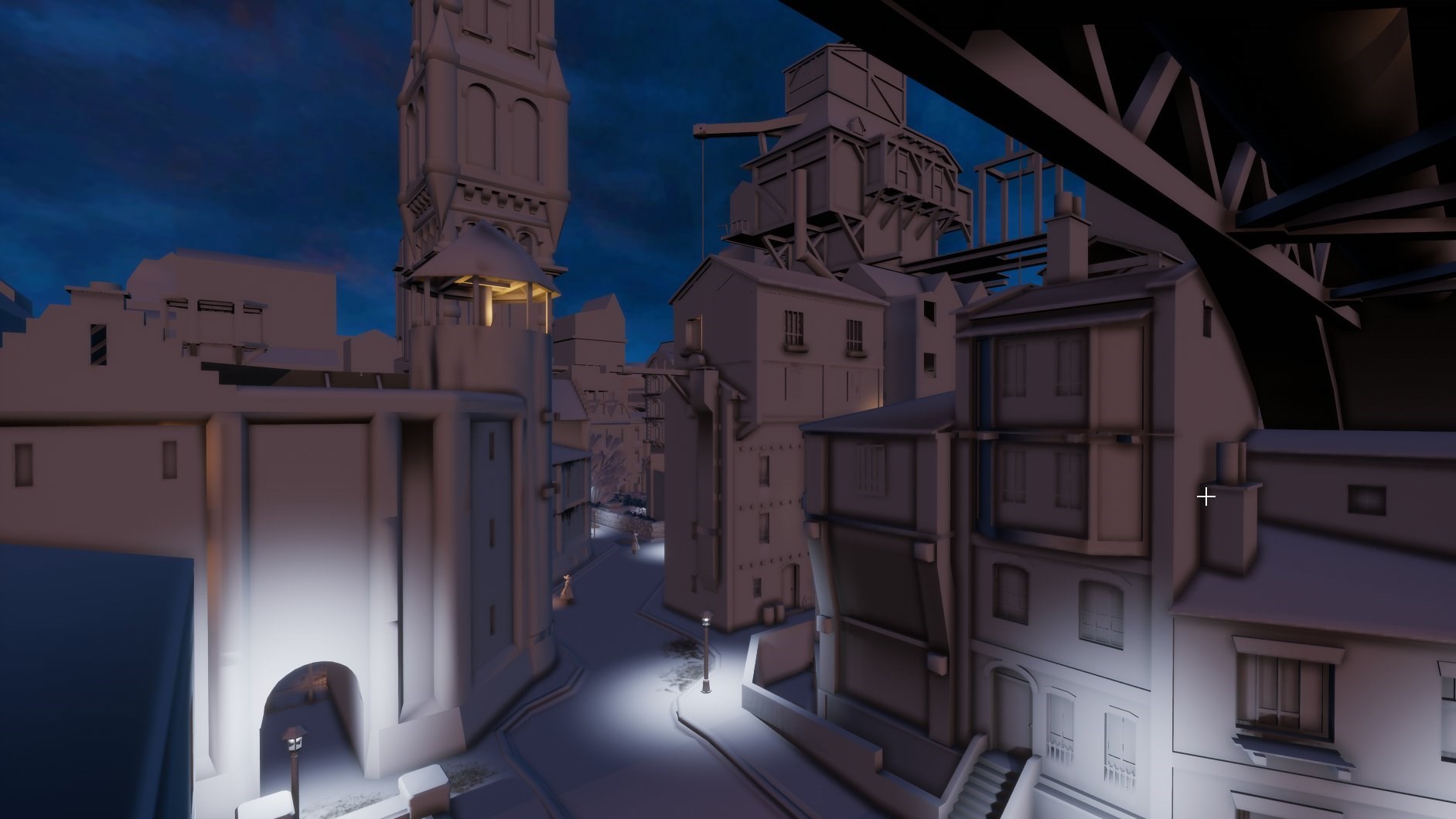
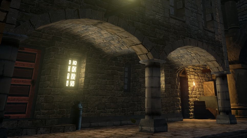
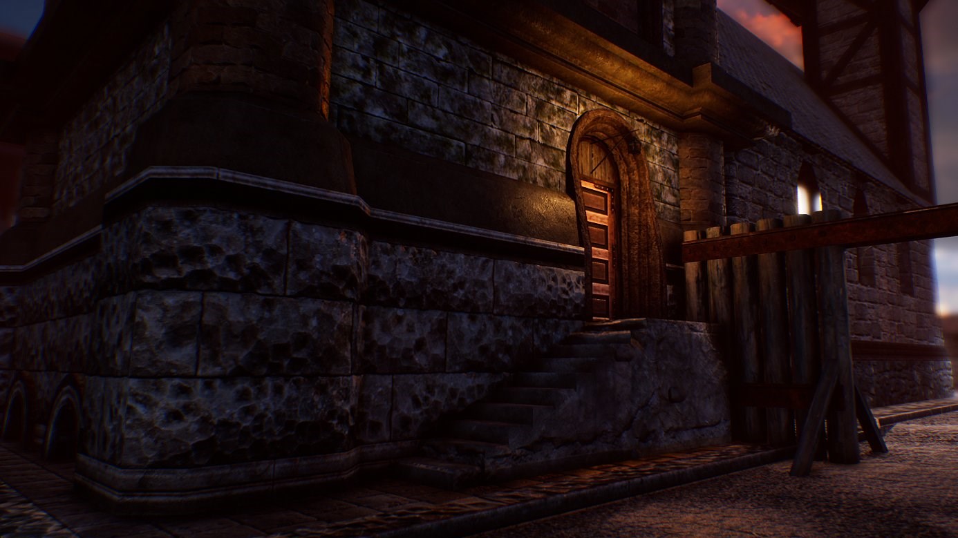
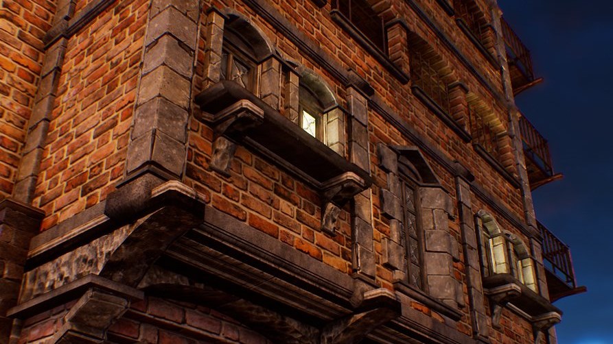
Skin Deep is a stealth/action first-person game by Blendo Games, which I had the privilege of getting to work on from mid-2020 to 2025. You play as Nina Pasadena, an 'insurance commando' who gets stowed aboard spaceships in cryosleep, ready to fight off space pirates who try to hijack the vessel. The player has to sneak around the level, arm themselves, unlock areas of the ship, take down the pirates, and rescue the crew who have been taken hostage. Stealth and combat have a strong emphasis on resourcefulness and making use of your environment, with very few traditional 'weapons'. I was one of two level designers on the project and created fourteen levels for the game (not counting work that didn't make it into the final product).
This was my first experience with id Tech 4, otherwise known as the Doom 3 engine. While it shared some similarities with previous id Tech engines and the Source engine, it had radically different rendering, lighting, and vis control techniques, all of which were a part of my learning experience. I quickly learned to optimise for the engine's unique constraints, contributing to the design process as we figured out exactly what the levels had to accomplish, what standards/conventions they needed to conform to, and how far we could push them. While early test maps were built with the breathing room of Thief in mind, the game swiftly took a direction that necessitated more dense, porous, intimate layouts, often crammed wall-to-wall with important gameplay elements. Ships had fully modeled interiors and exteriors, necessitating that the rooms within the ship were very tightly interwoven and used their space economically. Optimisation was also a constant challenge, as the engine was clearly not designed for the hoops we were making it jump through. I developed numerous techniques to improve vis control and reduce the costs of lighting, wearing the programmer's hat where necessary.
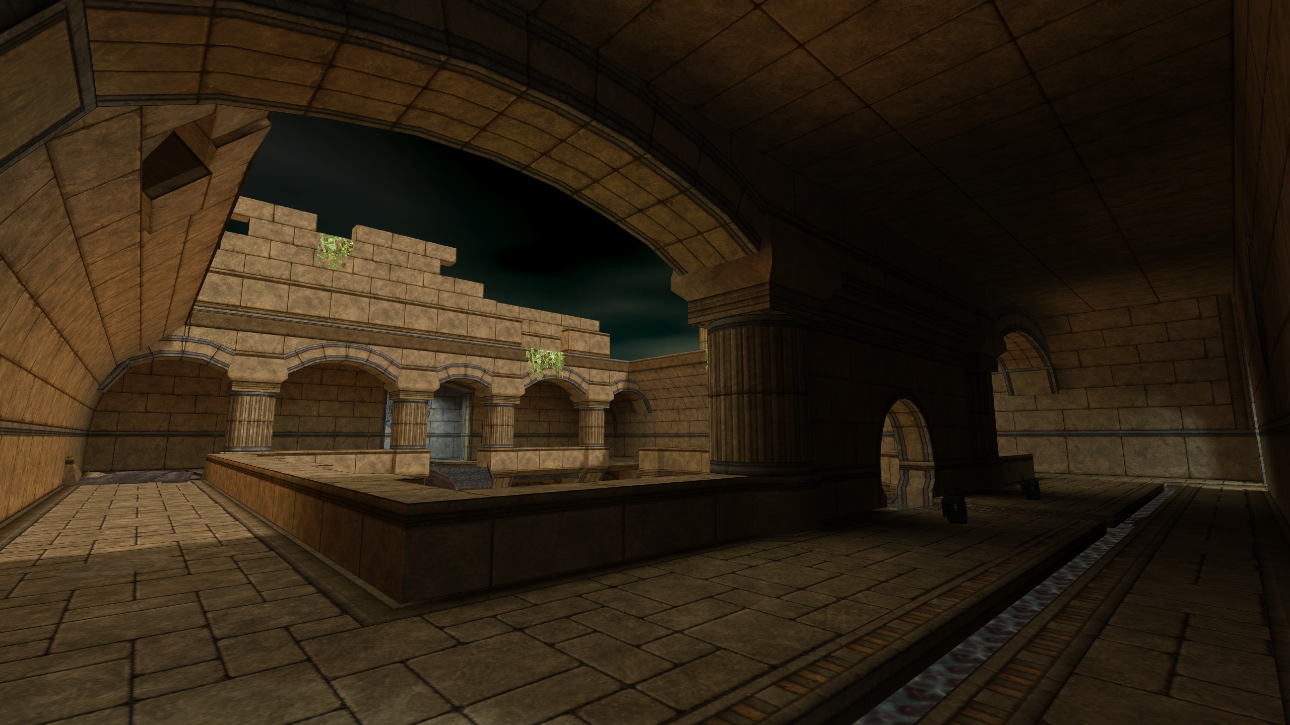
While the game initially took a more open-ended rogue-lite-y direction (with random spawn points, random items, and extremely non-linear levels), we eventually iterated towards a more bespoke, traditional immersive-sim-style experience, with mostly hand-placed elements and intentionally designed gating. I handled the process of transforming my levels (and building new ones) to satisfy these requirements, constructing connected graphs of rooms to identify how we could manage the player's path through the level. Gating used familiar stealth game elements like keys and keypad codes, with the intent to provide the player numerous ways to arrive at the same goals. I quite enjoyed figuring out how to build an interlocking puzzle box out of an existing space, and with the chance to create a more bespoke experience, relished in creating places that felt lived-in.
Parts of the game (internally referred to as "vignette levels") took a more linear, cinematic, narrative-focused structure, not unlike several of Blendo Games's previous well-known works (Thirty Flights of Loving, Gravity Bone, etc). The design requirements of these levels were almost totally unlike those of the spaceships, giving me a chance to get my hands dirty with a lot of scripting, effects, camera work, and choreography. This category also included the introductory tutorial, which I would rate as possibly the hardest level I've worked on. Creating an experience that taught the player the fundamentals of a very systems-heavy game, smoothly switching between on-rails narrative and guided versions of 'real' scenarios, all while staying engaging, was an enormous undertaking. It took a lot of iteration, a lot of discussion with Brendon, and a lot of testing—but I think we got there in the end.
Skin Deep released on April 30th 2025. It received accolades from publications such as PC Gamer and Eurogamer, and made it onto many end-of-year GOTY lists. It currently holds a 'Very Positive' rating on Steam, where it can be purchased.
-
 Go to previous slide
Go to next slide
Go to previous slide
Go to next slide
-
 Go to previous slide
Go to next slide
Go to previous slide
Go to next slide
-
 Go to previous slide
Go to next slide
Go to previous slide
Go to next slide
-
 Go to previous slide
Go to next slide
Go to previous slide
Go to next slide
-
 Go to previous slide
Go to next slide
Go to previous slide
Go to next slide
-
 Go to previous slide
Go to next slide
Go to previous slide
Go to next slide
-
 Go to previous slide
Go to next slide
Go to previous slide
Go to next slide
-
 Go to previous slide
Go to next slide
Go to previous slide
Go to next slide
-
 Go to previous slide
Go to next slide
Go to previous slide
Go to next slide
-
 Go to previous slide
Go to next slide
Go to previous slide
Go to next slide
-
 Go to previous slide
Go to next slide
Go to previous slide
Go to next slide
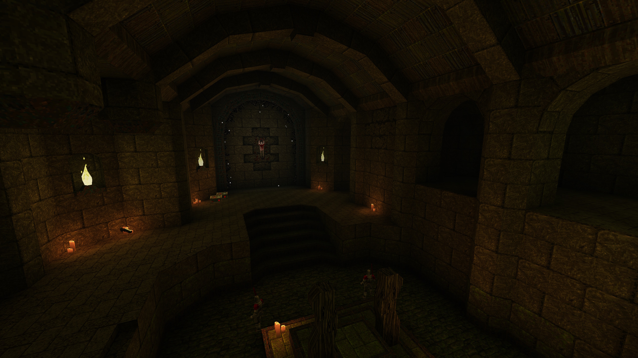
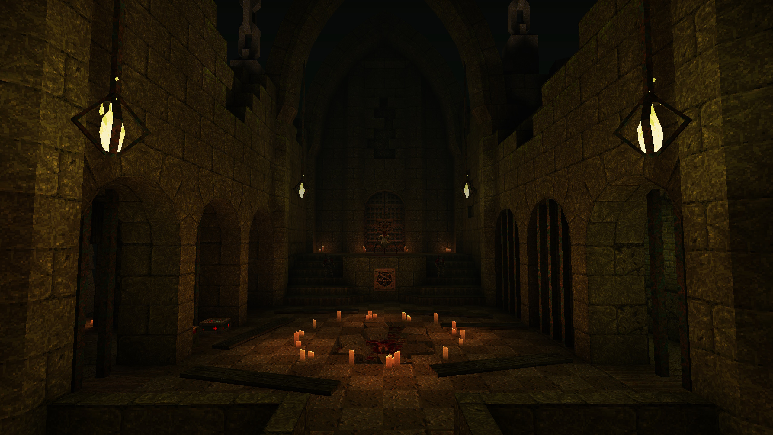
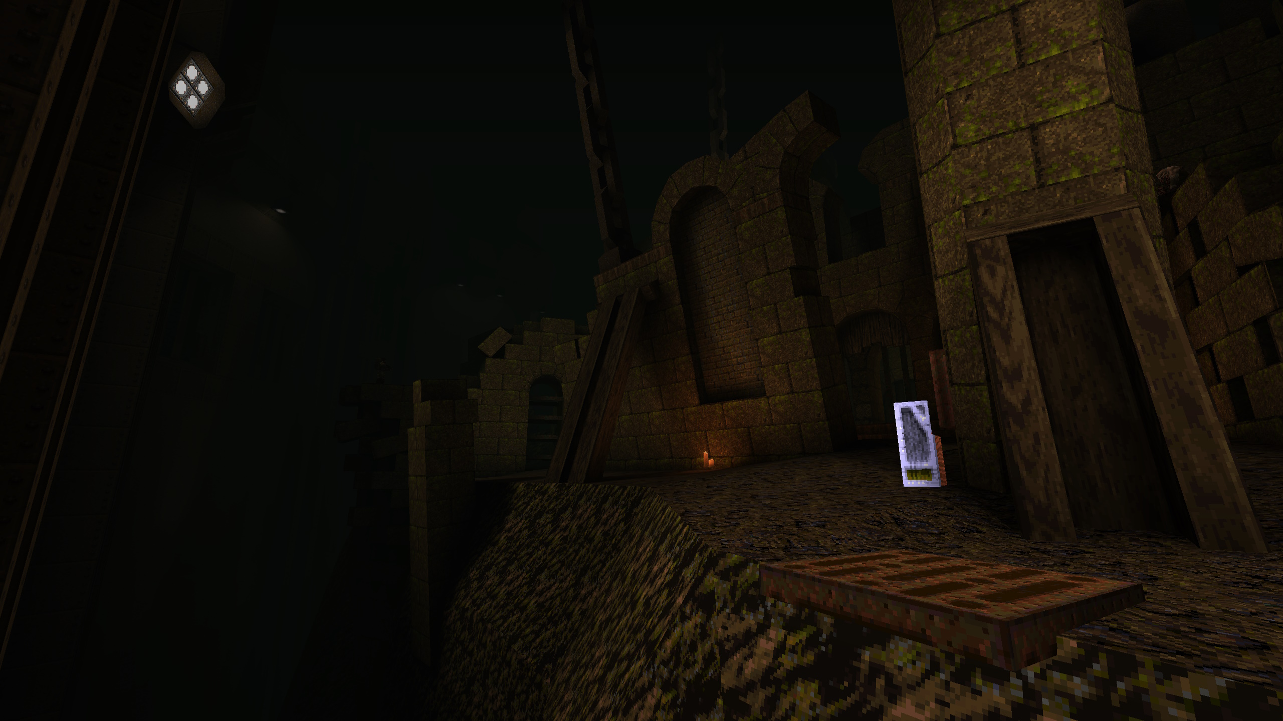
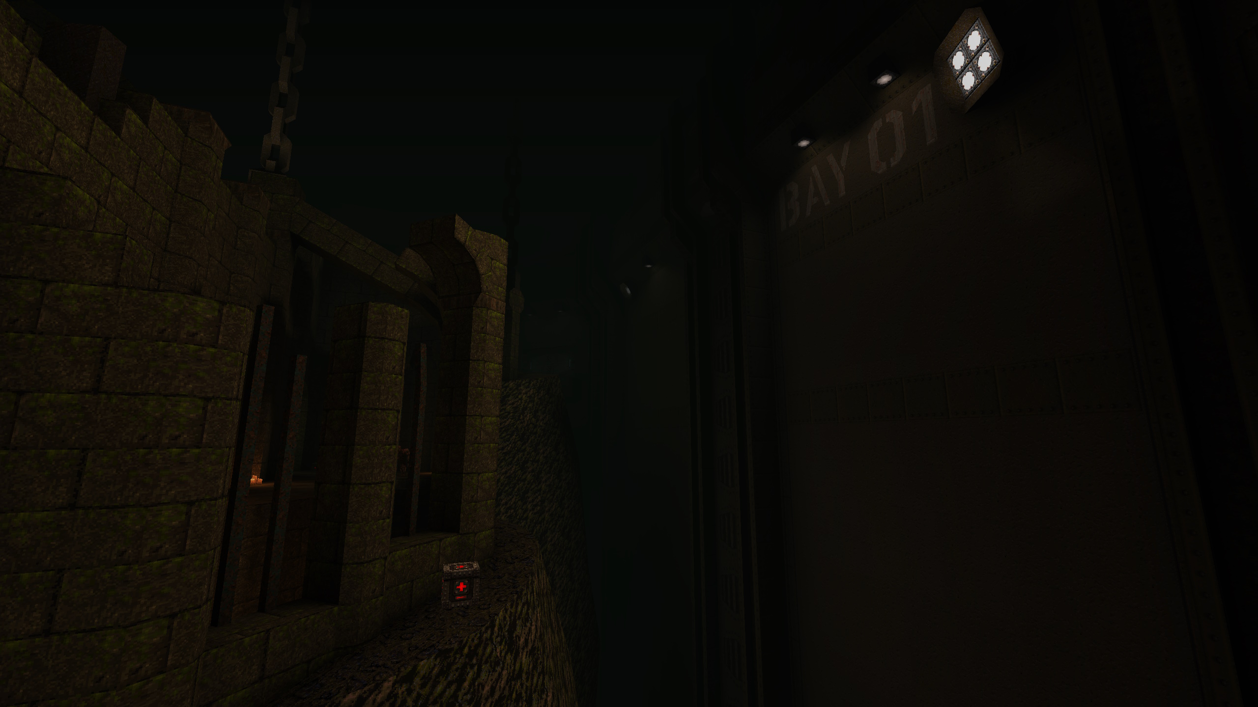
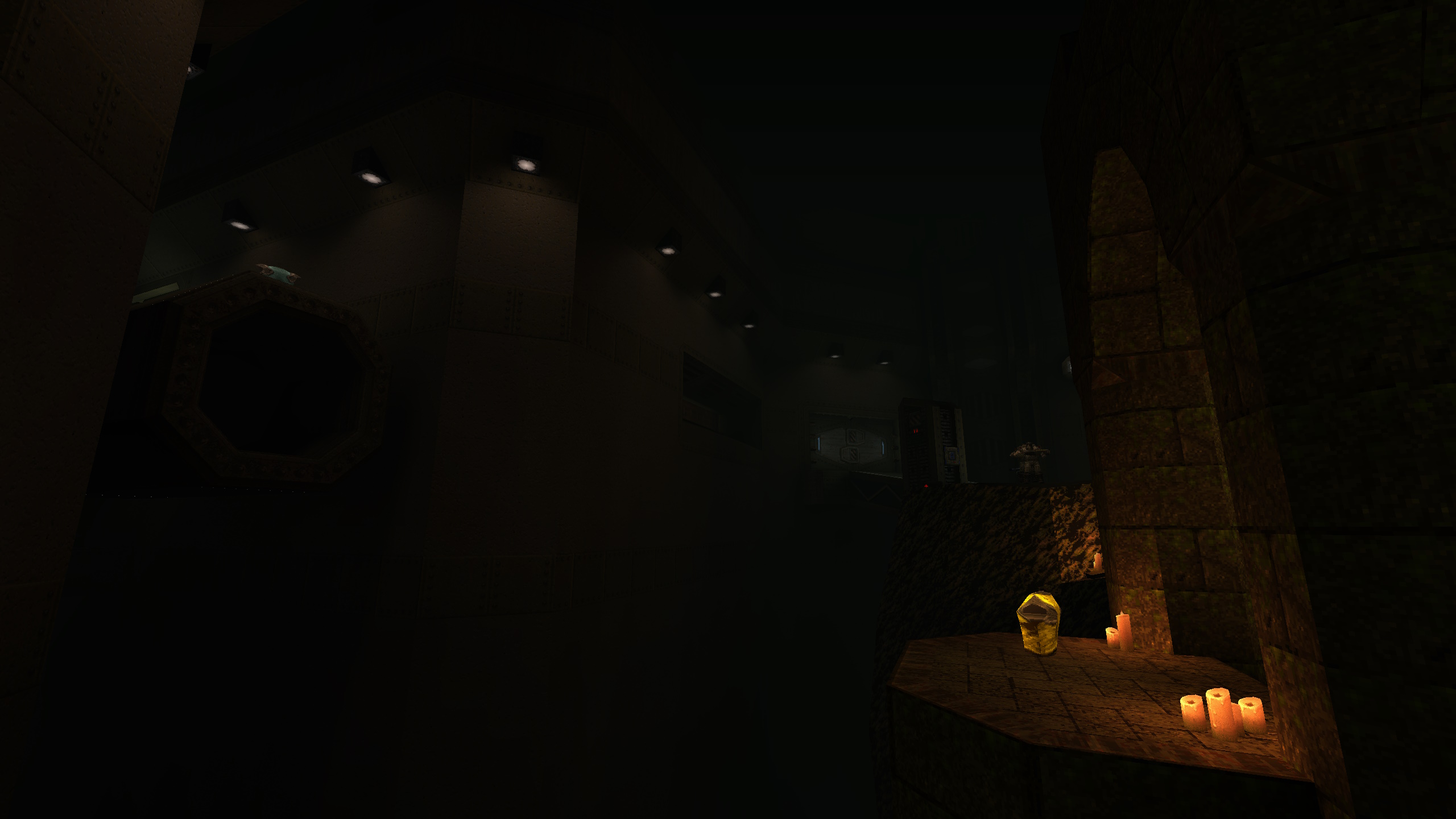
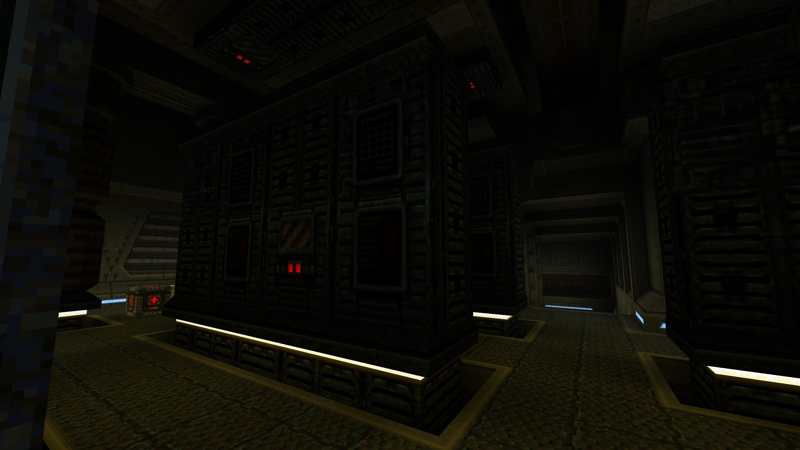
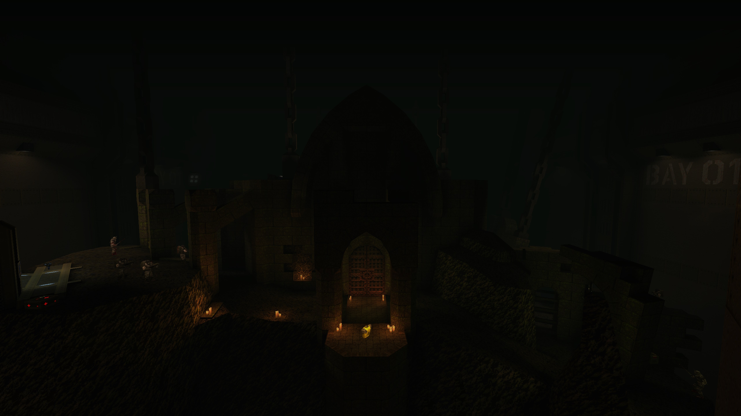
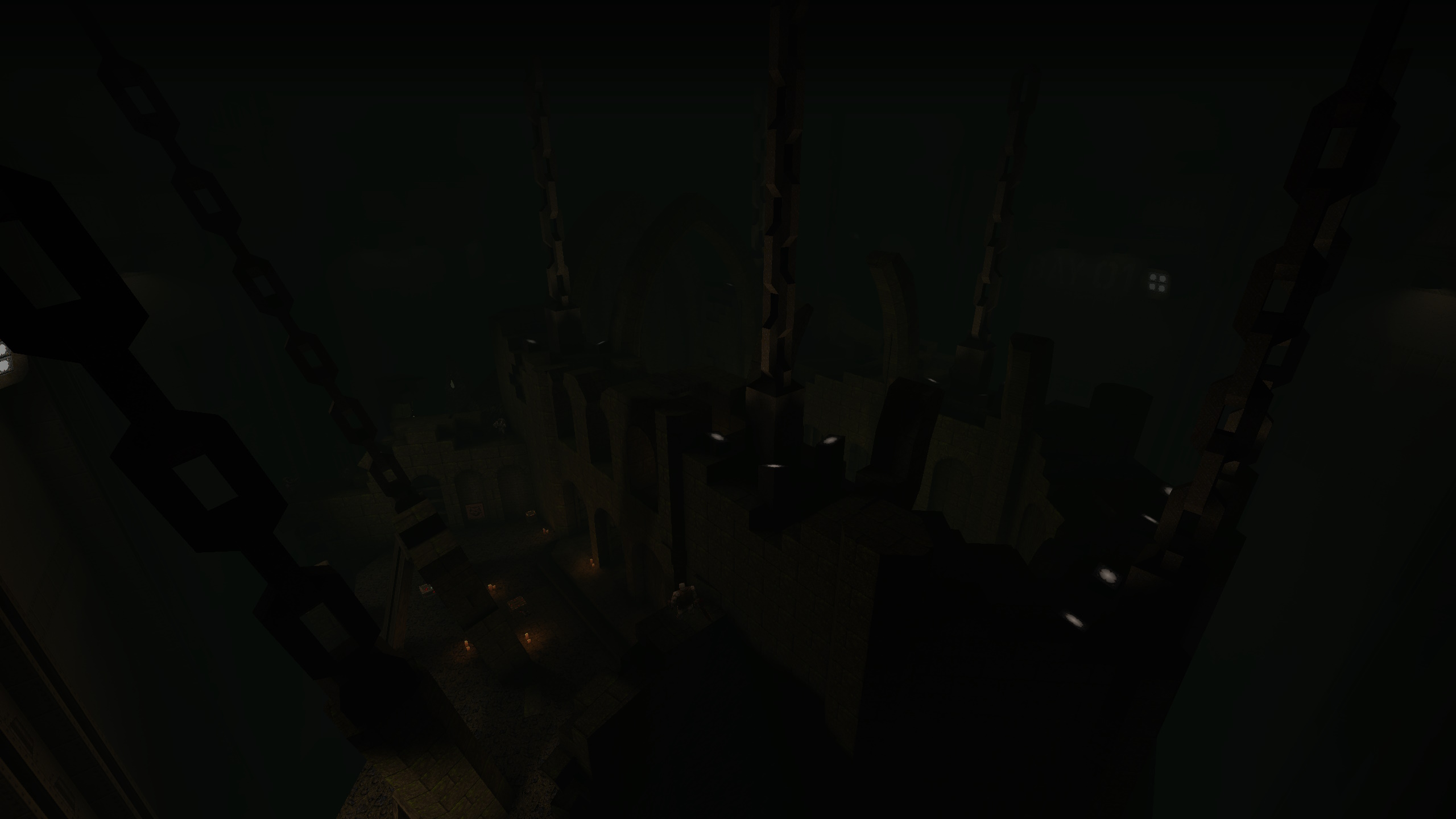
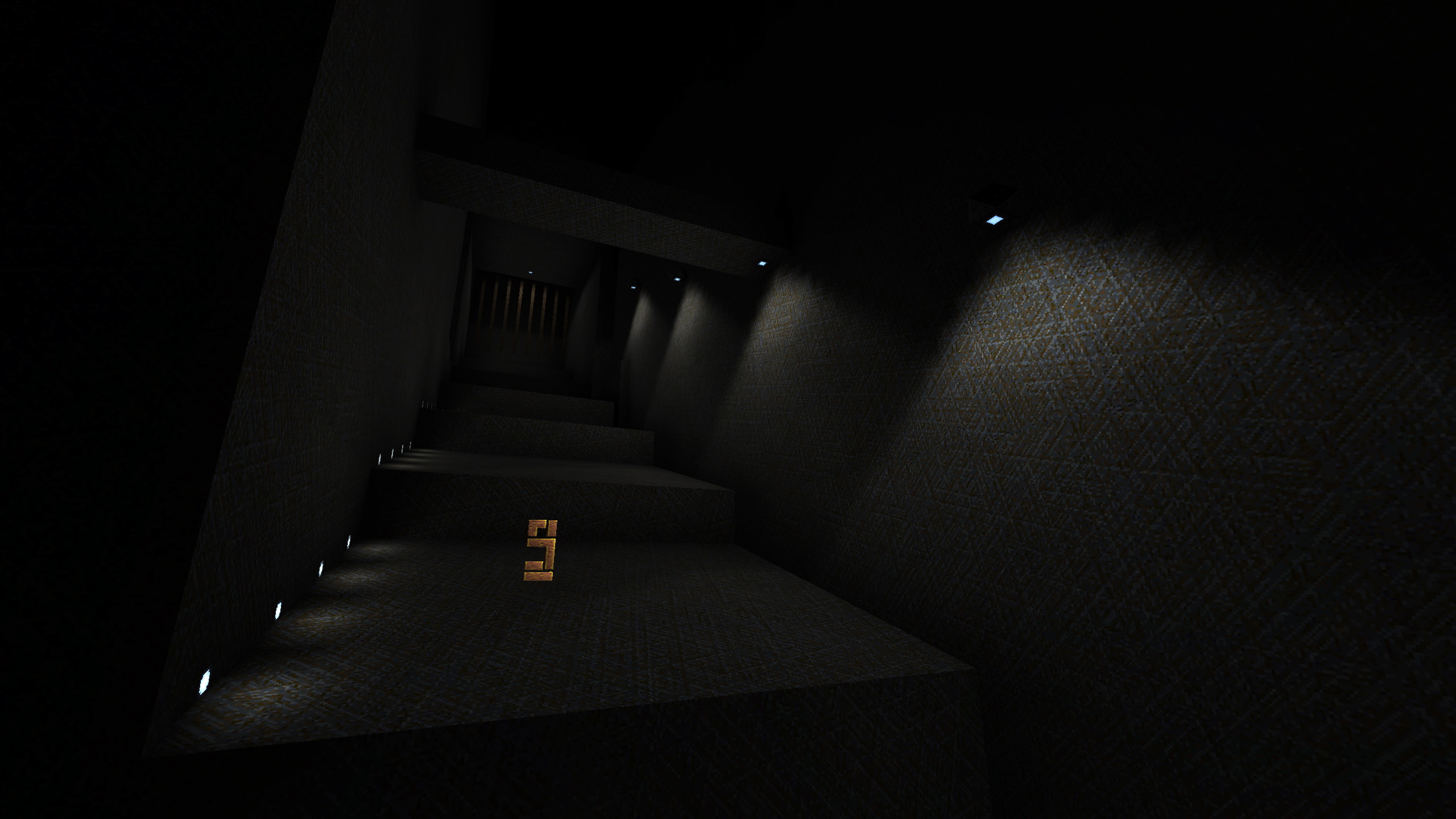
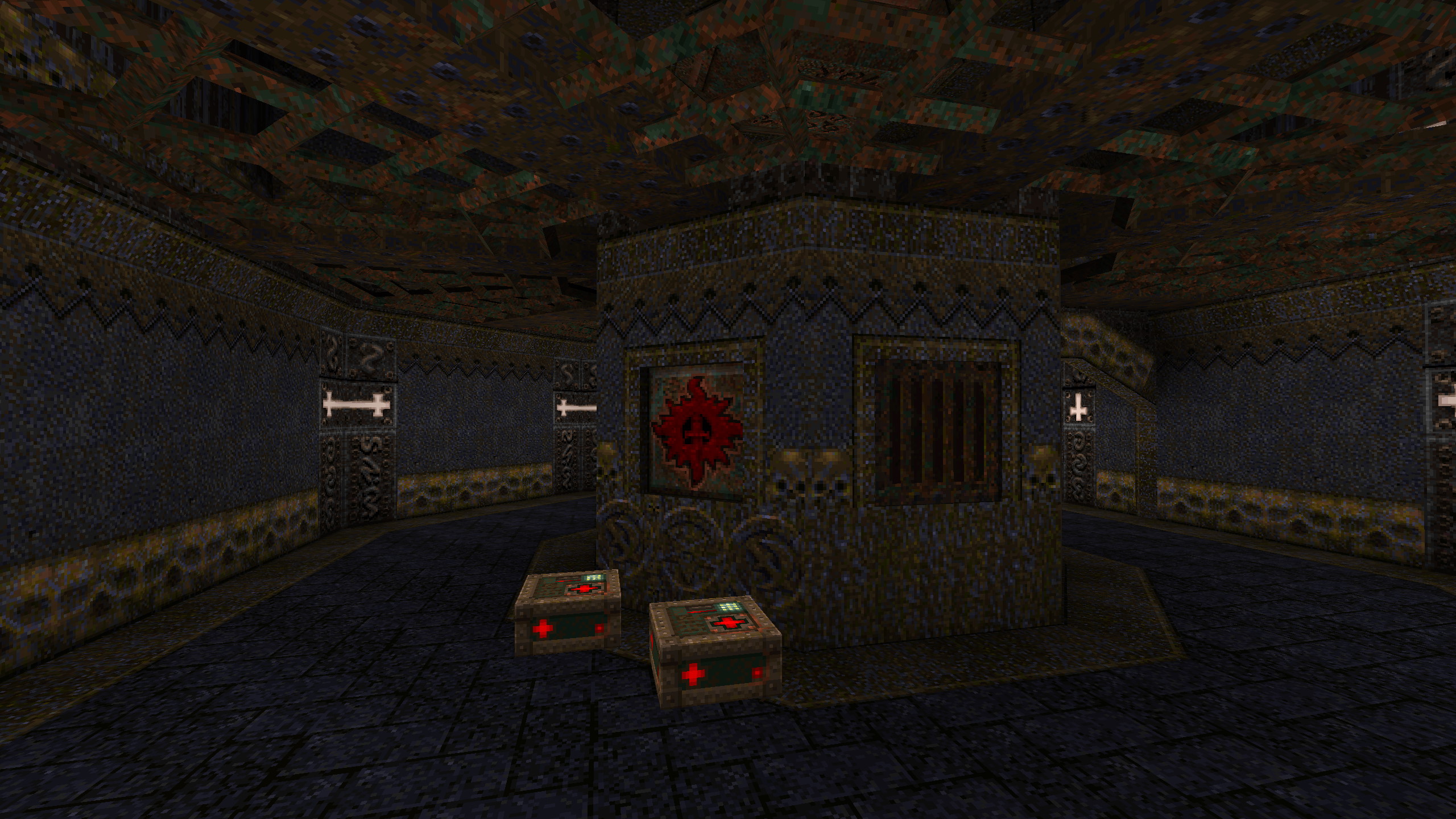
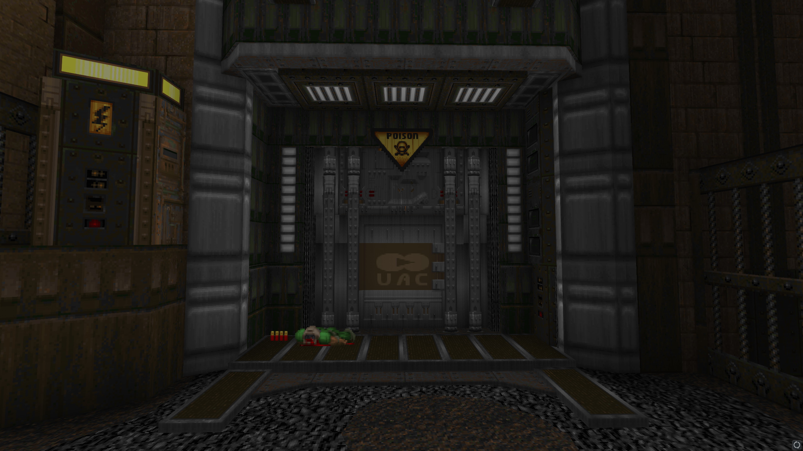
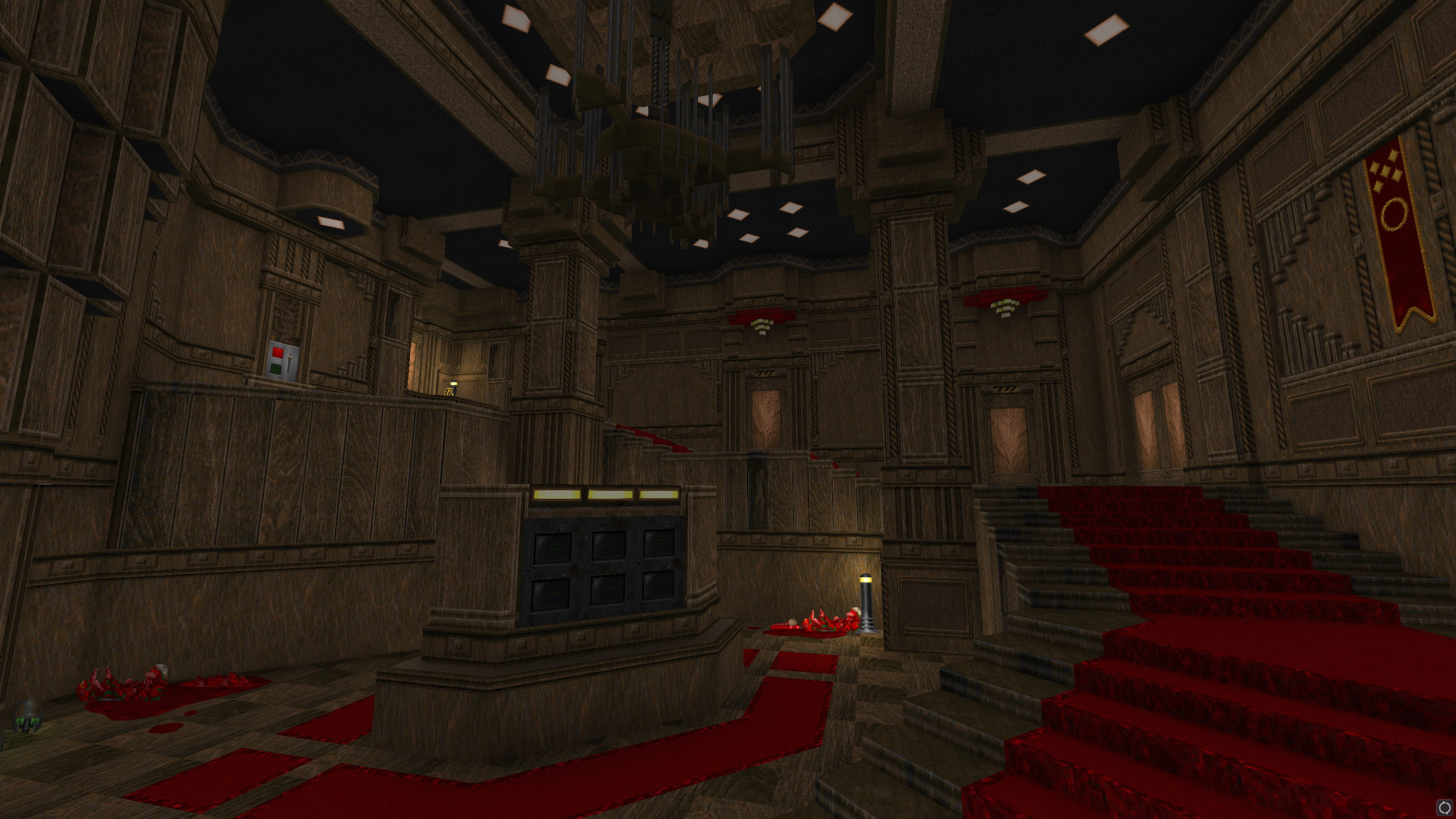
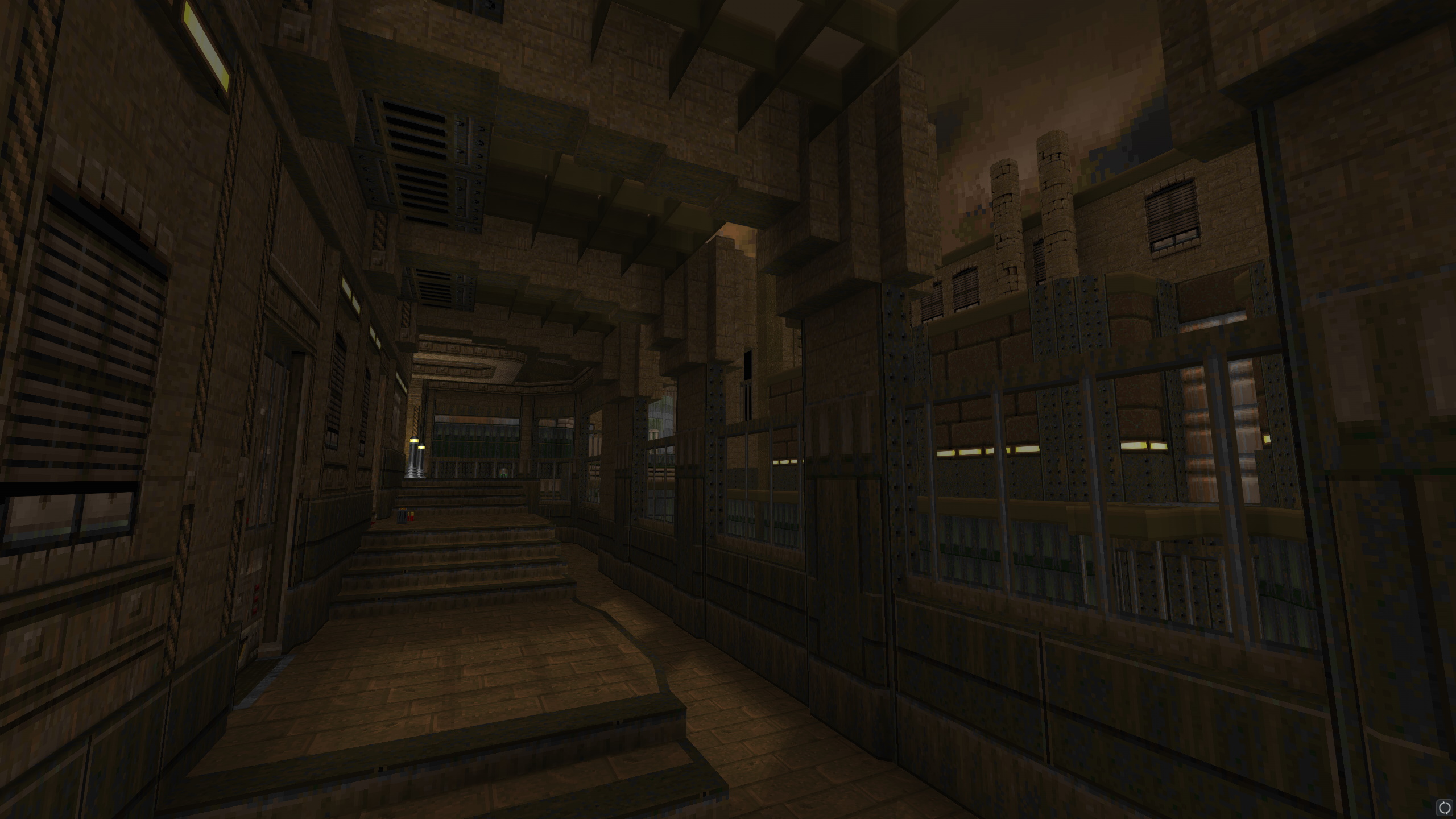
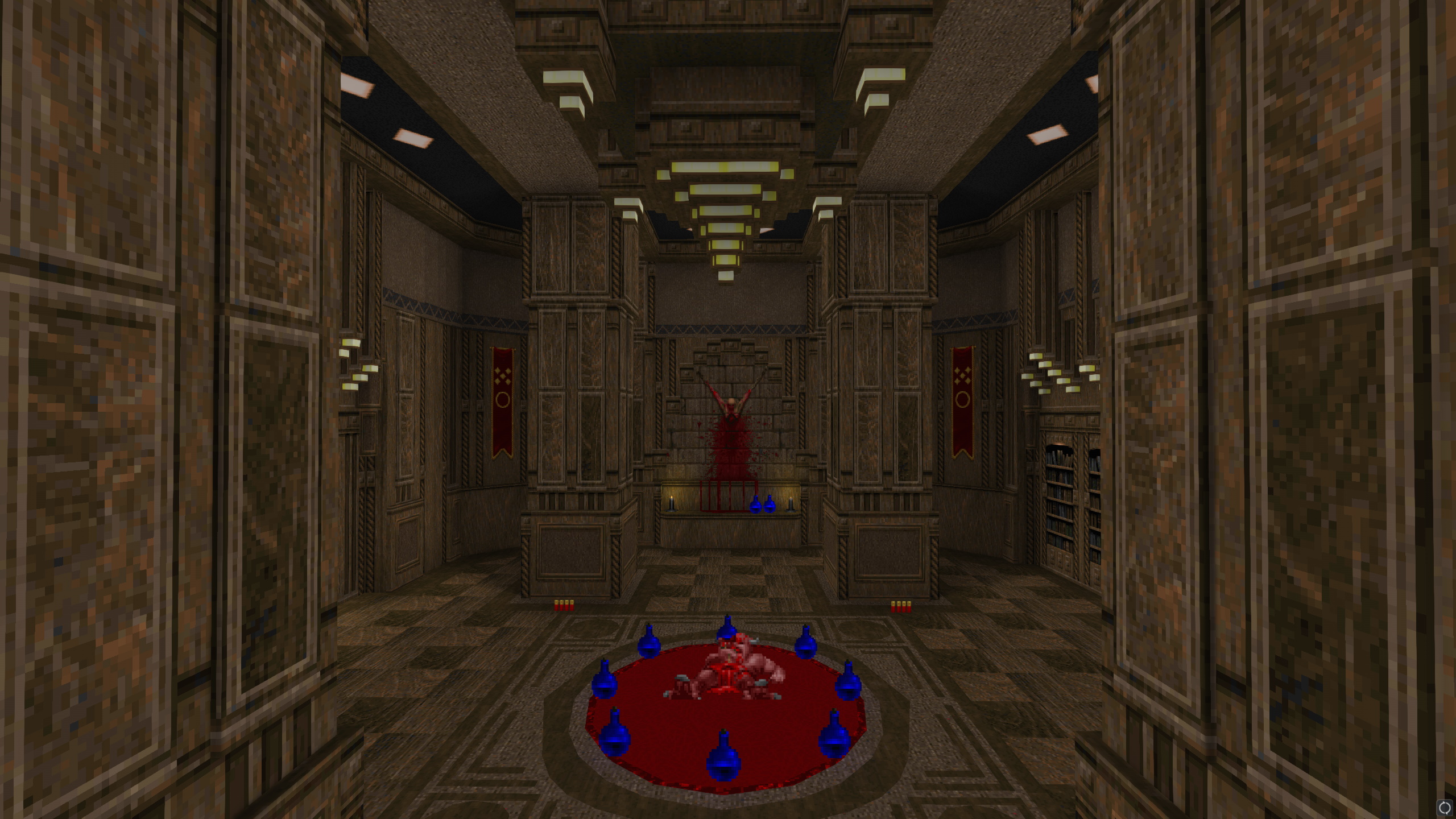
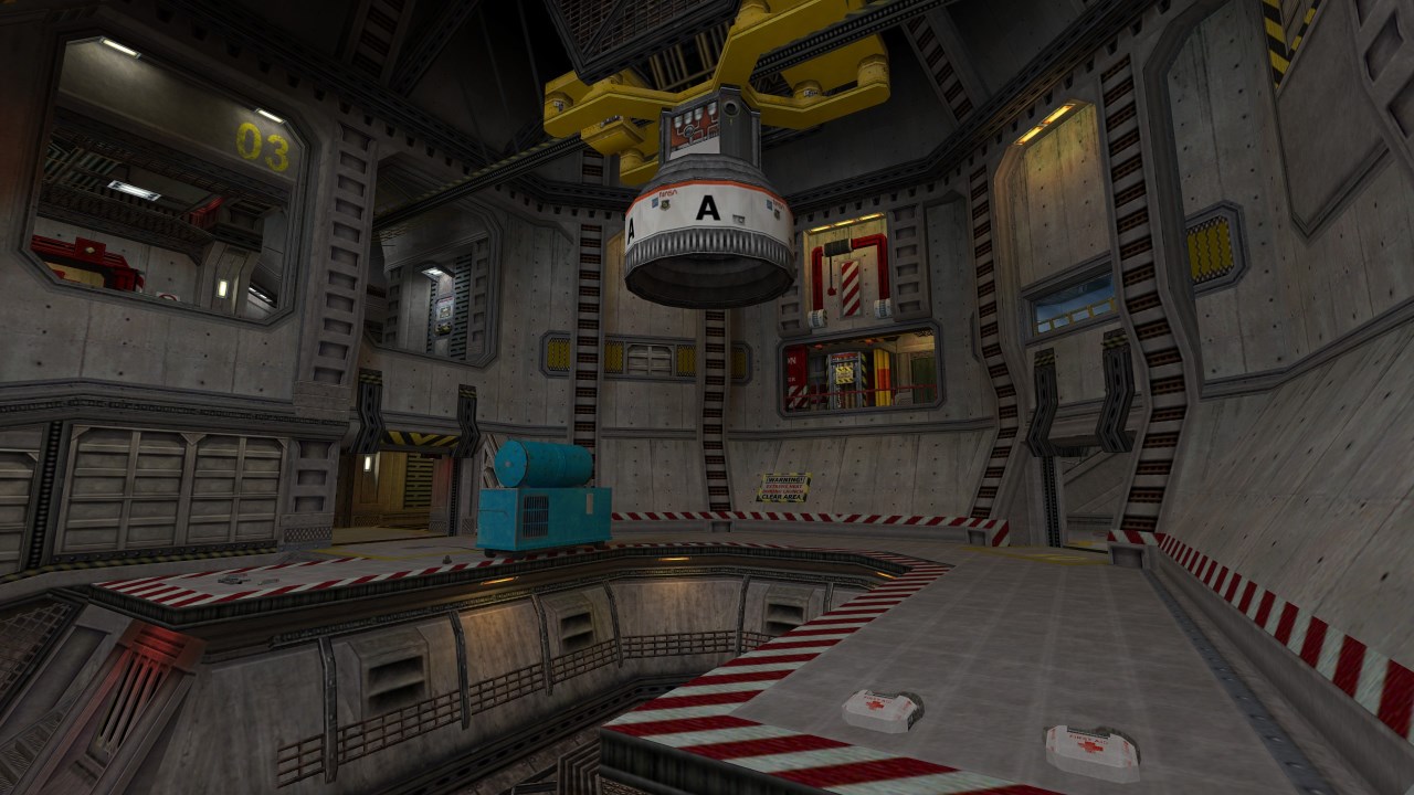
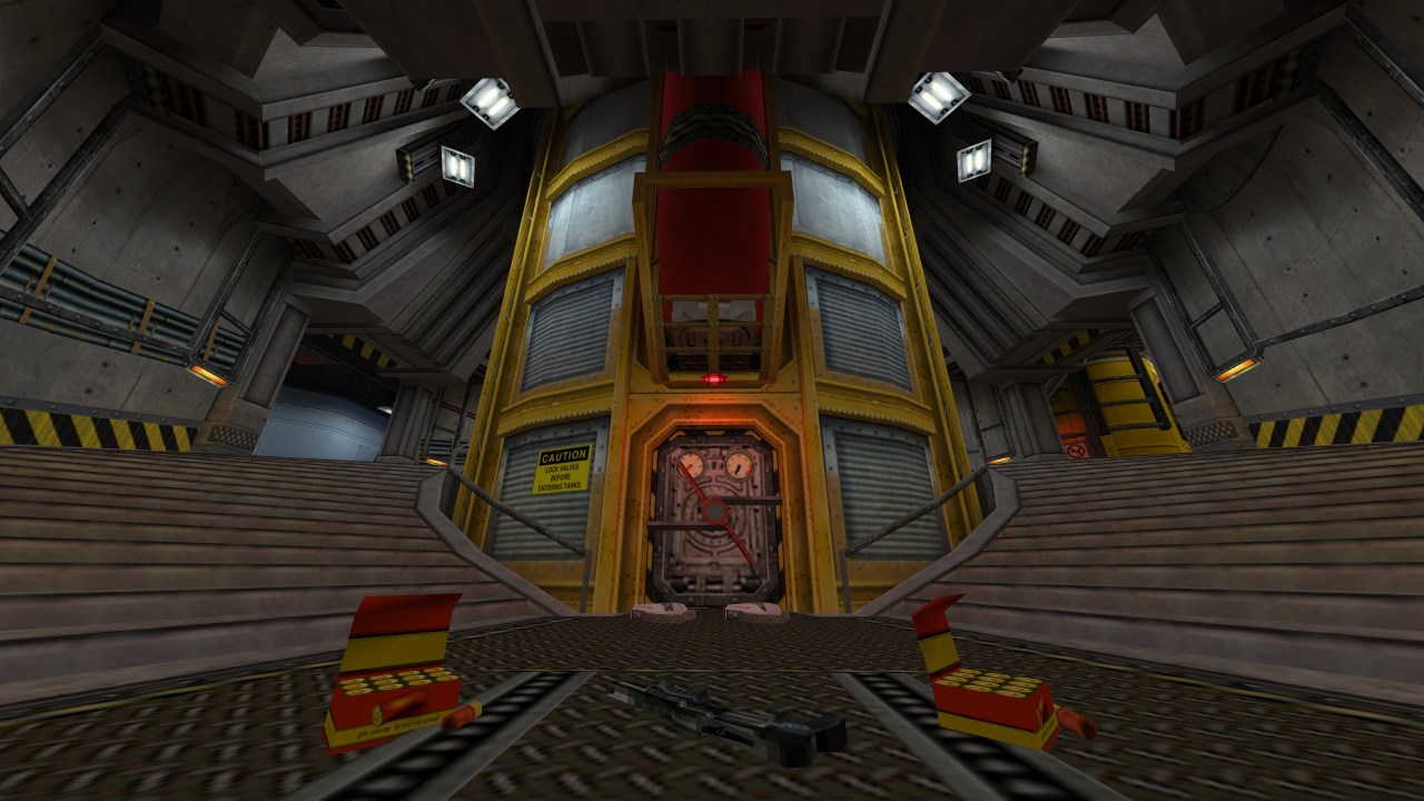
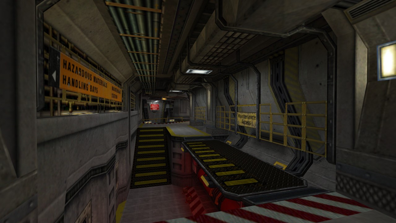
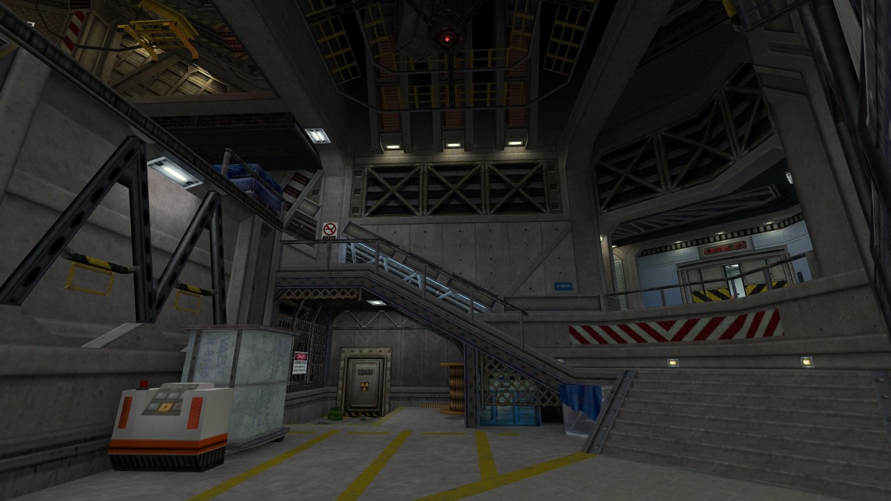
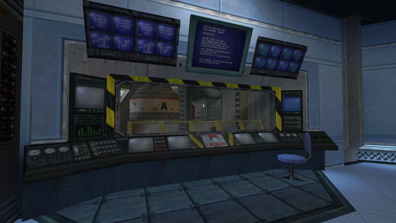
Sometimes you just want to flex a little. In contrast to many of my previous Quake maps, Only You Can Prevent Containment Breaches had no real special restrictions—only an urge to make something larger, and perhaps a little bit less aggressively linear and ambush-heavy. Feeling a little more confident in the Copper toolkit, I was excited to see what I could really do with it, and was determined to play around more with coloured lighting. Historically, when I embark on a project without restrictions, it means a multi-year drawn-out slog that I absolutely despise working on by the end. This time around, I only partially despised it. That's progress, baby!
The concept for this map was born out of a soup of influences—Quake's own military sci-fi and dark fantasy elements always felt a little too cleanly bifurcated, and while the community has often blended them far more effectively, I found myself drawn to the idea of a terrestrial containment facility in which an entire slice of eldritch reality was held, to be studied and isolated. The structure-inside-a-structure concept has striking examples in reality, from the Chernobyl sarcophagus to the utterly surreal 1998 photo of the Unabomber's cabin, sitting alone in an FBI warehouse. What could be so dangerous that the entire building needs to be contained? Just a little guy with an axe who loves to go "HUP HUP HUP", of course.
Despite trying to make concessions to nonlinearity, I was still quite insistent on making the player follow a narrative arc of sorts—breaking out of their shackles, fighting their way up through the chapel-like structure, breaking out into the containment facility, and finally returning for the climax. I had initially intended for there to be more back-and-forth between the two areas, with the player crossing the abyss via other means— perhaps the enormous chains that secure the structure in place, or catwalks lining the edge of the chamber—but as the layout took shape, I realised that such a goal would push the map's complexity and size up by an order of magnitude, and I had no intent of making this another magnum opus. For the sake of my own wellbeing, I kept it simple.
This was also my first experience releasing a map with a Big Reveal™, which meant being quite coy and selective when the time came to post screenshots about it. The map was still very well received, of course, but I couldn't help feeling a little uneasy, leading with a selection of dingy screenshots which carefully obscured the true nature of the space. Between this map and The Warmest Body In The Room, it feels like I've been leaning on the Quake community's goodwill and the fact that they won't dismiss a map en-masse just because the thumbnail isn't flashy or eye-catching enough. But shouldn't everyone be able to do that?
This map uses the music track Ebullism by Aleks Kmiec, featured in the first episode of the Quake mod Dwell. Thanks for graciously granting permission, Aleks!
-
 Go to previous slide
Go to next slide
Go to previous slide
Go to next slide
-
 Go to previous slide
Go to next slide
Go to previous slide
Go to next slide
-
 Go to previous slide
Go to next slide
Go to previous slide
Go to next slide
-
 Go to previous slide
Go to next slide
Go to previous slide
Go to next slide
-
 Go to previous slide
Go to next slide
Go to previous slide
Go to next slide
-
 Go to previous slide
Go to next slide
Go to previous slide
Go to next slide
-
 Go to previous slide
Go to next slide
Go to previous slide
Go to next slide
-
 Go to previous slide
Go to next slide
Go to previous slide
Go to next slide
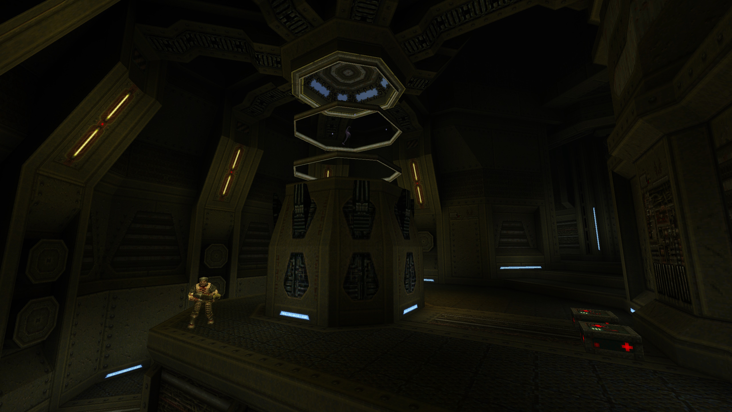
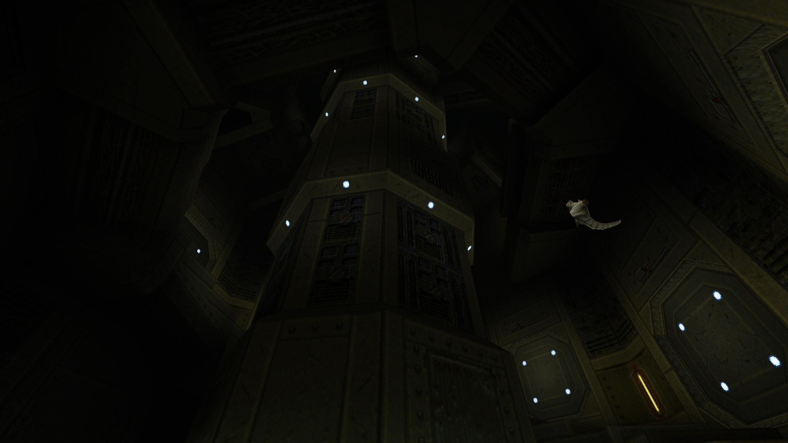
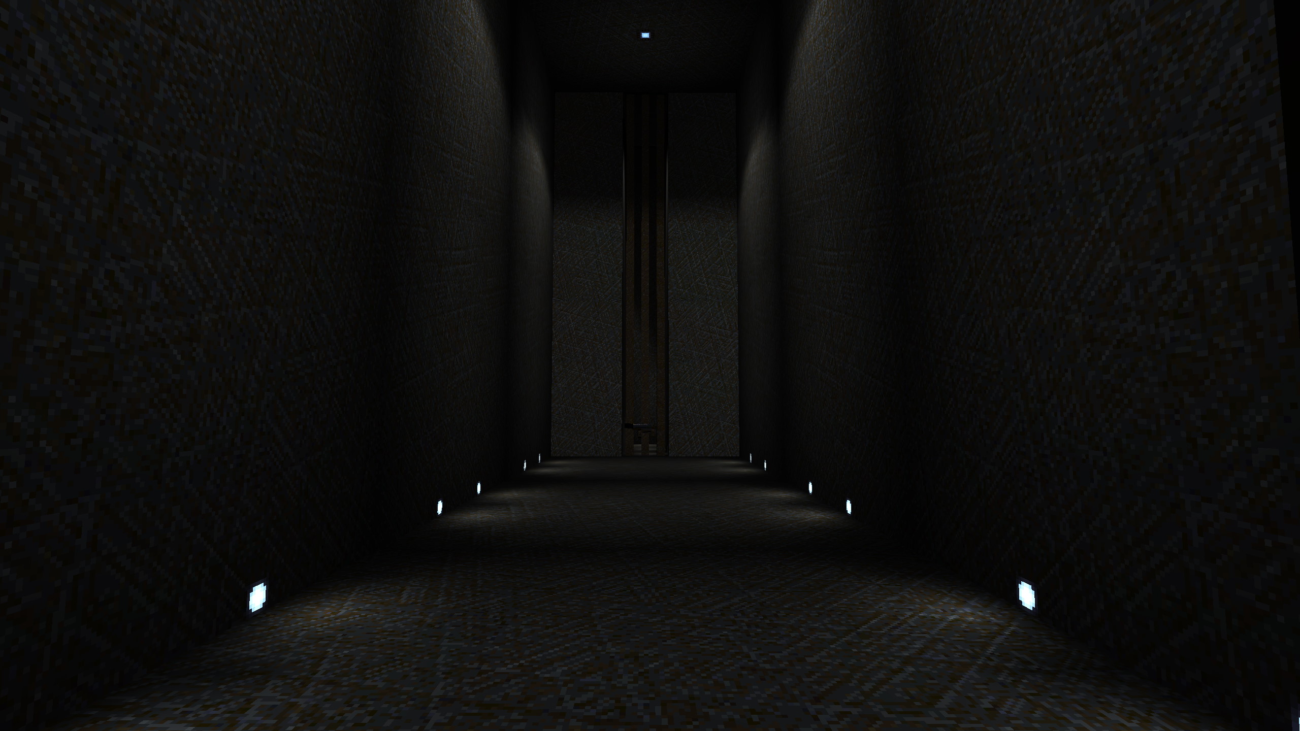
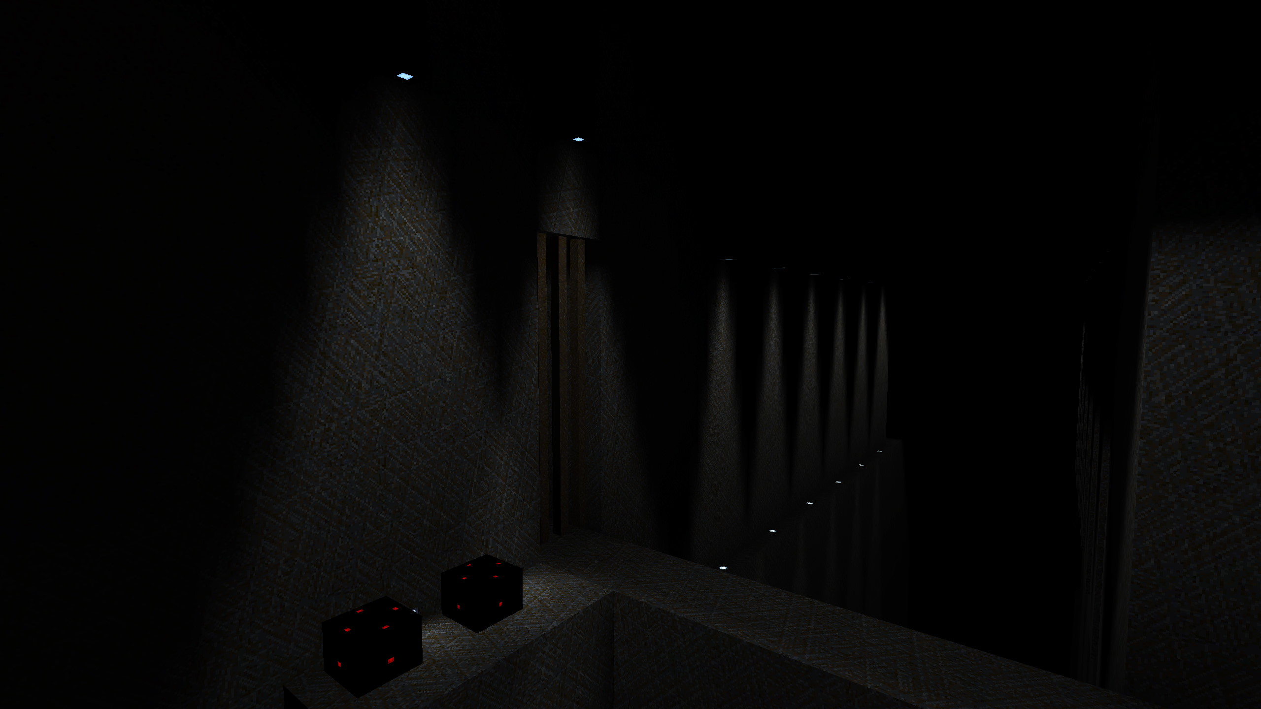
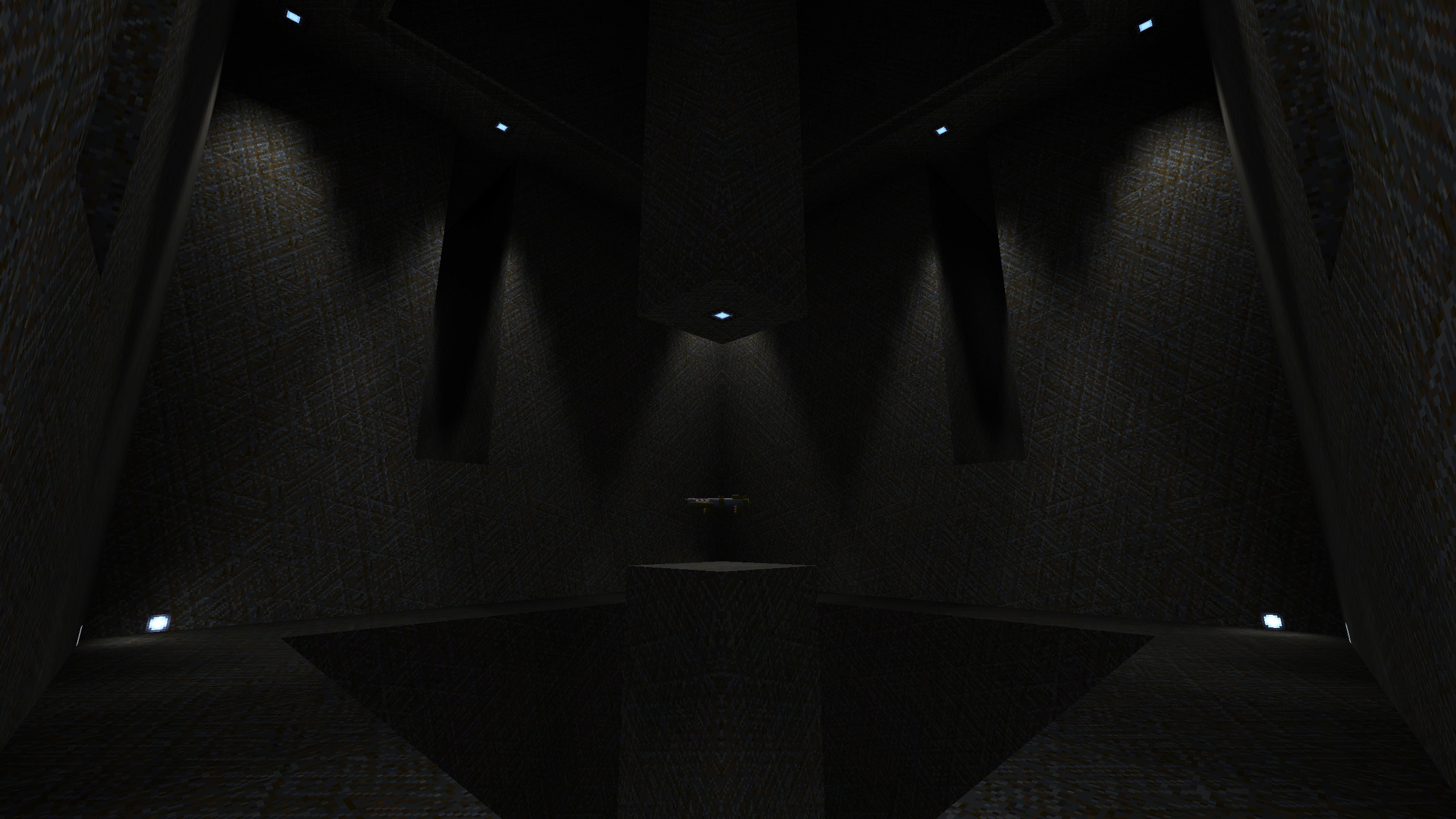
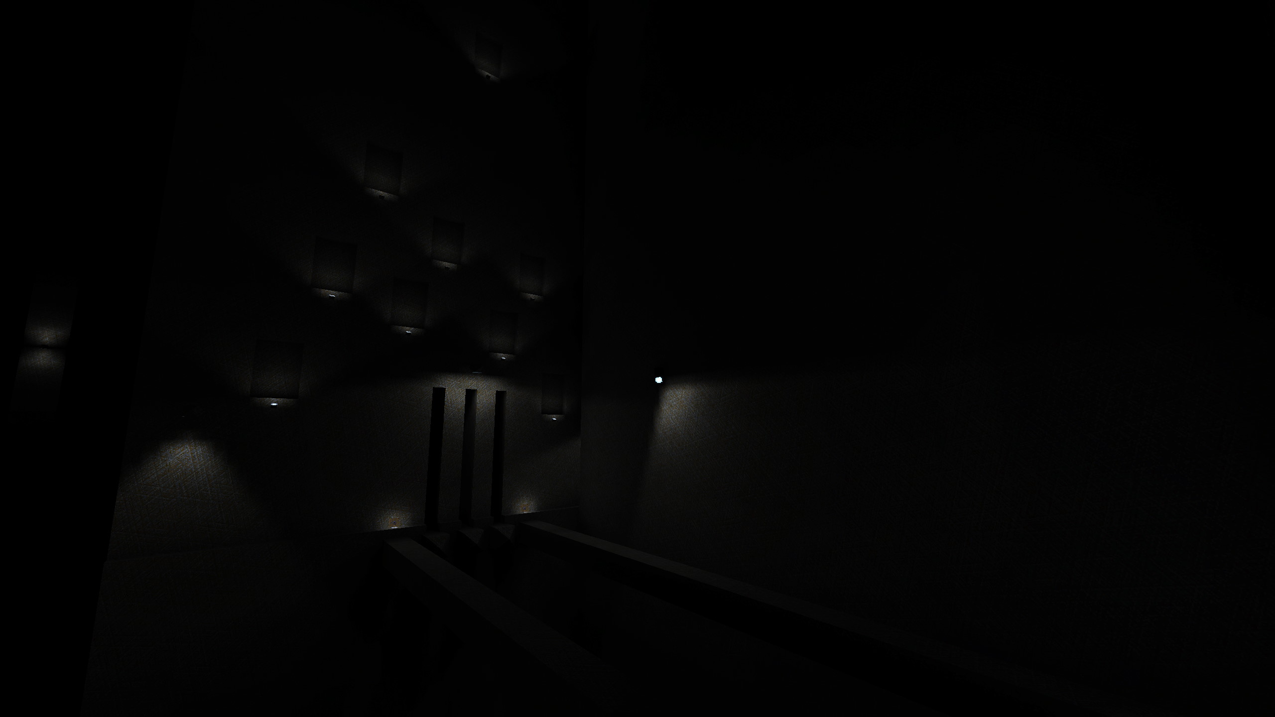
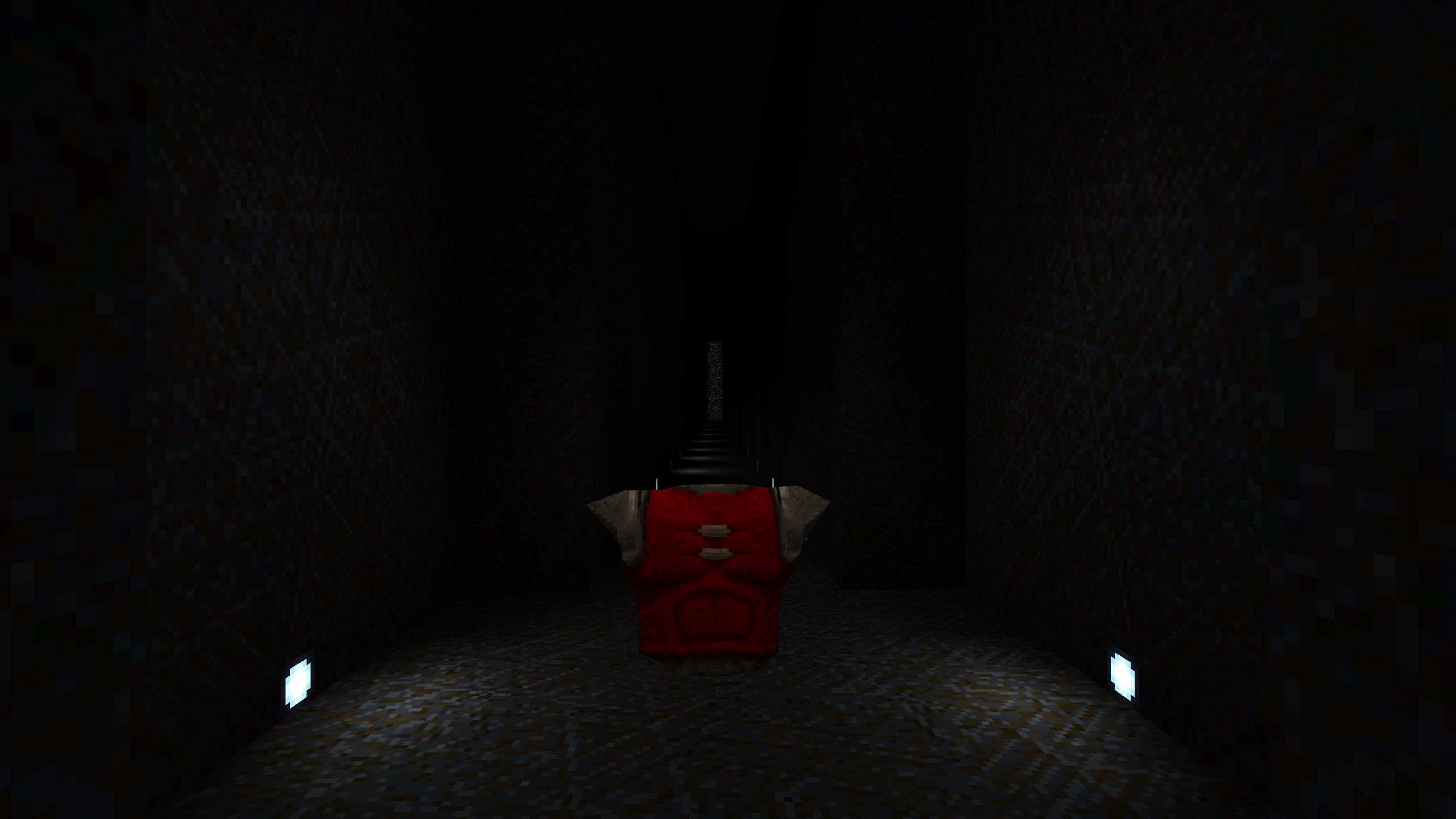
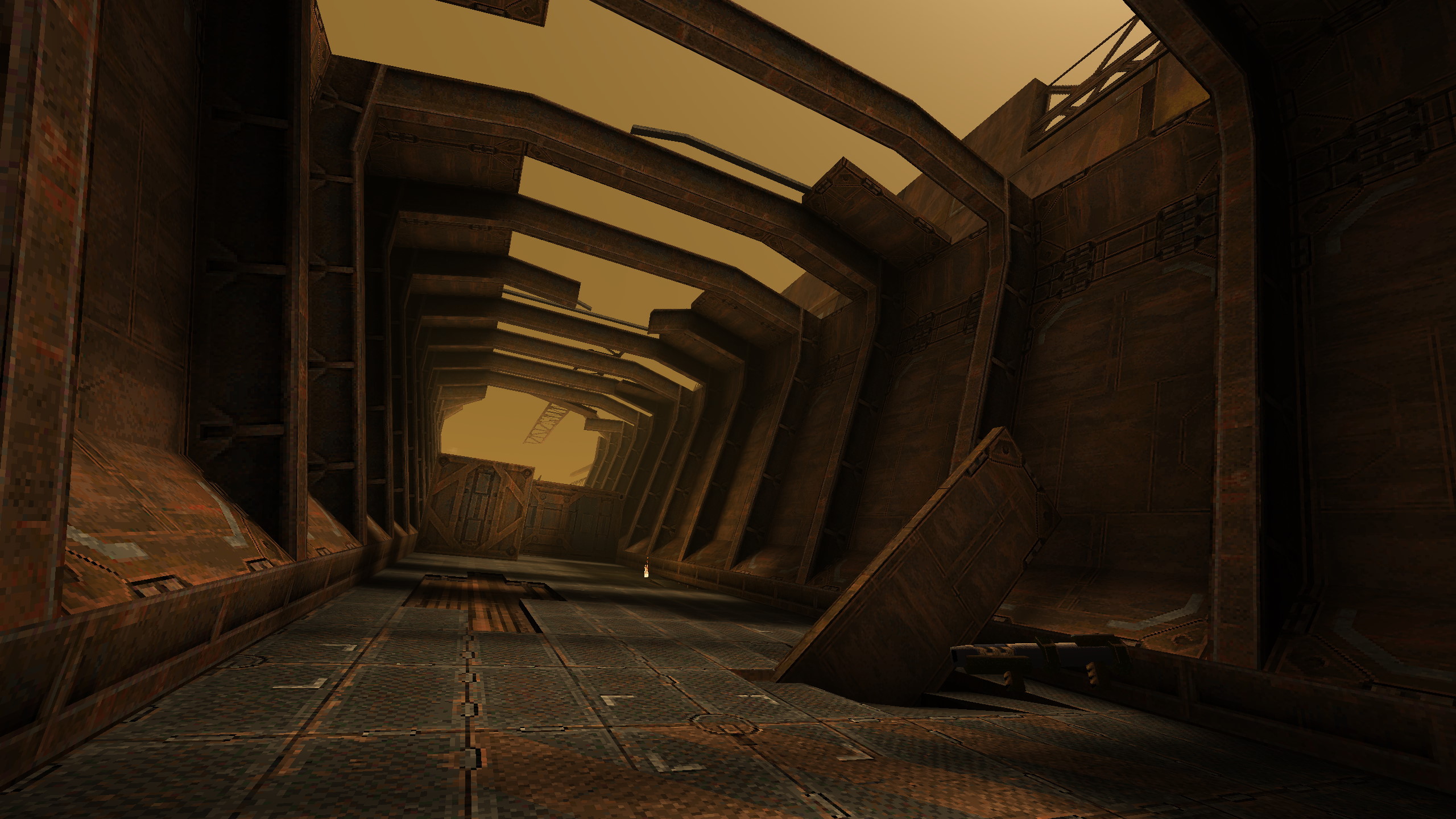
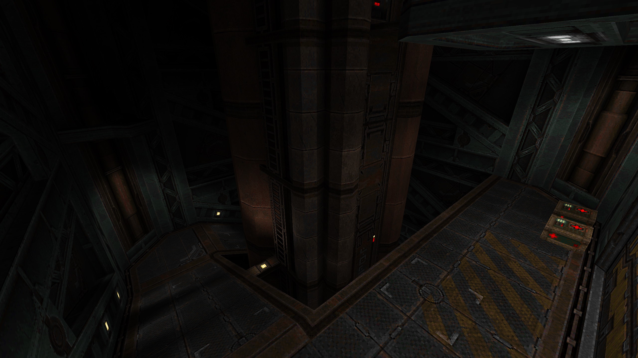
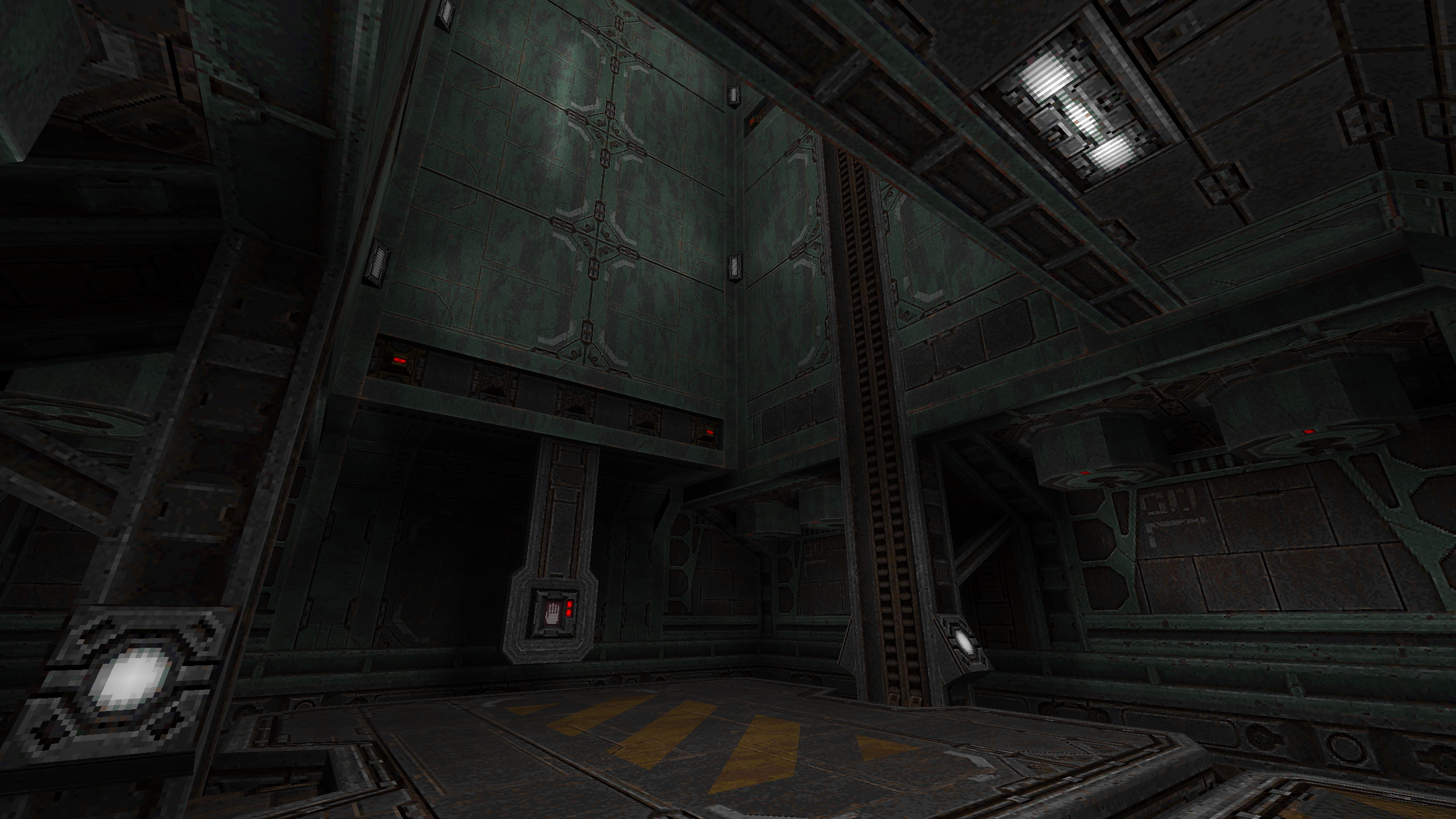
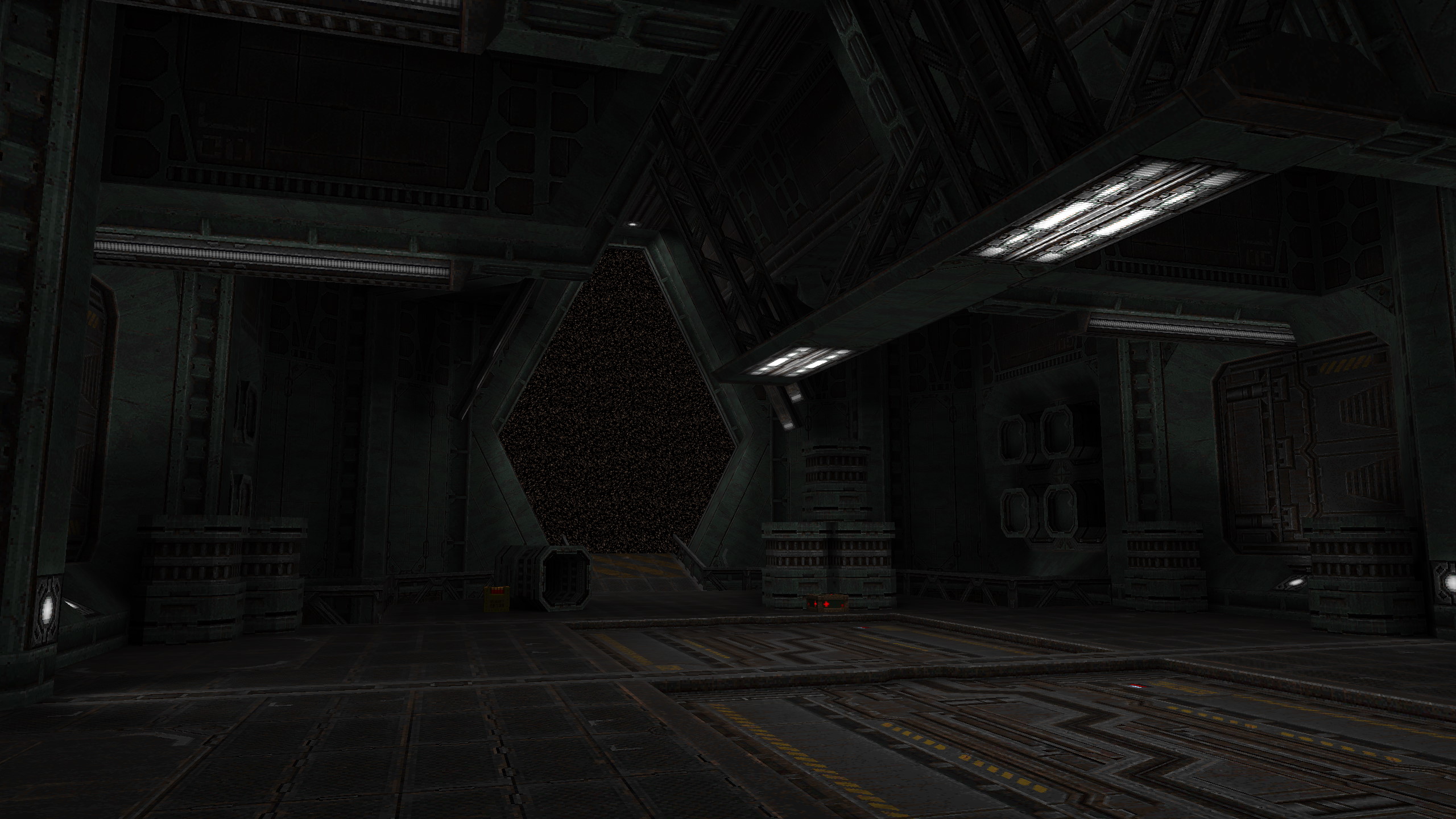
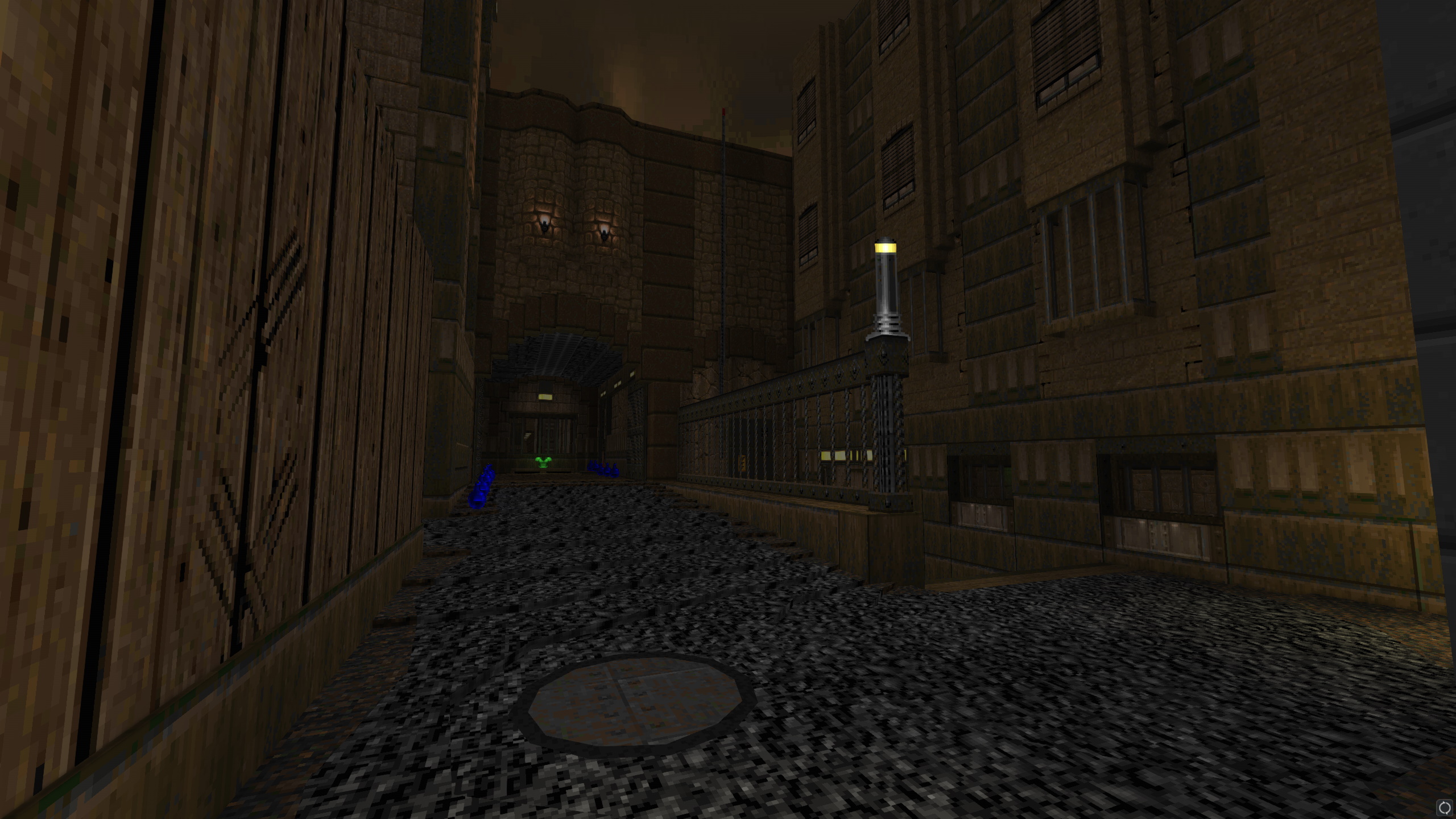
If you asked someone to describe my hobbyist mapping style, you'd probably get the bullet point of "self-indulgent overwrought brushwork" eventually. I love to play around with shapes and textures, and in an age of limit-removing source ports, extensively detailed geometry usually isn't a problem. It does, however, occasionally feel like a bad habit. For my own good, I made The Warmest Body In The Room; a map with the most minimal texturing and geometry I could muster, and to compensate, a frankly irresponsible number of lights.
As you might expect, the constraints necessitated another change of style. The map is a far cry from my usual dense approach, instead aiming for the feeling of a vast, impersonal, impenetrable megastructure. I went against a lot of level design common-sense to achieve this—forcing the player to inch along narrow ledges above bottomless pits, navigate samey corridors with copy-pasted intersections, and fight in a number of spaces that were either far too cramped or far too large. But that's the thing about level design: what matters most is intent. And I intended to make this place feel strange, austere, and dangerous.
Still, it pays to ensure that your audience (even if it is a very specific audience) isn't unnecessarily discouraged. My style of lighting on this map was geared heavily towards keeping the important things readable, while still feeling oppressive and disorienting. Small light sources close to the ground would help mark the join between walls and floors, while larger spotlights marked intersections or points of interest. Different light colours—something I hadn't used much in Quake up to this point, as it's not technically a feature of the original game—were occasionally used to differentiate between areas or draw the player in a direction. Out in the void, more lights were stapled to infinitely tall pillars—partially for detail and atmosphere, but partially because it's actually extremely confusing to stare into truly pitch-black space without anything distant to orient yourself by. You've no idea if it's a suffocating miasma inched from your face, a vast echoing chasm, or a Wile-E.-Coyote-style tunnel painted on a wall.
As you might expect, reception of The Warmest Body In The Room was... divided. It's the sort of thing you start to care about a lot less once you stop feeling like you have something to prove to people. Not that I think it was beyond criticism; I'll fully admit that the final arena fight was a cop-out for a map that I didn't really know how to finish properly, and that the map's opening few minutes—wherein the player nearly drowns, and is left to find their bearings on low health while Scrags peck away at them from the abyss—may have been more punishing than they needed to be for something so atypical. I'm glad to have set myself the challenge, though... even if the results are nigh-impenetrable to anyone with a little bit of screen glare.
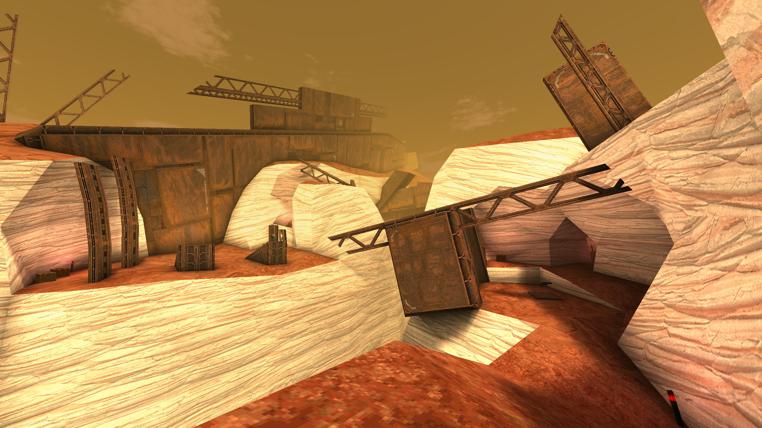
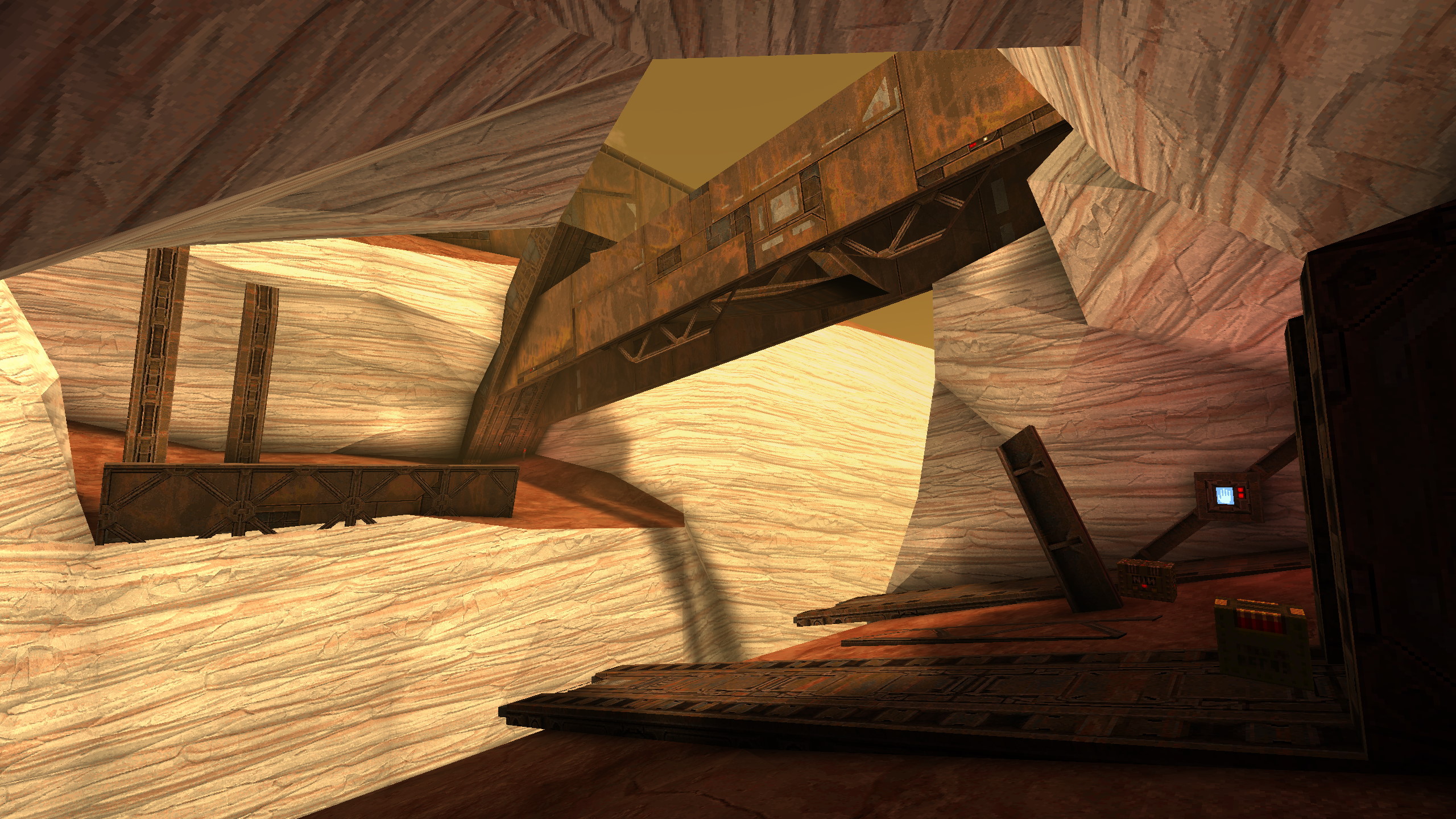
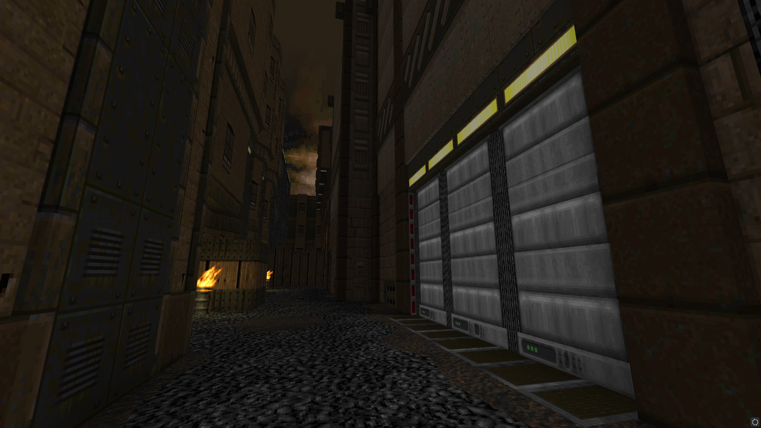
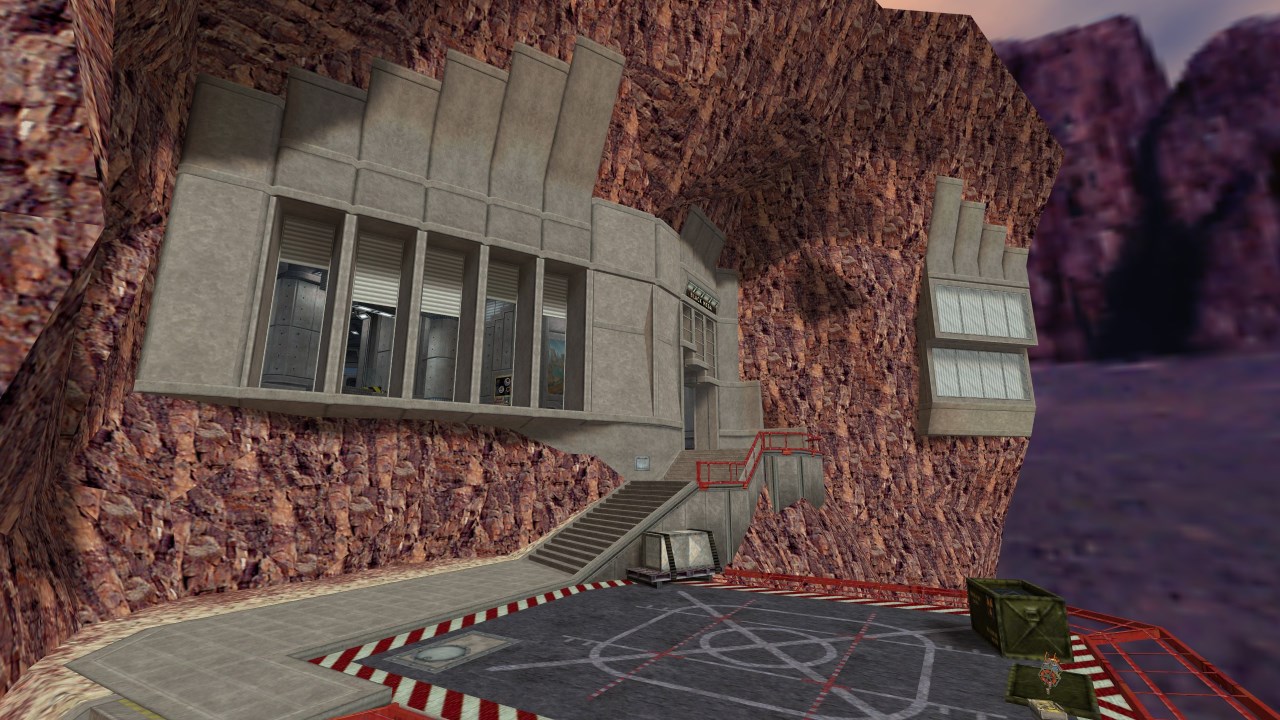
A short map thrown hastily together over the course of two weeks for Coppertone Summer Jam 2, a mapping jam for Quake's "Copper" mod. The theme of the jam, true to its name, was to create hot and sunny environments; a far cry from Quake's usual cold, dark, muddy labyrinths. While following the theme wasn't strictly a requirement, I thought it'd be a fun challenge—how do you maintain the crushing atmosphere and compelling encounter design when you're so far removed from the game's intended environment style?
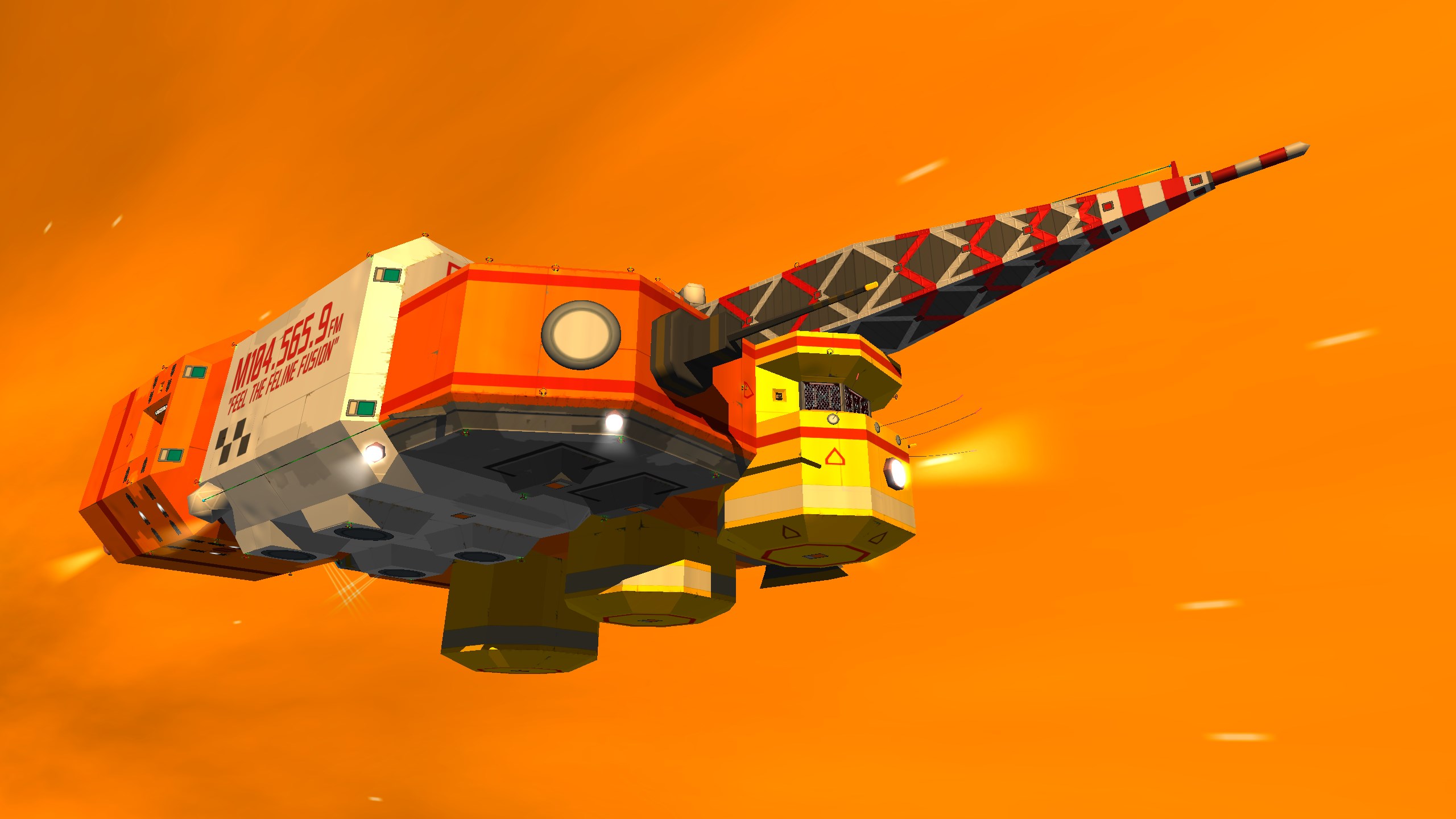
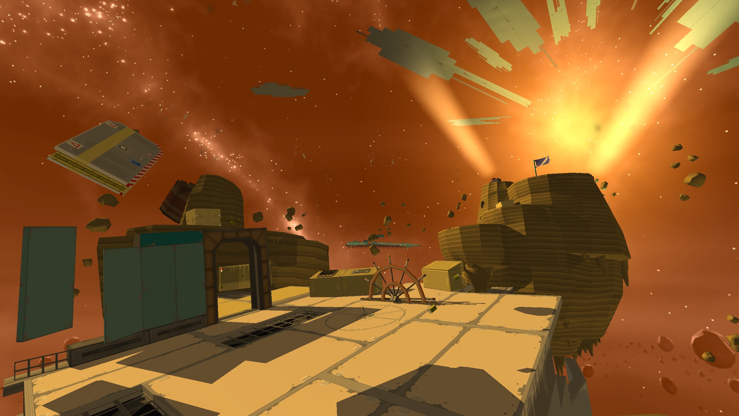
I ended up with a trek back and forth across a bleak alien chasm, inspired somewhat by the surface portions in the opening of Doom 2016. To help shape the geometry of the space, and lend a narrative arc to the level, I introduced a crashed spaceship—a rusting oblong hulk, half-buried in the sands, with enormous chunks of it scattered across the landscape. With this justification in place, I could add moving parts, arbitrary obstacles, artificial lighting and fast easy details. And fast was important—I could feel the two-week deadline breathing down my neck, made worse by the time-consuming task of hammering out a slightly-too-ambitious amount of natural terrain. I had plenty of experience vertex-editing vast arrays of tetrahedrons into natural surfaces from my time with Half-Life, but it's still not exactly a swift process.
Designing combat encounters for the great outdoors required a bit of a change of style. I was determined not to get bogged down in Serious-Sam-style horde encounters (a common urge, when you have more space to work with all of a sudden), but instead placed a greater focus on harassing the player with long-distance sniping enemies, like the Vore, Enforcer, and Scrag. With fewer potential monster closets at my disposal, I had to get a bit more creative when deploying monsters—having them hide behind terrain, burst out of cargo containers, or subtly teleport in behind narrow obstacles like Bugs Bunny stepping out from behind a lamp-post. Strictly speaking, there's nothing verboten in Quake about the designer just teleporting monsters in front of the player in plain sight, but I feel it lacks a certain finesse.
This was my first experience with Copper, the "Vanilla+" Quake mod that subtly polished some of the 1996 game's rougher edges, and—more importantly, in my eyes—granted level designers access to a wider range of tools. While I didn't have the luxury of really exploring Copper's full capabilities, I quickly grew fond of its little conveniences, many of which didn't significantly add behaviour to Quake, but did allow me to achieve results with one tenth as much entity logic and significantly more reliability. As an enjoyer of carefully choreographed ambushes, how could I not appreciate that?
-
 Go to previous slide
Go to next slide
Go to previous slide
Go to next slide
-
 Go to previous slide
Go to next slide
Go to previous slide
Go to next slide
-
 Go to previous slide
Go to next slide
Go to previous slide
Go to next slide
-
 Go to previous slide
Go to next slide
Go to previous slide
Go to next slide
-
 Go to previous slide
Go to next slide
Go to previous slide
Go to next slide
-
 Go to previous slide
Go to next slide
Go to previous slide
Go to next slide
-
 Go to previous slide
Go to next slide
Go to previous slide
Go to next slide
-
 Go to previous slide
Go to next slide
Go to previous slide
Go to next slide
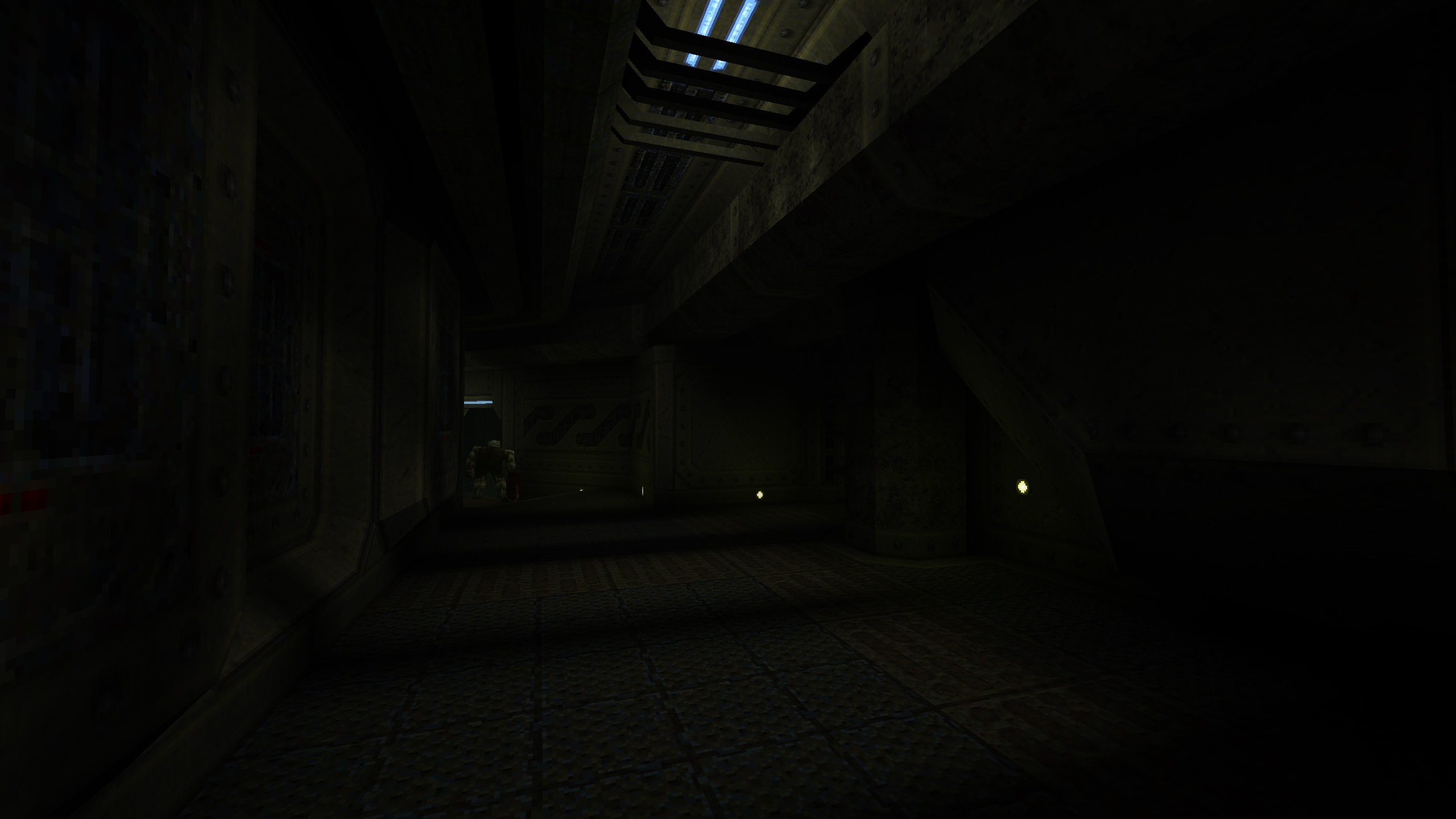
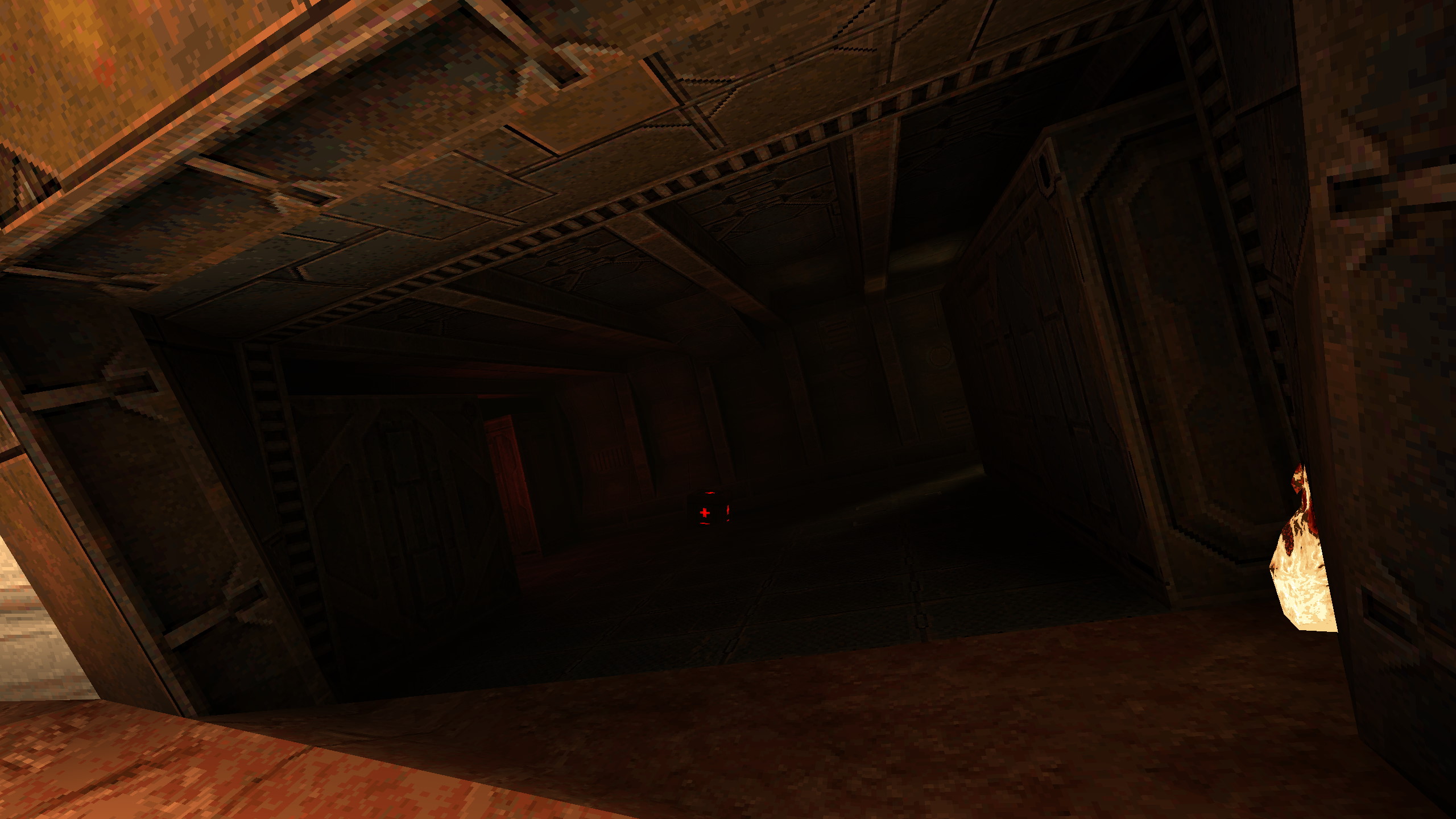
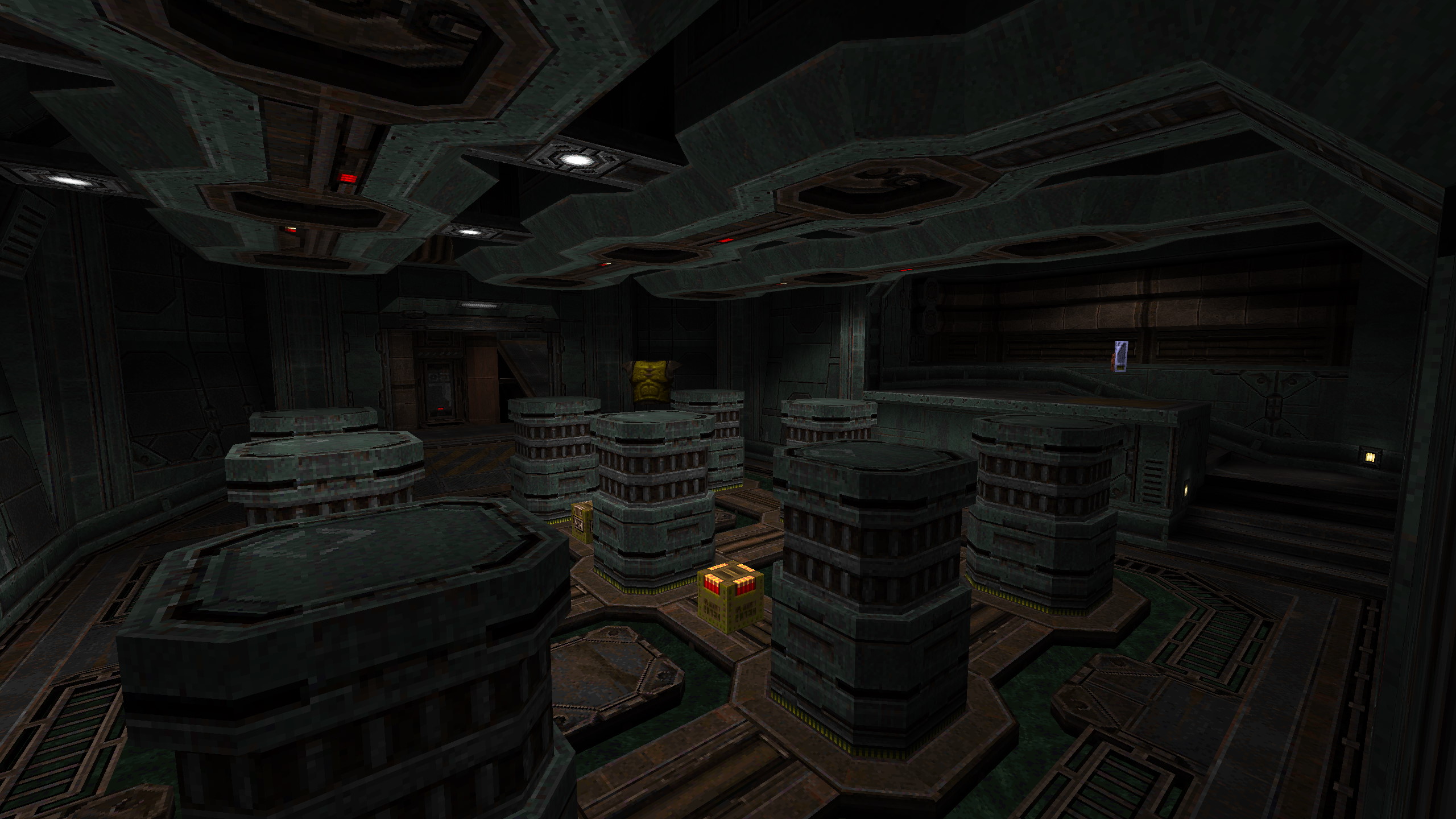
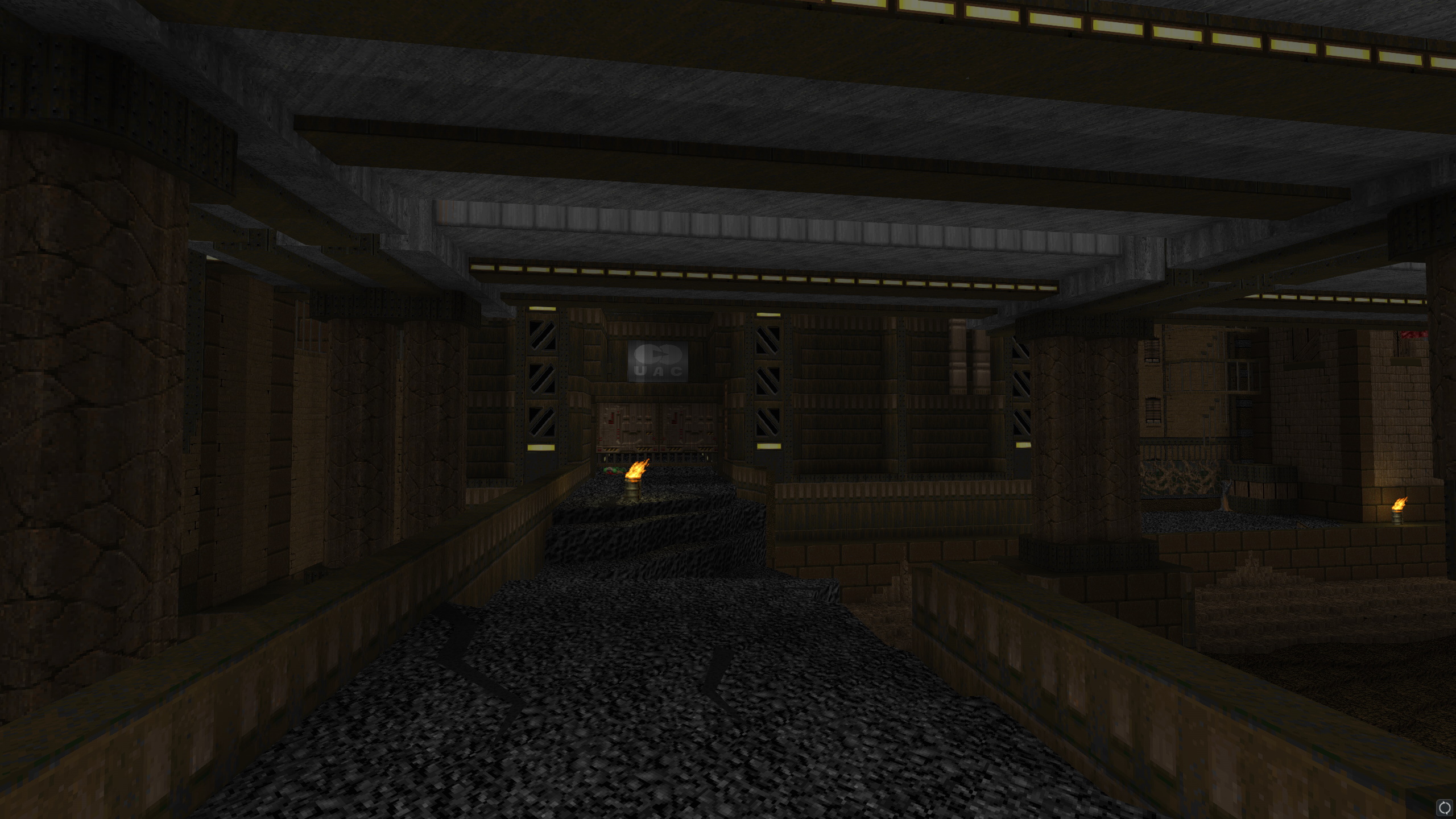
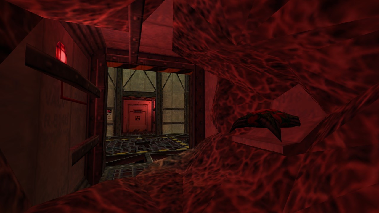
Head Reattachment Trauma is not about gender transition. Alright yes, I intentionally forced players to type "map suzyhrt" into the console in order to load the map, and yes, I came up with the name to deliberately evoke gradual healing from a violent destruction of the self, but that was mostly to annoy overly sensitive cis people who would rather we pretended not to exist. I don't really feel compelled to make art about my transition experiences themselves—there's nothing particularly insightful I can say about them—but I do occasionally feel compelled to be the cheeky scamp who pokes the wasps' nest.
In reality, Head Reattachment Trauma is about waking up in a canister, and being surrounded by a bunch of other canisters that keep opening and revealing soldiers—or malformed corpses, or weird blobs. There's kind of a basic boilerplate narrative to the space, hinting that they're growing baddies in tubes with varying degrees of success, but this map was mostly—like The Stars We Lost To Grief—an exercise in encounter design. I was eager to work with a bit more elbow room and play around with a wider range of monsters (grunts and enforcers included, which I had previously avoided for seeming too incongruous). Having found my feet, I was ready to lean into my identity as a creator of dense, ambush-laden maps.
I learned a lot about lighting in Quake while working on this map. While my preferred style leaned towards dramatic high-contrast lighting, this generally didn't work well with my ambitions for extensive moving parts. Precompiled lightmaps mean that if you cast a shadow on a wall, and then the wall shifts, it will take the shadow with it—something that looks, in my opinion, tremendously ugly. Instead, I typically used flat homogenous lighting around moving parts, supplementing the lack of detail with more complex brushwork and contrasting textures. It's possible that genre-savvy players could have used this to anticipate traps and secret doors ahead of time, but I don't believe the visual language was quite clear enough to make the distinction obvious.
I also once again felt the familiar drag of scope creep, particularly as I stretched out the map's ending into a complex entity-heavy elevator battle and final arena fight. With plenty of experience in brush-based geometry from GoldSrc and Source, I'll admit I wanted to show off a little. Detailing became a somewhat lengthy phase, and though Makkon's beautiful modern textures (available here) should have eased my task, I ended up feeling compelled to do justice to them, lacing areas with pipes, beams, and greebles. I also had to balance these ambitions with the need to keep the spaces readable and traversable even at Quake's blistering speed. For all the visual complexity of the walls, they typically maintained a simple line of trim between them and the floor that helped define the playable space, while the most ambitious details were saved for their upper reaches—or the ceiling. I'll teach gamers to look up yet.
-
 Go to previous slide
Go to next slide
Go to previous slide
Go to next slide
-
 Go to previous slide
Go to next slide
Go to previous slide
Go to next slide
-
 Go to previous slide
Go to next slide
Go to previous slide
Go to next slide
-
 Go to previous slide
Go to next slide
Go to previous slide
Go to next slide
-
 Go to previous slide
Go to next slide
Go to previous slide
Go to next slide
-
 Go to previous slide
Go to next slide
Go to previous slide
Go to next slide
-
 Go to previous slide
Go to next slide
Go to previous slide
Go to next slide
-
 Go to previous slide
Go to next slide
Go to previous slide
Go to next slide
The Stars We Lost To Grief was my first Quake map, but it was not my first attempt at a Quake map. I had a few little false starts, falling victim to over-ambitiousness before I’d had a chance to get comfortable with the game’s library of entities and monsters. In the end, I willingly subjected myself to the limitations of a ‘1024’-style map—a map that fits within the fairly snug confines of a 1024x1024x1024 unit cube. With so little space at my disposal, I was forced to suppress my natural urge for grand narrative arcs and knuckle down to the thing I actually wanted to practice: tight, varied encounter design.
Someone from id Software (maybe Romero?) once said that when they make a game with a new engine, the first level should be something that was completely impossible in their previous engine. This resonated with me a little, having just walked away from a massive Doom project with its limitations still painfully apparent, and The Stars We Lost To Grief quickly became a depraved orgy of moving parts, alternating between ambushes and traps with a healthy dose of timed platforming (note: still not sorry). I quickly saw the value in the 1024-unit limitation, and leaned into it to try and create hairy encounters with only a handful of monsters apiece. I love a good old-school movement-heavy shooter, but my eyes quickly glaze over when I’m just circlestrafing around a big pack of baddies in a wide-open area. Limited space to move is what keeps things interesting.
Getting to grips with Quake’s roster of baddies was an interesting time. It’s a fairly small list, and smaller still if (like me, at the time) you refuse to use the military-base-themed enemies outside of a military-base-themed level. In the map’s tight arenas, I focused on aggressive enemies that would either rush the player down or use large projectile attacks, hoping to make players panic in close-quarters: Ogres, Knights, Death Knights, Fiends, and of course, the Spawns. This was definitely when I fell in love with Ogres in particular, which I feel are enormously flexible and able to stay a threat in all sorts of contexts—provided the player isn’t powerful enough to just delete them on sight. Most fights combined these enemies with traps or hazards of some variety, letting me use fewer enemies while still keeping things stressful.
Like all ‘first’ projects, The Stars We Lost To Grief had a few rough edges. I had to scrap one trap entirely after realising there was no way to stop the cacophony of a dozen moving spikes once the player had successfully passed through it—a cacophony which was, due to the map’s small dimensions, impossible to escape. The 1024-unit restriction also meant that it was largely just a short linear gauntlet, with precious little room for exploration, secret hunting, or even just moments to breathe. Some people even found it overly brutal—but really, if I can't be a bit mean in Quake, where can I?
-
 Go to previous slide
Go to next slide
Go to previous slide
Go to next slide
-
 Go to previous slide
Go to next slide
Go to previous slide
Go to next slide
-
 Go to previous slide
Go to next slide
Go to previous slide
Go to next slide
-
 Go to previous slide
Go to next slide
Go to previous slide
Go to next slide
-
 Go to previous slide
Go to next slide
Go to previous slide
Go to next slide
-
 Go to previous slide
Go to next slide
Go to previous slide
Go to next slide
-
 Go to previous slide
Go to next slide
Go to previous slide
Go to next slide
-
 Go to previous slide
Go to next slide
Go to previous slide
Go to next slide
-
 Go to previous slide
Go to next slide
Go to previous slide
Go to next slide
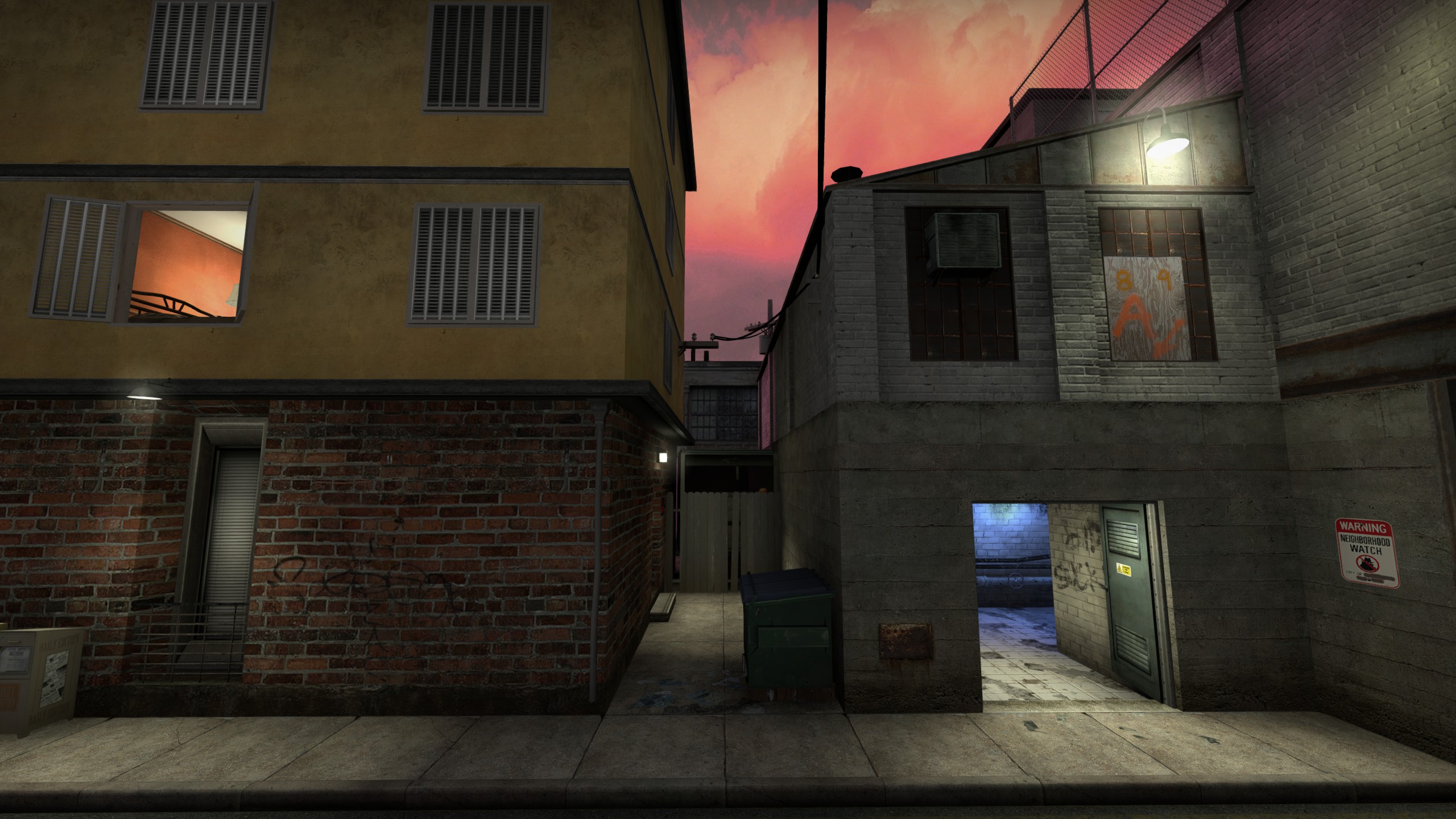
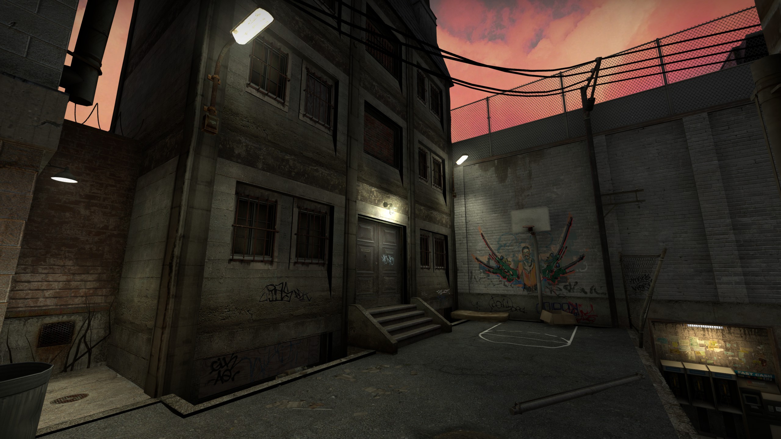
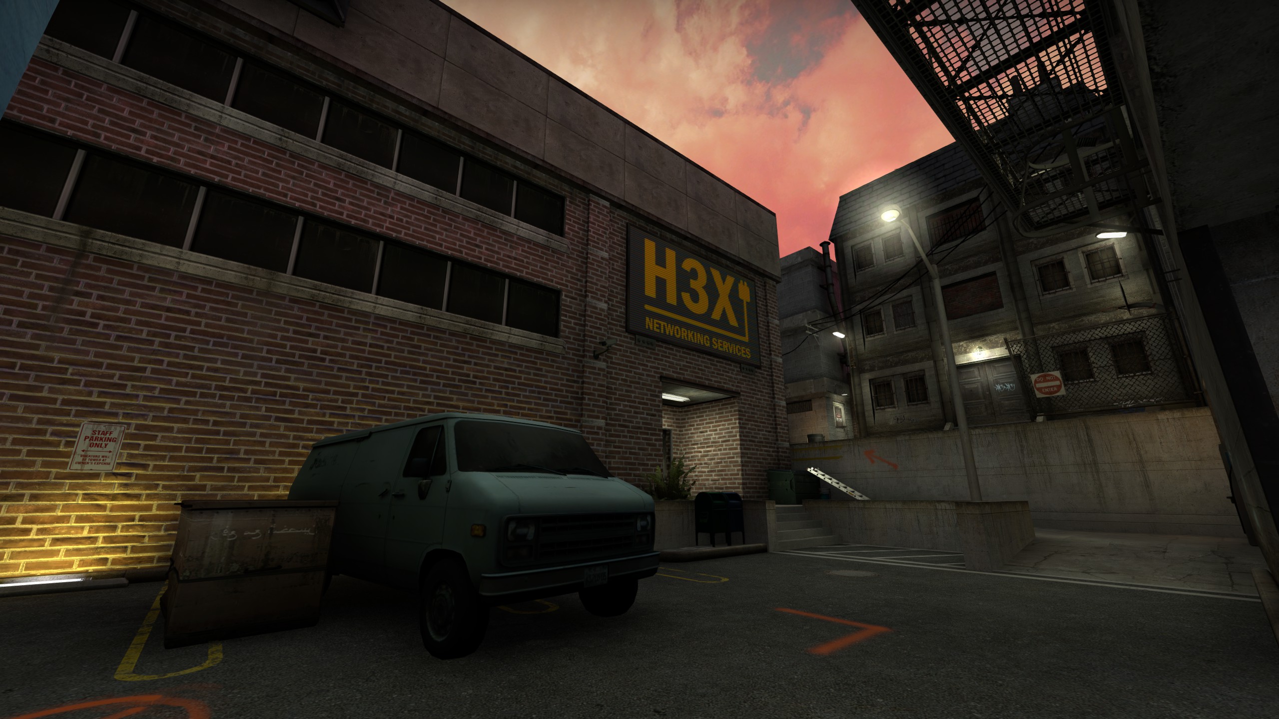
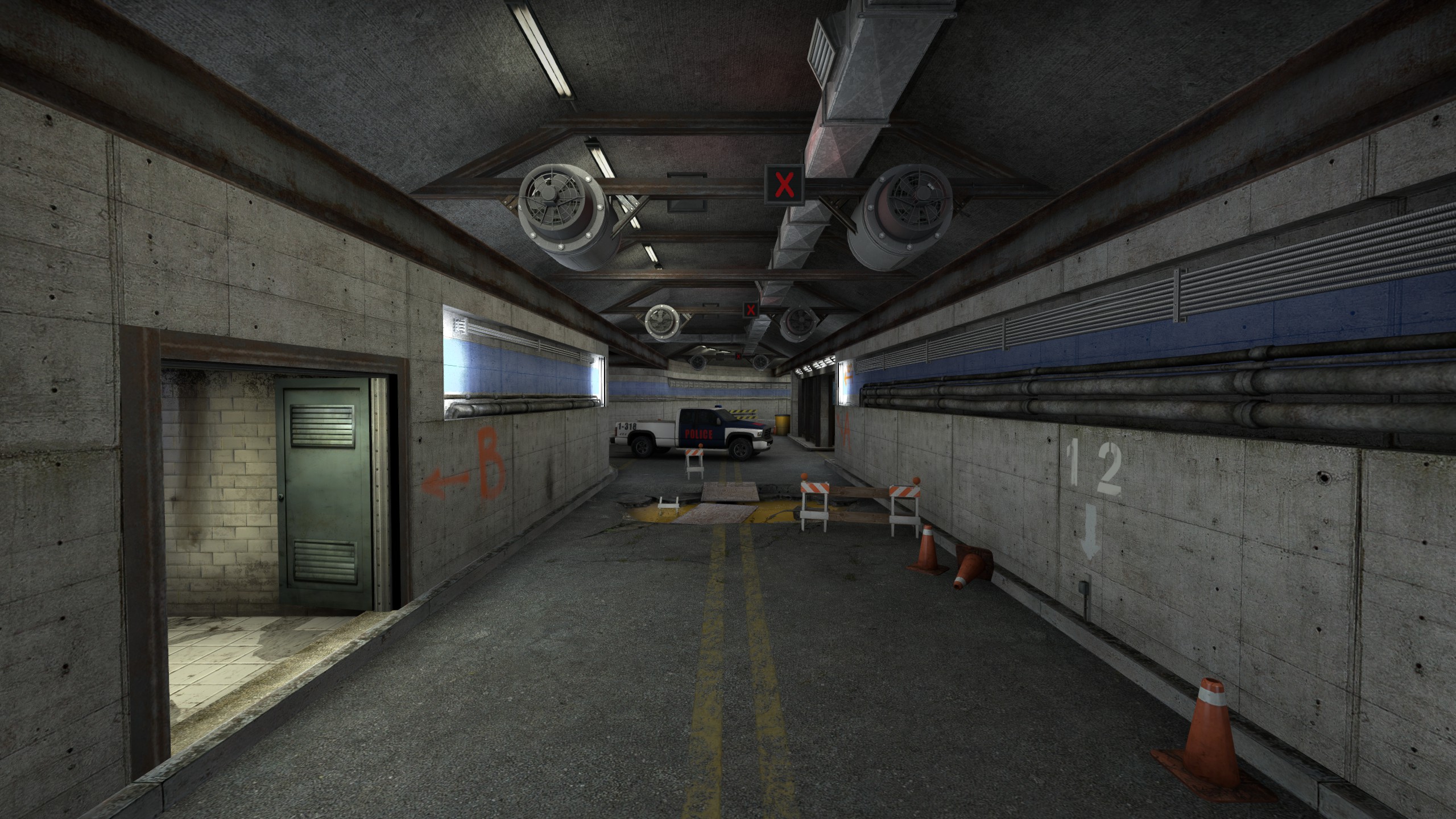
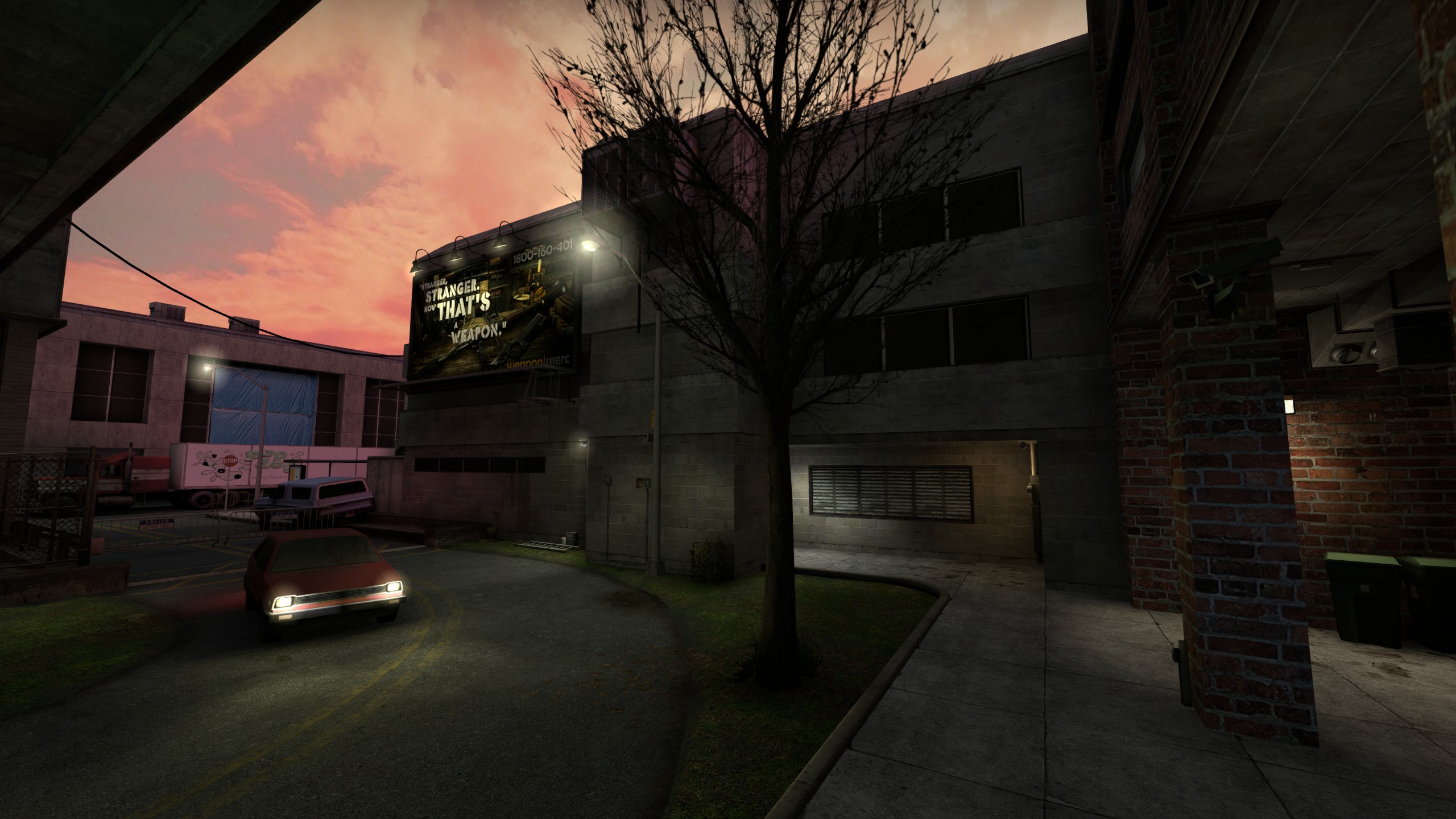
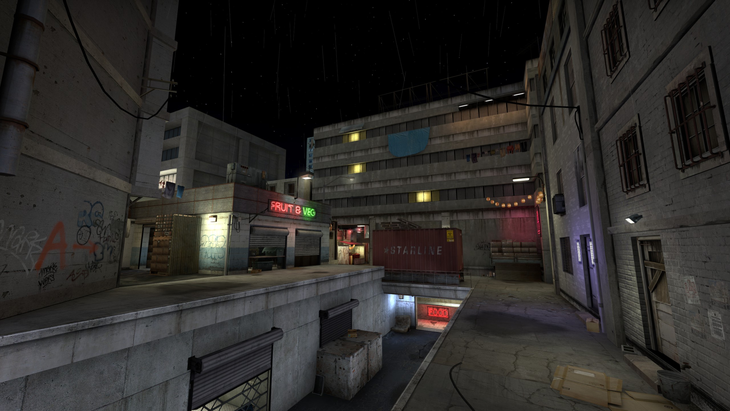
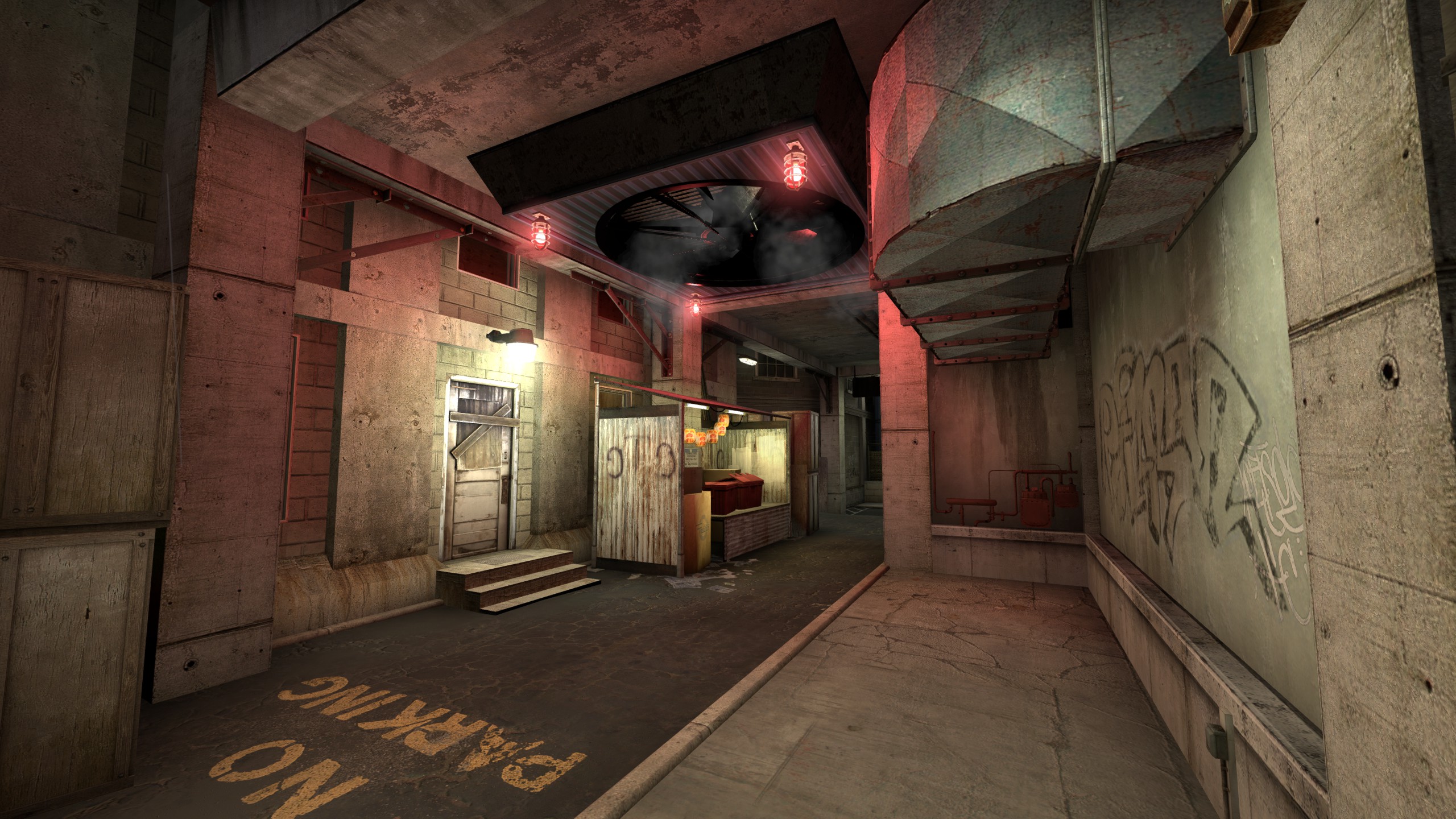
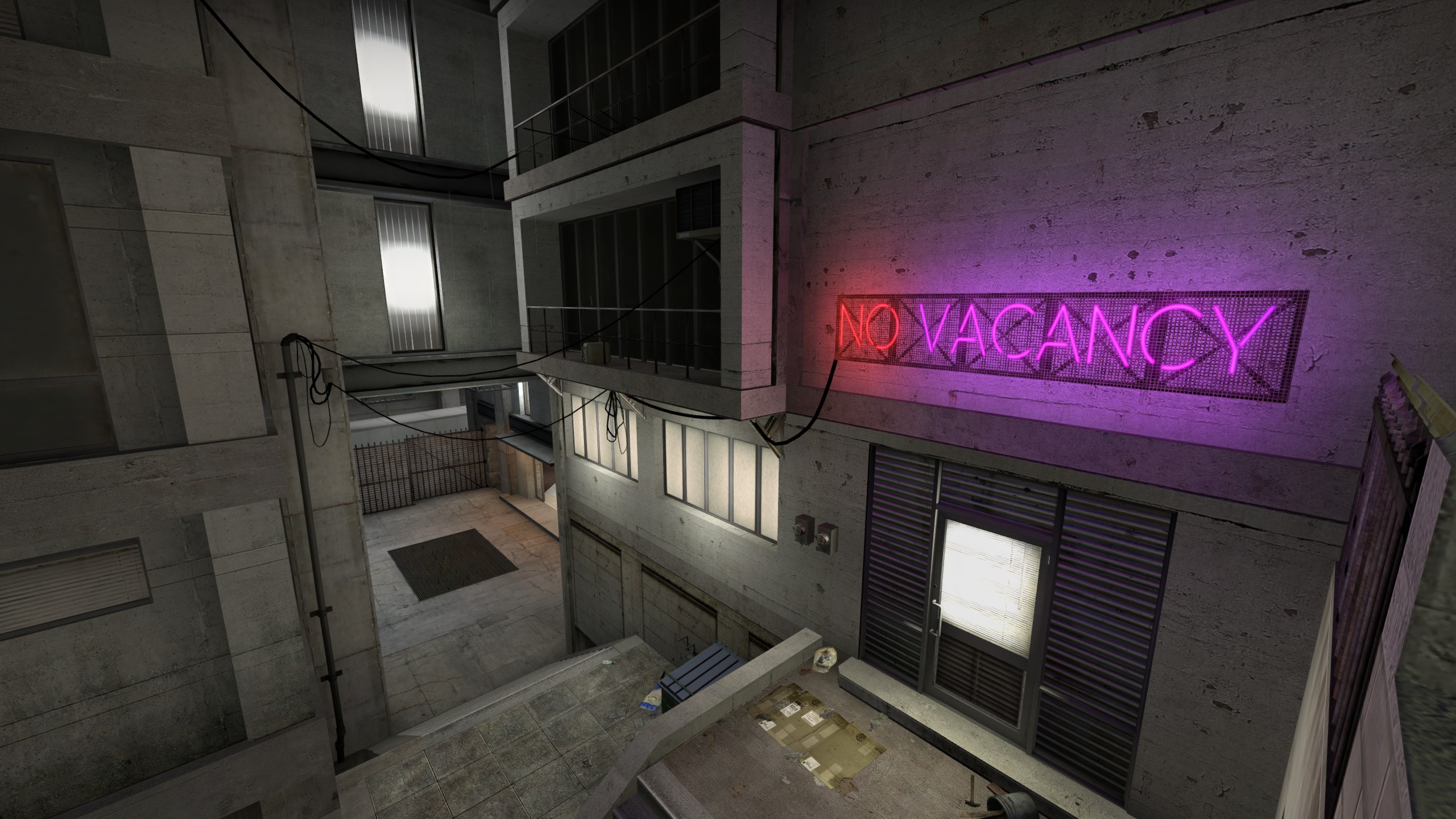
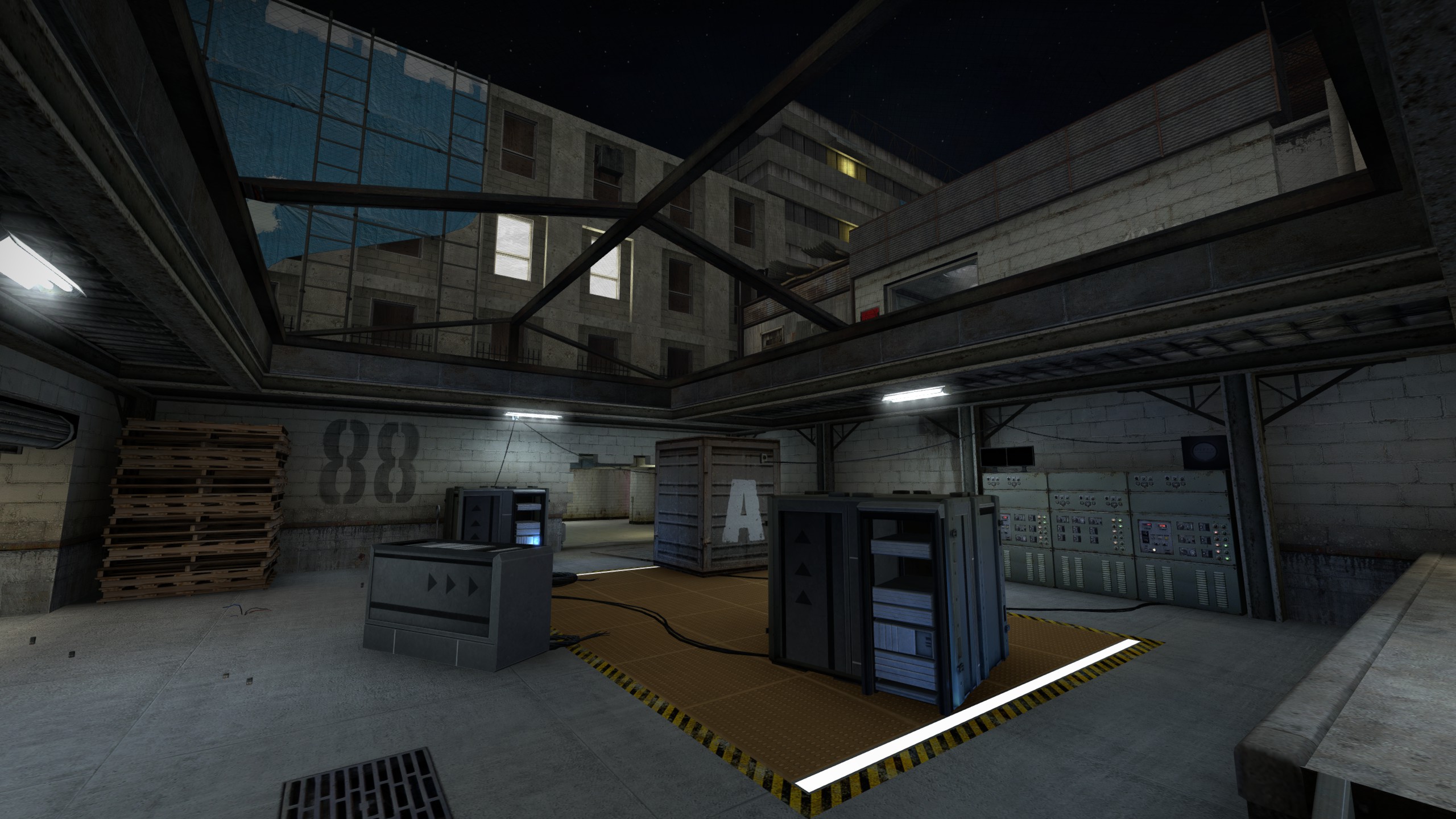
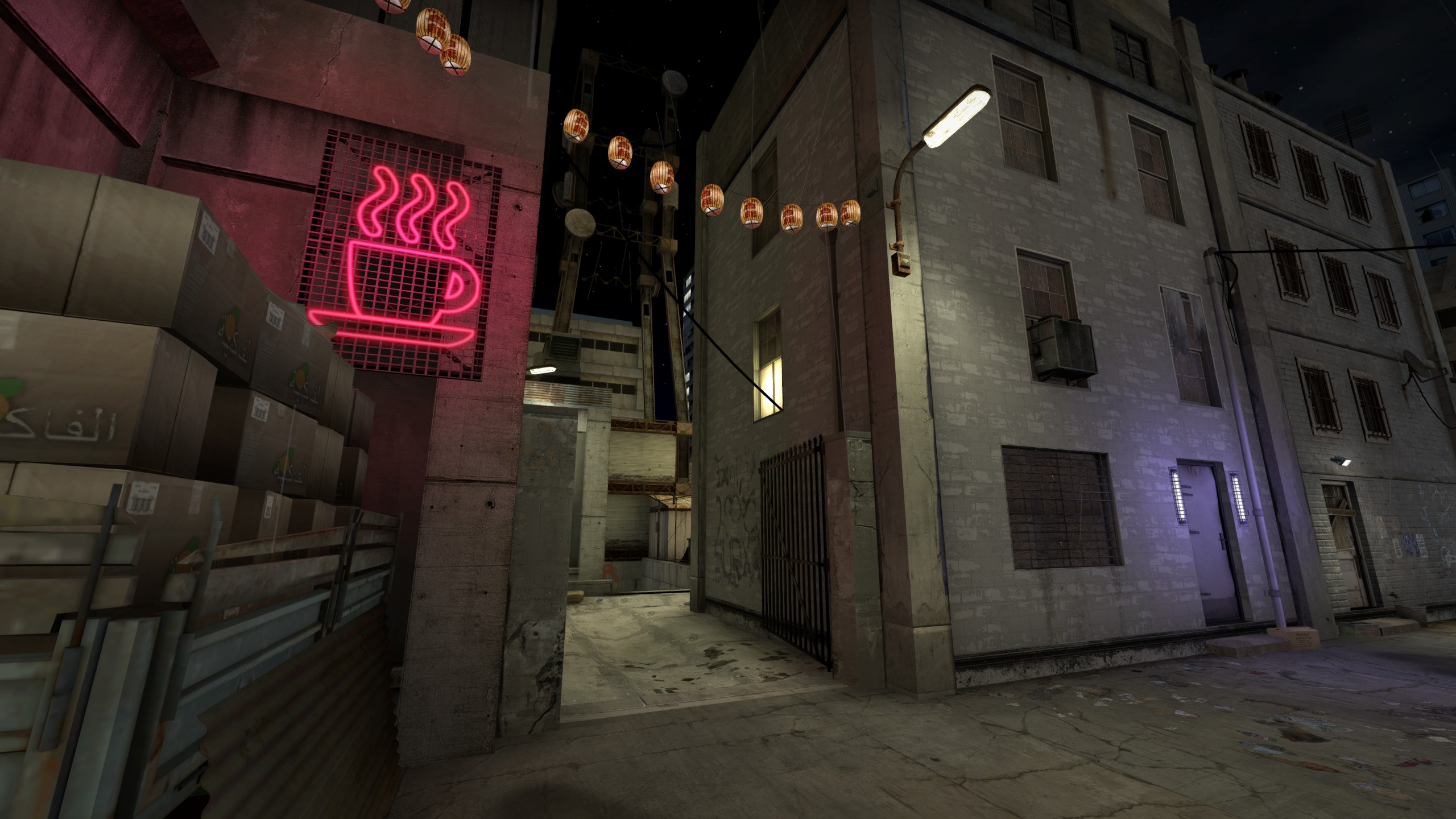
I have a bad habit, and it is scope. 'Don't Turn Your Back On The City' started as a basic exploration of layout and encounter design in Doom II... and then, when it came to visuals, got out of hand. Doom II promised 'Hell on Earth', but its levels were every bit as fuzzy and formless as its predecessor, asking you to look at a featureless rectangle of bricks and see a factory or a suburb. And yet, scrolling through its texture assets, a sharper picture of Hell on Earth began to form. Pieces that had never quite fitted together before, walls that never had a chance to work in tandem. I suppose I just couldn't leave that picture un-painted.
The map follows a fairly short arc through a sort of grim brown urban labyrinth, all dirty back-alleys and forgotten courtyards, with diversions into an infested hotel and gore-soaked garage. I had a few vague design principles in mind for it—some forced-perspective tricks, looping back to previous areas, rising and falling intensity of encounters—but the layout was largely just borne out of aimlessly iterating forward until all the bits fitted together. The linear path through the map was designed to tease the player with locked doors and unreachable keys, both of which would naturally be reached again by following the path forward. For most games I would call it typical design; for Doom, I wondered if it was a bit patronising.
Detailing was a case of setting an impractical standard early and sticking to it out of stubbornness. I wanted crooked buildings looming over me and I would get crooked buildings, dammit. The format I'd settled on, Boom-compatible, meant that true 3D geometry was still largely out of reach, so I had to improvise. Overhead details were made of fiddly mid textures hovering in the air, and building tops were selectively turned into sectors (where possible) to let walls recede out of view over them. Shadows were hand-drawn based on fuzzy estimates of light falloff and sun direction, rendering the resultant sector soup almost impossible to modify further. Many wall features demanded the abuse of tiny sliver-wide sectors, creating jagged almost-sheer staircases that would show their seams if a perceptive player used vertical look. Which they don't, thank goodness.
'Don't Turn Your Back On The City' was well-received, but its encounters were described as generally inoffensive. Part of this was no doubt my own inexperience causing me to play it fairly safe, though I think the nature of the map also made it more difficult to play around with moving parts. In many respects the encounters were also overly tightly controlled—aggressively blocking monsters to ensure they behaved exactly as intended—which I think showed a lack of faith in the game's systems on my part. As level designers, we have to accept that not everything will unfold smoothly 100% of the time, and embrace emergent experiences rather than trying to snuff them out.
-
 Go to previous slide
Go to next slide
Go to previous slide
Go to next slide
-
 Go to previous slide
Go to next slide
Go to previous slide
Go to next slide
-
 Go to previous slide
Go to next slide
Go to previous slide
Go to next slide
-
 Go to previous slide
Go to next slide
Go to previous slide
Go to next slide
-
 Go to previous slide
Go to next slide
Go to previous slide
Go to next slide
-
 Go to previous slide
Go to next slide
Go to previous slide
Go to next slide
-
 Go to previous slide
Go to next slide
Go to previous slide
Go to next slide
-
 Go to previous slide
Go to next slide
Go to previous slide
Go to next slide
-
 Go to previous slide
Go to next slide
Go to previous slide
Go to next slide
-
 Go to previous slide
Go to next slide
Go to previous slide
Go to next slide
-
 Go to previous slide
Go to next slide
Go to previous slide
Go to next slide
-
 Go to previous slide
Go to next slide
Go to previous slide
Go to next slide
Perthowned was a parting love letter to Half-Life deathmatch, and an exercise in... incredibly irresponsible brushwork. The layout was inspired by the classic map 'Crossfire' and was intended to evoke a similar flow at a more sustainable, relaxed pace. I used no custom textures in its construction, and built it to the engine's hardcoded constraints. You could theoretically play it on a computer from 1998—if you didn't mind a framerate in the single digits.
A large multi-tiered central space with multiple entry points—presented as a testing chamber for prototype rocket engines—invites players with generous healing items, and right beneath the rocket's nozzle, the powerful versatile gluon gun. In observation of tradition, however, the chamber is a trap; a player in the overlooking control room can press a large red button to seal the doors on the lower level and fire the thruster, superheating the chamber in an echo of Blast Pit's famous sequence, and directing a cloud of flames out of the exhaust trench.
I had a couple of thoughts in mind when I implemented this. While a number of routes lead into the central chamber, I wanted to keep players rotating in and out in quick succession, so I left a Sword of Damocles quite literally dangling overhead, pushing players towards the ground floor exits with a lingering unease. Furthermore, I wanted another nod to Crossfire, specifically a large event that occasionally radically alters the flow of play. Crossfire's impending air strike draws everyone away from the main arena towards an isolated, cramped bunker—the only spot that's safe when the hellfire hits. Traffic through the map becomes nearly unidirectional, and spaces that are otherwise neglected become suddenly hotly contested.
I love that recontextualisation of space. Perthowned's map event isn't quite as dramatic, but is designed to direct flow in a similar manner. By sealing the ground-level exits, and promising imminent toasty death, players inside the chamber are prompted to make a desperate scramble for the exhaust trench's exit, forcing them onto the otherwise-quiet cliffside. These cliffs also feature the feared tau cannon: a high-mobility, high-damage weapon that enables a successful escapee to quickly get back into the fray—and just maybe, seek revenge.
-
 Go to previous slide
Go to next slide
Go to previous slide
Go to next slide
-
 Go to previous slide
Go to next slide
Go to previous slide
Go to next slide
-
 Go to previous slide
Go to next slide
Go to previous slide
Go to next slide
-
 Go to previous slide
Go to next slide
Go to previous slide
Go to next slide
-
 Go to previous slide
Go to next slide
Go to previous slide
Go to next slide
-
 Go to previous slide
Go to next slide
Go to previous slide
Go to next slide
-
 Go to previous slide
Go to next slide
Go to previous slide
Go to next slide
-
 Go to previous slide
Go to next slide
Go to previous slide
Go to next slide
-
 Go to previous slide
Go to next slide
Go to previous slide
Go to next slide
-
 Go to previous slide
Go to next slide
Go to previous slide
Go to next slide
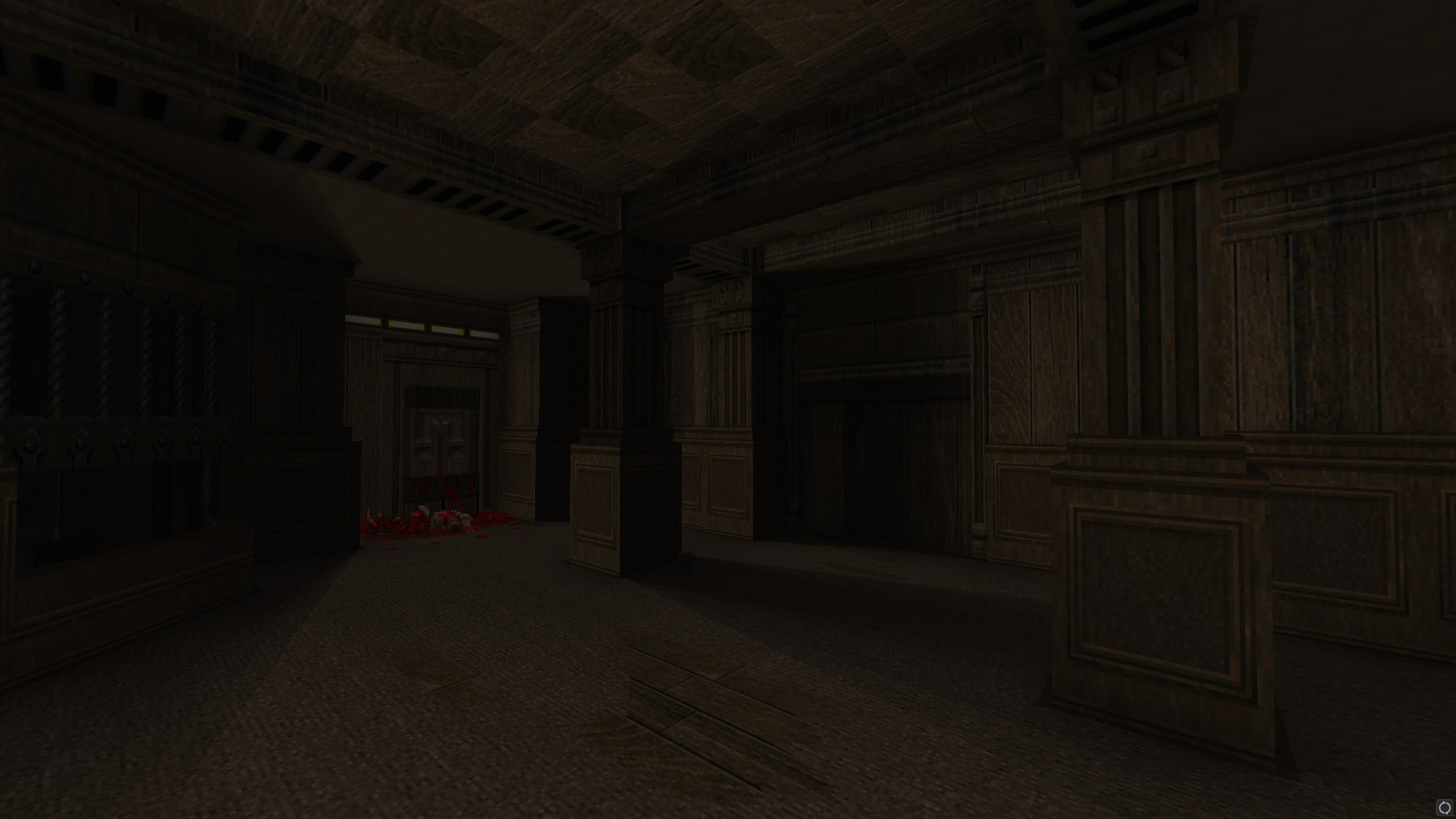
A remake/rebuild/re-whatever of Cloister, a Half-Life deathmatch map created by the series' own writer, Marc Laidlaw. The name is a reference to an old episode of the sci-fi series Red Dwarf, where Dave Lister finds himself exasperatedly trying to correct his pet cat's distant descendant on the details of a religious order founded on offhand remarks he made over three million years ago. After being repeatedly erroneously referred to as 'Cloister the Stupid'—an ignoble but seemingly Christ-like figure—Lister breaks down and exclaims "No. No, it's not Cloister. It's me, it's Lister! It's Lister the Stupid!"
Cloister was never officially released but was retrieved (partially) from the 'WC map pack', a miscellaneous collection of internal assets that were leaked alongside the Half-Life 2 beta in 2003. As a self-acknowledged maker of monumentally poor decisions, I set about reconstructing the map and bringing it up to a higher standard of aesthetic quality, while preserving its play space to as reasonable an extent as possible. Marc seems understandably bemused as to why I'd pour my time into this, but as far as I can tell, the project had his approval—or at least, his world-weary tolerance.
This was an unusual project. Marc's layout had a number of eccentricities and design decisions that I would otherwise frown on, but in the interests of preserving the spirit of the map, I tried to rework delicately and sparingly. Similarly, the brushwork had hints of an intended architectural style here and there—tall narrow halls, crumbling courtyards, looming overhangs and a secluded pool—that needed to be reinterpreted, reimagined, or occasionally just... thrown out. I tried to steer clear of explicit architectural inspiration on this project in favour of imagining my own motifs, but as you can probably see, a few classical influences may have snuck in there. Lots of expensive columns.
Owing to the limitations of the engine, and my own relative inexperience with it, a number of sacrifices had to be made to squeeze the map into Half-Life's modest constraints. I'd initially put a greater focus on detailing inaccessible spaces, creating alcoves with recurring motifs reminiscent of some fabricated religious order. I'd underestimated how quickly curved geometry, like arches, tends to chew up clipnodes—the engine's equivalent of a compiled collision mesh—and a lot of 'unnecessary' detailing had to go out the window.
A sadly canned UE4 stealth game that I was working on with the delightful Joe Wintergreen at Impromptu Games. Operating on a casual contract, I spent most of my time in this position working on the hub level—a slice of a pseudo-medieval, pseudo-Industrial-Revolution city that sprawled vertically as much as horizontally. The game was influenced by the classic immersive sim experience laid down by the Thief series, albeit with more acrobatic tools and (for at least a while) some very ambitious worldbuilding.
I had to create a space that was inherently enjoyable to traverse either when exploring aimlessly or moving from A to B; full of opportunities for the players to encounter pockets of narrative—or create their own. Building layouts had to feel realistic, conducive to AI navigation, and provide alternating zones of safety and risk. On top of that, it had to be at least partially presentable: we needed a vertical slice to secure more stable funding.
It was a lot of balls to keep in the air, and I'll be the first to admit that I dropped a few. In the earlier stages of the project I was too eager to impress, creating detailed structures without greyboxing or planning routes. Oh, sure, I left opportunities open—a window here, a landing here, roof access there—but it was ultimately a strategy of creating blindly and hoping that things just fell into place later. Later on I was more responsible, creating rough outlines that could be easily tweaked or swept away, but feel I weighed myself down with decision paralysis. Immersive sims aim to create a dynamic, plausible, seamless world that you can lose yourself in—and being in charge of shaping that world is a lot to ask.
Ultimately, we weren't able to secure funding, but I came out the other end pleased with some of my creations. Many structures ended up highly porous in a manner similar to Dishonored, littered with entrances and exits to facilitate casual exploration, and with our tools pipeline (importing Hammer brush geometry into UE4) I was able to create some genuinely attractive vistas. The architecture ended up a mishmash of time periods and improbable fantasy, but that was probably for the best—nobody wants samey, after all.
-
 Go to previous slide
Go to next slide
Go to previous slide
Go to next slide
-
 Go to previous slide
Go to next slide
Go to previous slide
Go to next slide
-
 Go to previous slide
Go to next slide
Go to previous slide
Go to next slide
-
 Go to previous slide
Go to next slide
Go to previous slide
Go to next slide
-
 Go to previous slide
Go to next slide
Go to previous slide
Go to next slide
-
 Go to previous slide
Go to next slide
Go to previous slide
Go to next slide
-
 Go to previous slide
Go to next slide
Go to previous slide
Go to next slide
-
 Go to previous slide
Go to next slide
Go to previous slide
Go to next slide
-
 Go to previous slide
Go to next slide
Go to previous slide
Go to next slide
-
 Go to previous slide
Go to next slide
Go to previous slide
Go to next slide
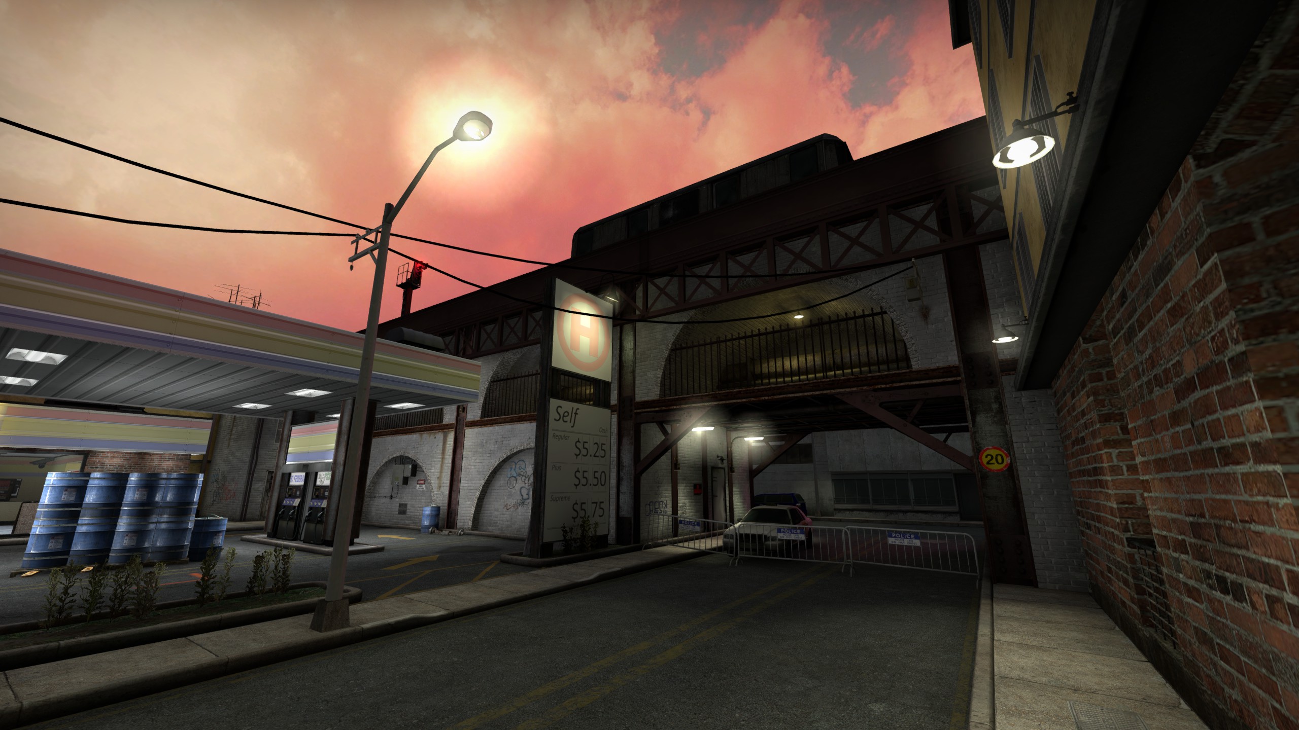
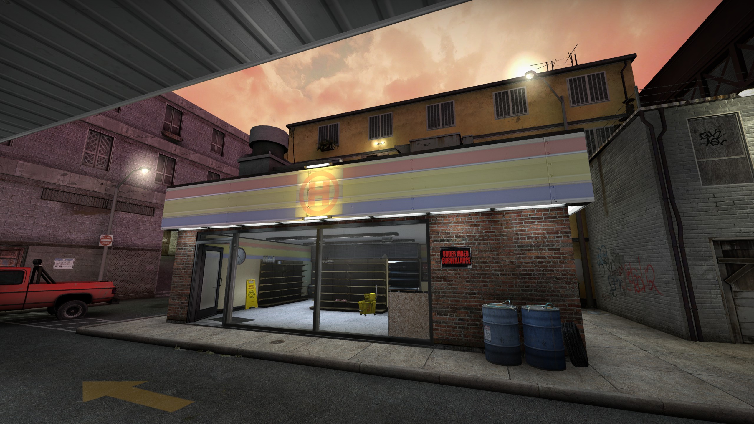
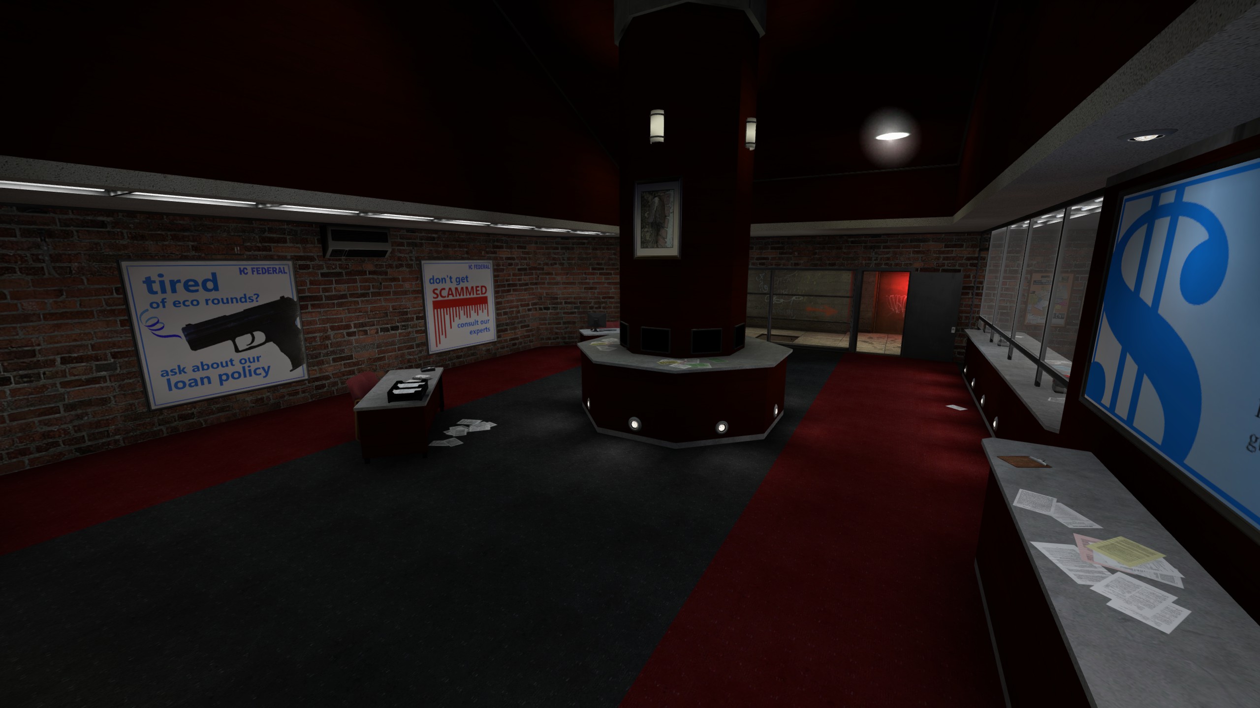
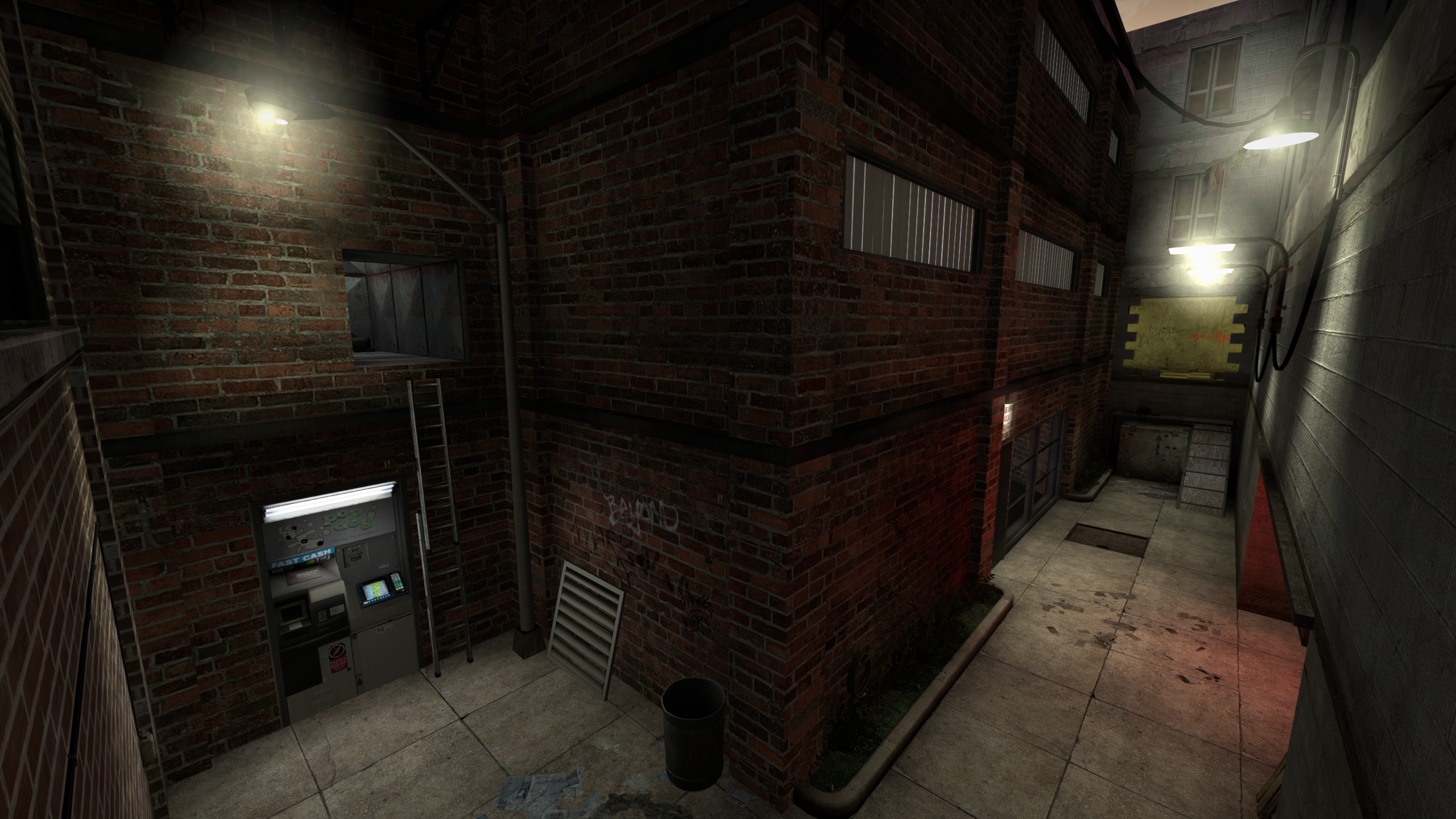
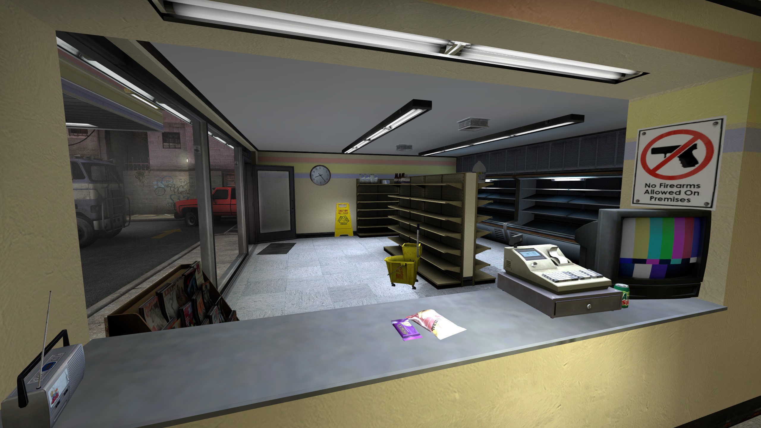
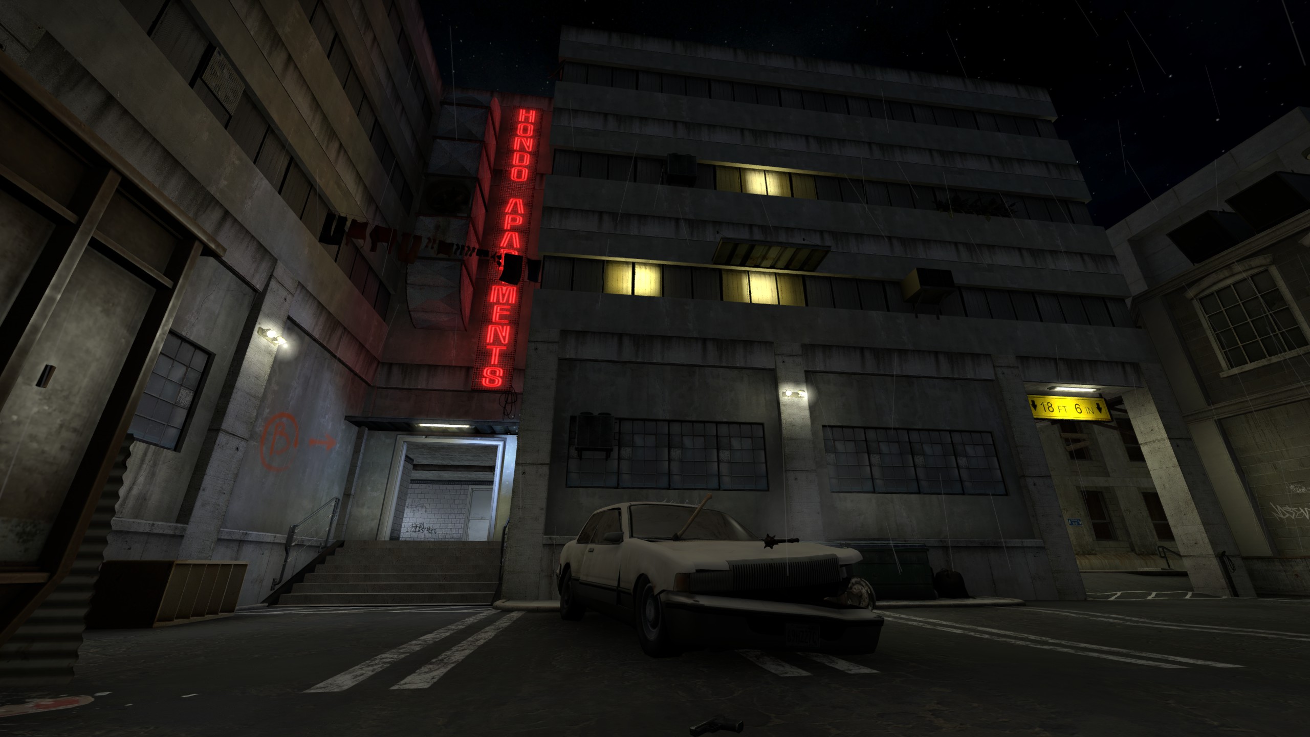
A remake of ahl_nocredit, a classic map for Action Half-Life by the notorious Hondo. This was a self-indulgent project, born largely of a design idea I had: could you take the layout of a free-for-all deathmatch-oriented map and successfully adapt it to CS:GO's defusal mode? I'll admit I had other motives—I hero-worshipped Hondo for his dedication to atmosphere and his extensive, unnerving secret areas—but after numerous greybox experiments, I had grown tired of conventional Counter-Strike layouts, and de_nocredit gave me the excuse I needed to fly in the face of them.
Placement quickly became something of a challenge. ahl_nocredit was full of arenas and corridors that suited a multitude of engagement ranges and play styles, but it was designed for players to circulate aimlessly through, while the flow of Counter-Strike maps is (at least initially) much more focused on controlling ground, with both teams contesting fairly predictable positions. I had to ensure that the bomb sites would be fun to fight over, with a handful of entrance points that granted different strategic boons, and I had to ensure that the Counter-Terrorists would be at least mostly there before the Terrorists arrived. If possible, I also had to ensure the existence of one or more central spaces that would open up further options for the Terrorists, if they managed to secure them.
The semi-abstract nature of Hondo's brushwork also gave me some welcome environment design wiggle-room. I was dedicated to preserving and enhancing the mood of the original map—a decrepit pseudo-American inner-city labyrinth—but when faced with a blank wall or featureless corridor, I was able to nudge the presentation here and there, painting in hints of something deeper, something beyond those walls.
The end layout turned out as something of a Dust-like, with site A almost directly on top of the CT spawn and site B tucked away to the side. To alleviate the wide-openness of the petrol station forecourt, I scattered a number of vehicles and cargo pallets—a sin, perhaps, but the product of desperation—and I opened up a shortcut to make a circuitous route from the original layout slightly more practical for fast-paced engagement. Ultimately the map was still a strange beast that garnered little to no recognition outside of its very niche intersection of interests— but what's the point of art if you can't create for your own sake?
-
 Go to previous slide
Go to next slide
Go to previous slide
Go to next slide
-
 Go to previous slide
Go to next slide
Go to previous slide
Go to next slide
-
 Go to previous slide
Go to next slide
Go to previous slide
Go to next slide
-
 Go to previous slide
Go to next slide
Go to previous slide
Go to next slide
-
 Go to previous slide
Go to next slide
Go to previous slide
Go to next slide
-
 Go to previous slide
Go to next slide
Go to previous slide
Go to next slide
-
 Go to previous slide
Go to next slide
Go to previous slide
Go to next slide
-
 Go to previous slide
Go to next slide
Go to previous slide
Go to next slide
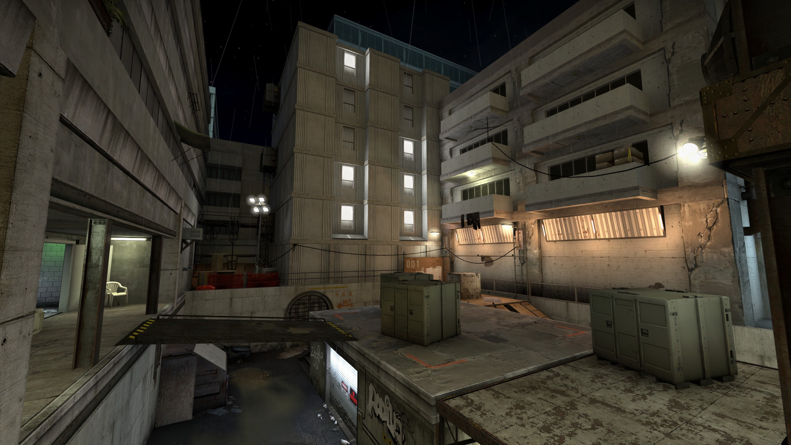
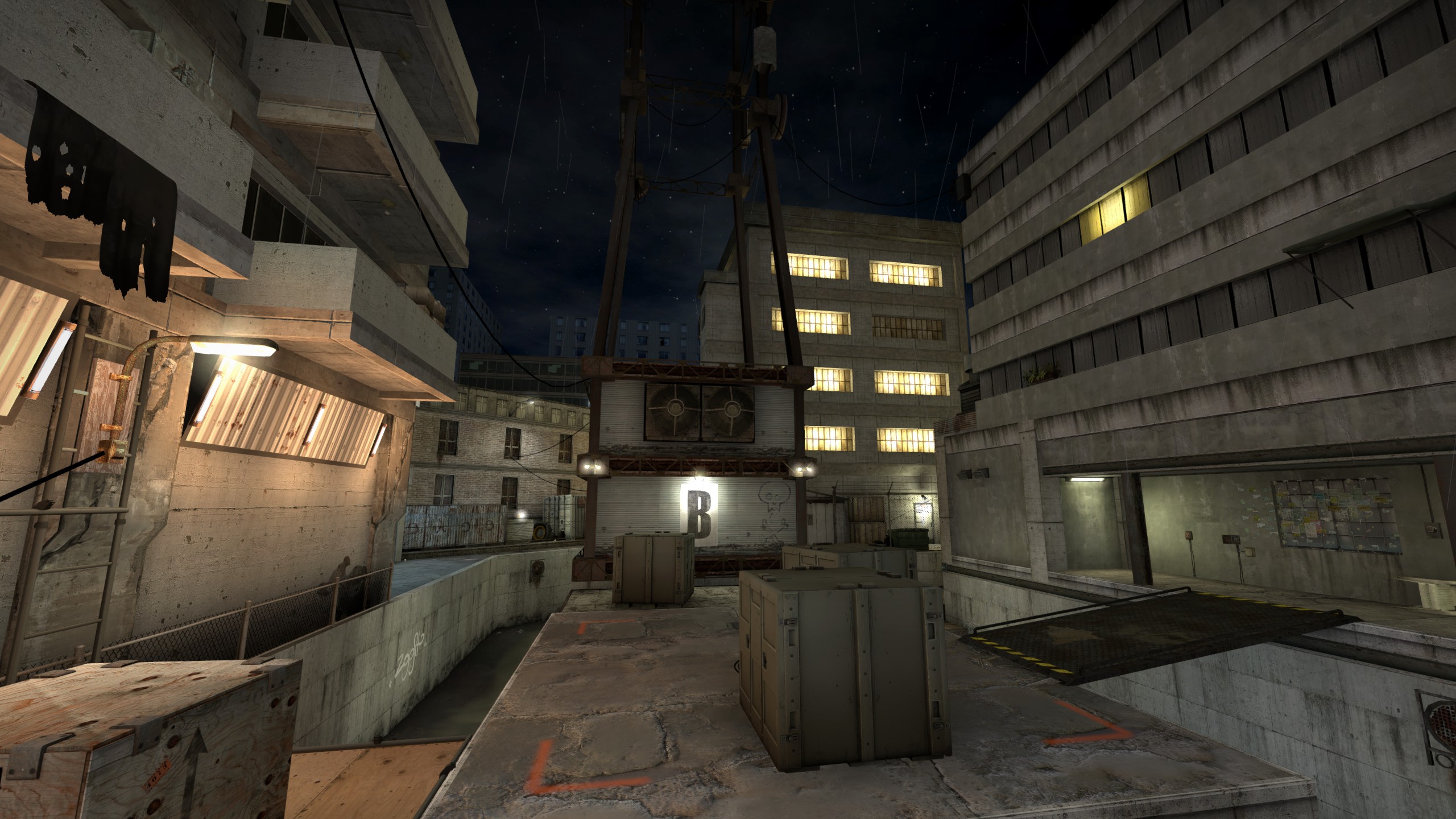
My earliest work of level design to see the light of day. Coredump was a product of many of my conflicting desires; the desire to create an acclaimed competitive defusal map, the desire to create a distinctive aesthetic that escaped the usual Counter-Strike locales, the desire to play with greater verticality in bombsite layouts. Unsurprisingly, it was a lot to take on, and despite being well-received on the Workshop, I don't believe it really holds up.
The overarching layout is a fairly conventional affair, with two bombsites reasonably close to the Counter-Terrorist spawn, a handful of lateral routes for rotating between them, and a 'mid' area that grants the Terrorists more options for assault if they're able to secure it. Mid draws influences from Mirage, with several parallel paths on different tiers and a semi-protected room for defending snipers. Notably, whichever team controls it can rotate through to a rooftop overlooking site A.
This is, I think, the maps biggest weakness, and doubtless a source of frustration for many: a player on the rooftop can be enormously effective at defending the site, but (critically) there is no way to reach their position from the site's ground-level, besides taking a lengthy detour through mid. This can leave players on the site feeling helpless, especially when it comes down to time-pressured scenarios like planting or defusing; even if they know someone is on the roof, they can't do anything about it besides hoping to bait them out. It was a bold design concept, but in hindsight, a little too one-sided.
However, I am pleased with a number of features; I think I did well to create a night-time map that was still visually readable in CS:GO, a game that has done everything it can to discourage such a theme. The architectural design could be politely described as 'nebulous'—I was hesitant to commit to a regional style, despite using the term 'cyberpunk' rather too much—but I think it does well by the game's visual standards, lack of custom assets notwithstanding.